DOGE “Wall of Receipts” data downloaded using the DOGE API found here: [https://api.doge.gov/docs](https://api.doge.gov/docs)
Location/additional grant information accessed using the USA Spending API, documentation found here: [https://api.usaspending.gov/](https://api.usaspending.gov/)
**Process:**
When downloading the DOGE data, most of the grant information is removed, including the location of the recipient and the place of performance. DOGE does provide a permalink to the corresponding grant in USA Spending. I used R to download all the DOGE cancelled grants with the DOGE API, then I used the USA Spending API and the permalink provided by DOGE to match each individual DOGE cancellation with its extended information, like place of performance or recipient type. Map was made in ArcGIS Pro. This map includes only cancelled grants, not cancelled leases or contracts.
Bjarki56 on
The colors are too similar to distinguish all the gradations.
ImSomeRandomHuman on
DOGE has managed to make a congressional district out of the Great Lakes.
It_Happens_Today on
As a Michigander, can I ask wtf is that?
[deleted] on
[deleted]
intertubeluber on
It looks like UNC(?) lost some major research funding. Any idea what that is?
ndfb47 on
A few suggestions:
1. Make the “no data” color something very different as it is currently difficult to distinguish between the lowest bracket and the no data counties. You have the entire rainbow to work with.
2. Is there a particular point you are trying to make with this? My mind is trying to make some geographical or political story out of this. If that is what you’re trying to do, perhaps a companion plot showing partisan lean or current house representation. Or maybe a scatter plot of partisan lean vs DOGE cuts. I could come up with a dozen more, but you get the picture- show us what you’re trying to show us.
3. I am curious about base rates here. The absolute monetary value matters, but there may be some skew if there is an underlying unbalance in grant funding. It would be interesting to see this same plot as a percentage of funding cut.
turb0_encapsulator on
I was worried this would be extremely partisan. it actually isn’t.
showersrover8ed on
Research triangle park getting gutted cause science is for losers
vezkor09 on
I live in Michigan and excuse me whaaaaaat
MichaelinNeoh on
Swing populations in swing states.
antaresdawn on
Yes. Fuck my district in NC in particular. RTI, Duke, UNC, EPA, NC State, NC Central, hospitals, NIOSH… and those are just the ones I know about.
flapjaxrfun on
So maybe it was a bad time to buy a house in RTP?
mcgato on
Did I miss something, or did Hawai’i add a bunch of new islands?
rainspider41 on
I think the MN CD7 cuts of planned Parenthood is more than a million. It was $250k just to set up the one in Alexandria. This data seems very conservative. (Small c conservative)
ahhshits on
Lmaooo
Imagine promising 2 trillion in savings… and WASTE, FRAUD, and ABUSE.
Then only coming up 30 billion in cuts if that?
chuff80 on
I live next to UCSD. It’s a bloodbath up there.
TrapDaddyReturns on
It’s crazy living in a manufacturing state and having to sign a petition to ask the government not to cut our funding.
jorrflv on
What is going on in northern Nevada… what got cut up there?
Vatnos on
I live in NC district 4 AMA. ☠️
jackslipjack on
Super interesting map! Are you taking the DOGE “data” at face value? If so, a better title would probably be “claimed DOGE cuts,” given how many have been shown to be bogus or overstated.
Zhong_Ping on
So fuck Alaska I guess.
This seemed to hit Republican strongholds the hardest.
smashed__ on
My county had a grant to remove dying trees and replace them. They made decent progress until the grant was revoked. Additionally, they had a grant to replace a lot of the dated technology used in the police department and that grant was revoked.
[Source](https://hometownnewsnow.com/local-news/789975)
PM_ME_YER_MUDFLAPS on
Doesn’t look like it has TN enough
Absolute-Limited on
$0 and No Data should be more distinct.
boom929 on
Jfc Texas is so fucking gerrymandered.
Professor_McWeed on
Manhattan is completely covered by the thick gray state outline. I was hoping to see if NYC is as dark as Boston.
wombatshit on
Minnesota’s least impacted areas seem to align with the ag corridor… weird.
Kolt56 on
Love this, as a fish in Lake Michigan I’m glad my vote counted.
Also what year are these from and which chatbot hallucinated the congressional districts in Pennsylvania?
Also trying to wrap my brain around your corner of Indiana and Ohio, that’s totally factual! Great job.
_Mychael on
Does anyone know what the East TN cuts were specifically?
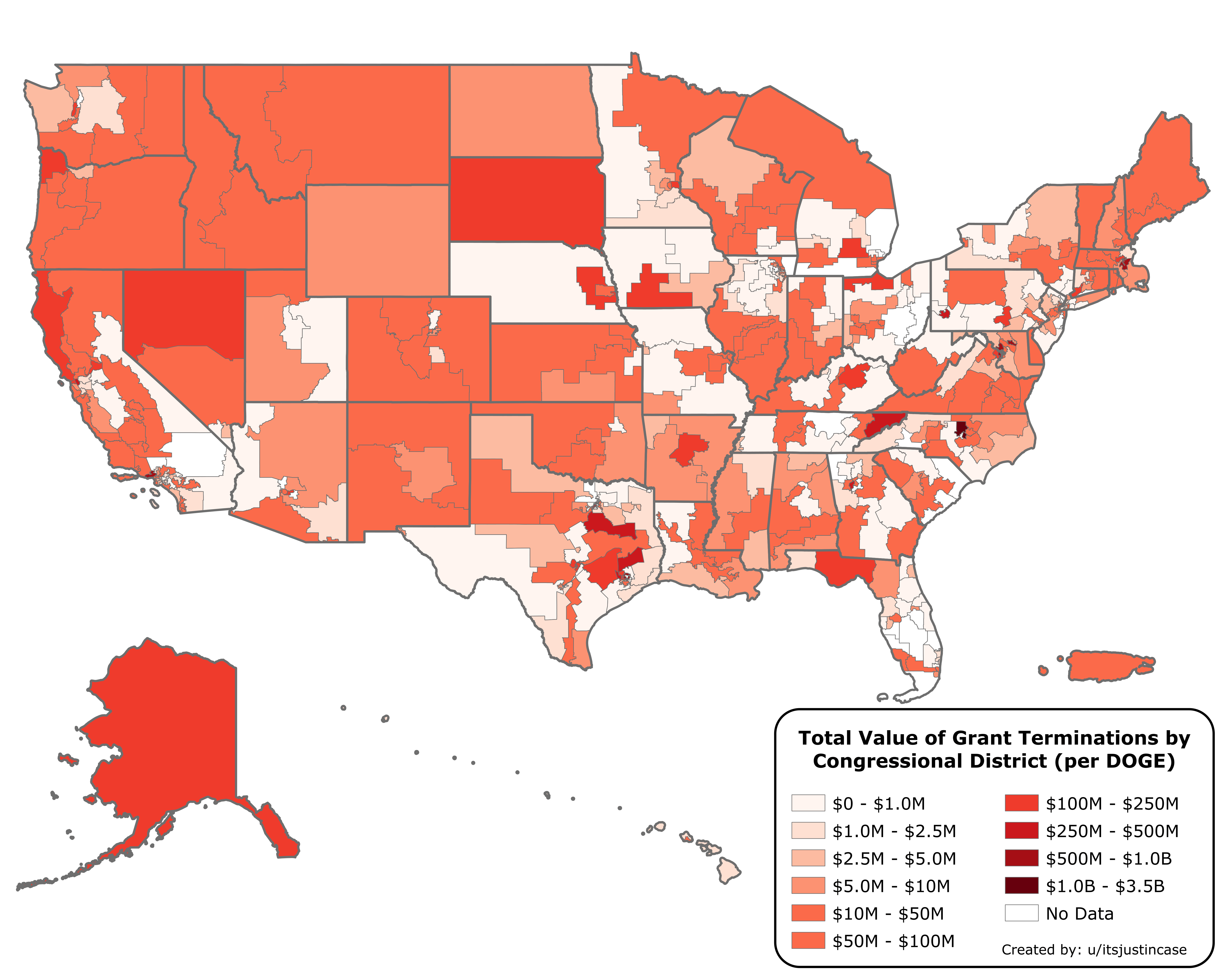

![Dollar Value of DOGE Cuts to US Federal Grant Programs by Congressional District [OC]](https://www.byteseu.com/wp-content/uploads/2025/06/jwnh8rs5cz7f1-1536x1229.png "Dollar Value of DOGE Cuts to US Federal Grant Programs by Congressional District [OC]")
31 Comments
**Sources**:
119th Congressional District boundaries from the US Census Bureau here: [https://www.census.gov/geographies/mapping-files/time-series/geo/cartographic-boundary.html](https://www.census.gov/geographies/mapping-files/time-series/geo/cartographic-boundary.html)
DOGE “Wall of Receipts” data downloaded using the DOGE API found here: [https://api.doge.gov/docs](https://api.doge.gov/docs)
Location/additional grant information accessed using the USA Spending API, documentation found here: [https://api.usaspending.gov/](https://api.usaspending.gov/)
**Process:**
When downloading the DOGE data, most of the grant information is removed, including the location of the recipient and the place of performance. DOGE does provide a permalink to the corresponding grant in USA Spending. I used R to download all the DOGE cancelled grants with the DOGE API, then I used the USA Spending API and the permalink provided by DOGE to match each individual DOGE cancellation with its extended information, like place of performance or recipient type. Map was made in ArcGIS Pro. This map includes only cancelled grants, not cancelled leases or contracts.
The colors are too similar to distinguish all the gradations.
DOGE has managed to make a congressional district out of the Great Lakes.
As a Michigander, can I ask wtf is that?
[deleted]
It looks like UNC(?) lost some major research funding. Any idea what that is?
A few suggestions:
1. Make the “no data” color something very different as it is currently difficult to distinguish between the lowest bracket and the no data counties. You have the entire rainbow to work with.
2. Is there a particular point you are trying to make with this? My mind is trying to make some geographical or political story out of this. If that is what you’re trying to do, perhaps a companion plot showing partisan lean or current house representation. Or maybe a scatter plot of partisan lean vs DOGE cuts. I could come up with a dozen more, but you get the picture- show us what you’re trying to show us.
3. I am curious about base rates here. The absolute monetary value matters, but there may be some skew if there is an underlying unbalance in grant funding. It would be interesting to see this same plot as a percentage of funding cut.
I was worried this would be extremely partisan. it actually isn’t.
Research triangle park getting gutted cause science is for losers
I live in Michigan and excuse me whaaaaaat
Swing populations in swing states.
Yes. Fuck my district in NC in particular. RTI, Duke, UNC, EPA, NC State, NC Central, hospitals, NIOSH… and those are just the ones I know about.
So maybe it was a bad time to buy a house in RTP?
Did I miss something, or did Hawai’i add a bunch of new islands?
I think the MN CD7 cuts of planned Parenthood is more than a million. It was $250k just to set up the one in Alexandria. This data seems very conservative. (Small c conservative)
Lmaooo
Imagine promising 2 trillion in savings… and WASTE, FRAUD, and ABUSE.
Then only coming up 30 billion in cuts if that?
I live next to UCSD. It’s a bloodbath up there.
It’s crazy living in a manufacturing state and having to sign a petition to ask the government not to cut our funding.
What is going on in northern Nevada… what got cut up there?
I live in NC district 4 AMA. ☠️
Super interesting map! Are you taking the DOGE “data” at face value? If so, a better title would probably be “claimed DOGE cuts,” given how many have been shown to be bogus or overstated.
So fuck Alaska I guess.
This seemed to hit Republican strongholds the hardest.
My county had a grant to remove dying trees and replace them. They made decent progress until the grant was revoked. Additionally, they had a grant to replace a lot of the dated technology used in the police department and that grant was revoked.
[Source](https://hometownnewsnow.com/local-news/789975)
Doesn’t look like it has TN enough
$0 and No Data should be more distinct.
Jfc Texas is so fucking gerrymandered.
Manhattan is completely covered by the thick gray state outline. I was hoping to see if NYC is as dark as Boston.
Minnesota’s least impacted areas seem to align with the ag corridor… weird.
Love this, as a fish in Lake Michigan I’m glad my vote counted.
Also what year are these from and which chatbot hallucinated the congressional districts in Pennsylvania?
Also trying to wrap my brain around your corner of Indiana and Ohio, that’s totally factual! Great job.
Does anyone know what the East TN cuts were specifically?
One county in NC got screwed. Can someone explain