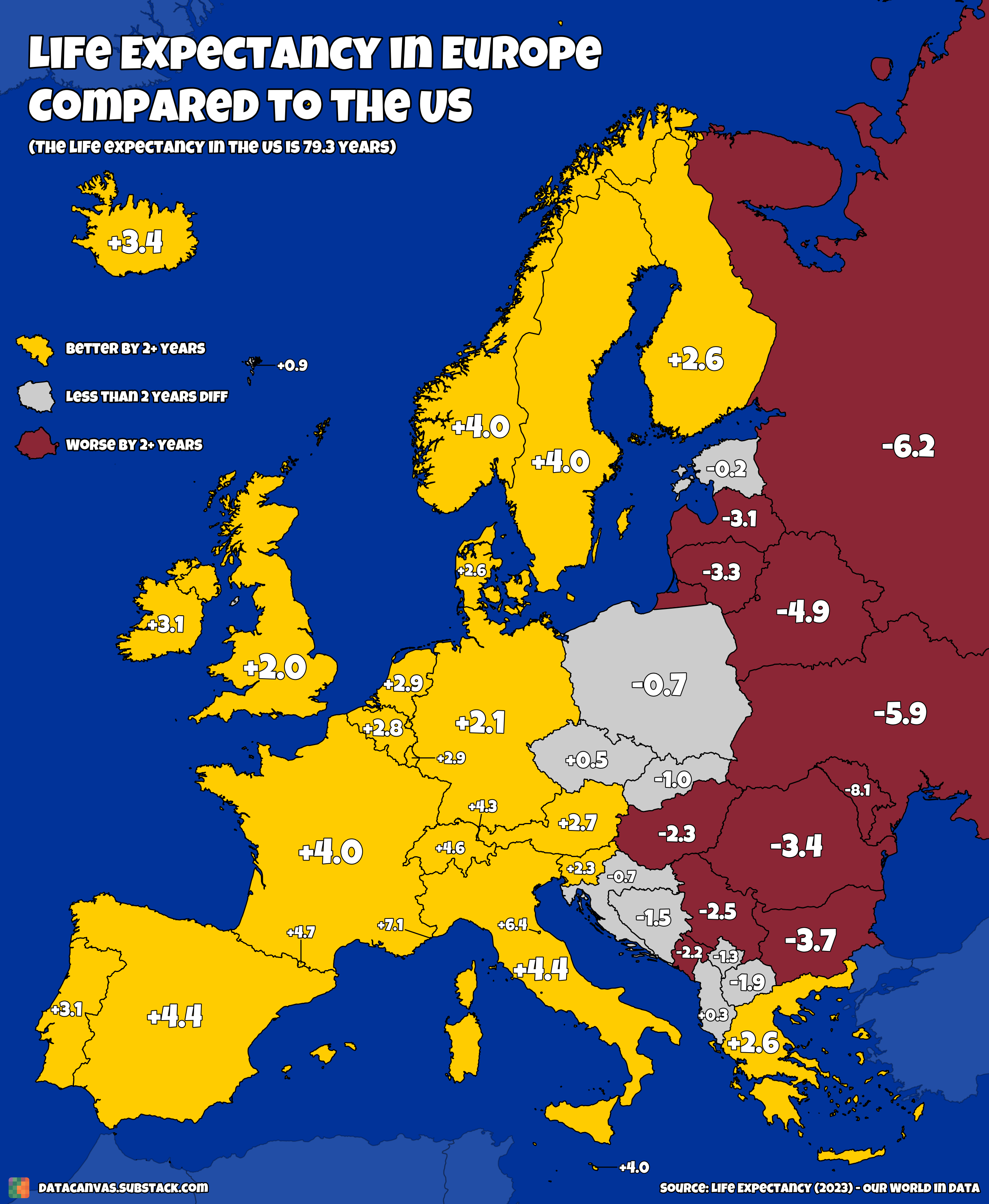
It’s actually also quite crazy seeing the differences among Europe
NoEnd917 on
Is that death by natural causes or overall death? Cause we all know what’s been going around in America
thePedrix on
For once a metric showing Portugal on pair with other Western European countries
girkkens on
What universal healthcare does to a mf
superurgentcatbox on
I wonder how this compares to obesity and/or alcohol consumption.
KR1735 on
Honestly it’s impressive the U.S. gets this close when it doesn’t even have universal health care and is one of the most obese countries in the world.
NiJuuShichi on
With the exception of Slovenia, this map perfectly differentiates post-Communist countries and the rest of Europe.
Boris_Ignatievich on
worst life expectancy in western europe (you’ll never sing that!)
Lumpy_Dentist_5421 on
Please stop putting Russia as part of Europe – we don’t want them
lex_koal on
Finally, the East Europe border
haluura on
So what the data is saying is that countries with solid, well funded socialized medicine have higher life expectancy than the wild west system we have…
BroseppeVerdi on
I wonder how much Russia and Ukraine have changed over the past 3 years.
alundaio on
I never understand why people compare all of US as a whole compared to these tiny countries that dwarf some US states. Compare States and I believe you’ll see the same kind of parity.
YourRoaring20s on
Now remove Appalachia and the South from the US and redo the figures
BrettHullsBurner on
I would imagine obesity accounts for like 90% of the reason for western European countries having slightly higher life expectancy than the US.
orionismud on
I know it would make it a lot more work, but increasing how much the color is related to the numbers would make this data much more beautiful. Darker red for more negative numbers, etc.
prosa123 on
Low US life expectancy is even more troubling when one considers the size of the Hispanic population with their famously long life expectancies (see “Hispanic Paradox“ on Wikipedia).

![[OC] Life Expectancy in Europe Compared to the US: Which Europeans can expect to live longer than Americans?](https://www.byteseu.com/wp-content/uploads/2025/06/nuzyswqtlo8f1-1262x1536.png "[OC] Life Expectancy in Europe Compared to the US: Which Europeans can expect to live longer than Americans?")
18 Comments
@UK, wanna be health buddys? Greetings, Germany.
It’s actually also quite crazy seeing the differences among Europe
Is that death by natural causes or overall death? Cause we all know what’s been going around in America
For once a metric showing Portugal on pair with other Western European countries
What universal healthcare does to a mf
I wonder how this compares to obesity and/or alcohol consumption.
Honestly it’s impressive the U.S. gets this close when it doesn’t even have universal health care and is one of the most obese countries in the world.
With the exception of Slovenia, this map perfectly differentiates post-Communist countries and the rest of Europe.
worst life expectancy in western europe (you’ll never sing that!)
Please stop putting Russia as part of Europe – we don’t want them
Finally, the East Europe border
So what the data is saying is that countries with solid, well funded socialized medicine have higher life expectancy than the wild west system we have…
I wonder how much Russia and Ukraine have changed over the past 3 years.
I never understand why people compare all of US as a whole compared to these tiny countries that dwarf some US states. Compare States and I believe you’ll see the same kind of parity.
Now remove Appalachia and the South from the US and redo the figures
I would imagine obesity accounts for like 90% of the reason for western European countries having slightly higher life expectancy than the US.
I know it would make it a lot more work, but increasing how much the color is related to the numbers would make this data much more beautiful. Darker red for more negative numbers, etc.
Low US life expectancy is even more troubling when one considers the size of the Hispanic population with their famously long life expectancies (see “Hispanic Paradox“ on Wikipedia).