
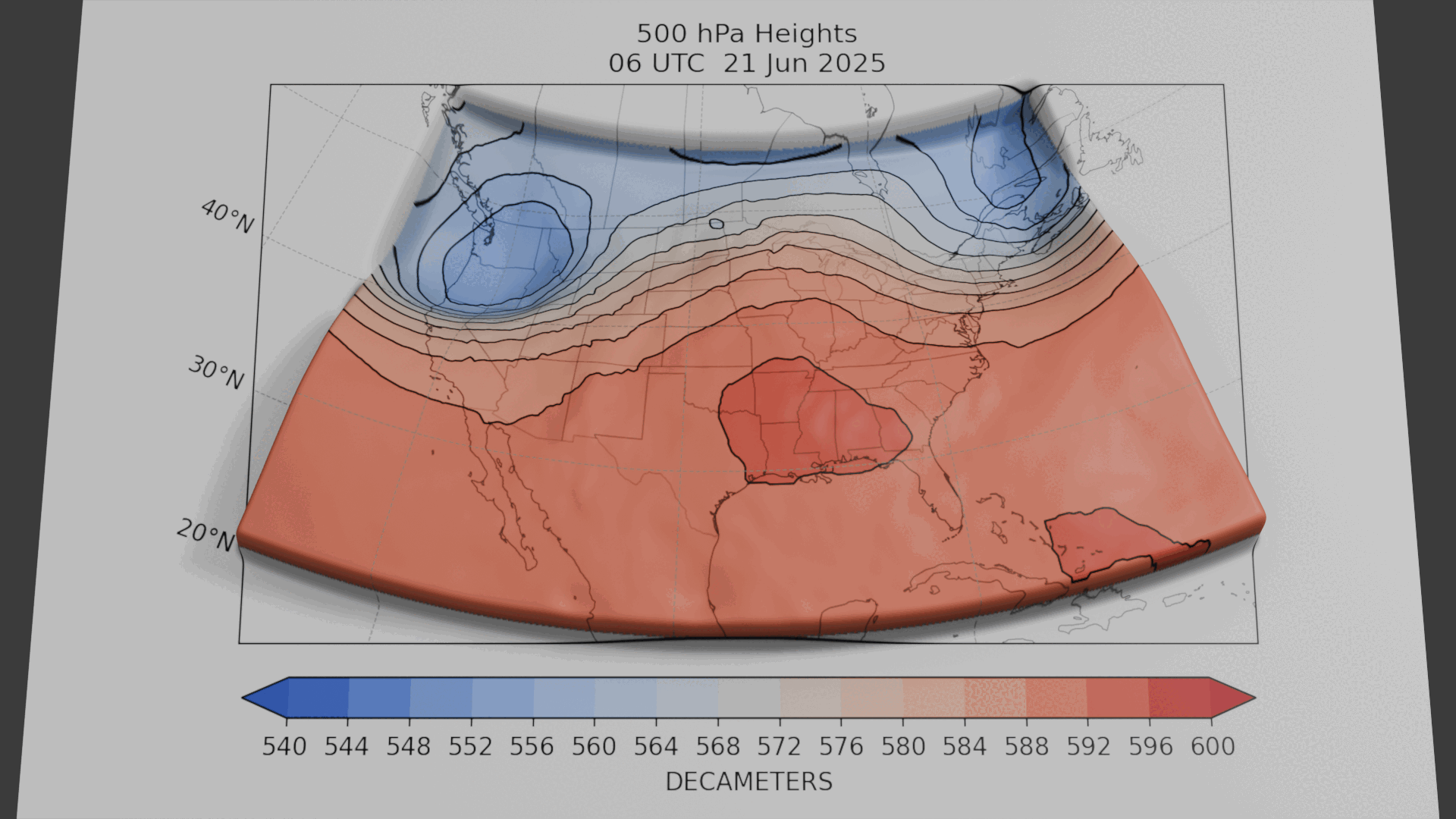
![Development of the heat dome over the eastern US [OC]](https://www.byteseu.com/wp-content/uploads/2025/06/tkqm3yjeix8f1-1536x864.gif "Development of the heat dome over the eastern US [OC]")
data source: ECMWF
viz tool: Blender
data link: https://www.ecmwf.int/en/forecasts/datasets/open-data
This animation shows pressure in the middle of the troposphere, roughly 5 km above the surface, from June 21 – June 24. The field shown is 500 hPa geopotential heights. Reds indicate higher pressures and lows indicated lower pressures.
For more on heat wave patterns in the Northeast US, see: https://www.nature.com/articles/s41612-021-00186-7
Mathew Barlow
Professor of Climate Science
University of Massachusetts Lowell
Posted by Mathew_Barlow
4 Comments
It’s so fucking hot right now
This is nothing compared to the polar vortex and heat dome from a few years ago
I’d love to know the relationship between pressure and the temp. My suspicion isn’t a direct mapping.
Everyone just go outside and blow towards the ocean, we’ll be alright