
![[OC] Armed Conflict Casualties from 1990 to 2024](https://www.byteseu.com/wp-content/uploads/2025/06/xjtdyszhy19f1-578x1536.png "[OC] Armed Conflict Casualties from 1990 to 2024")
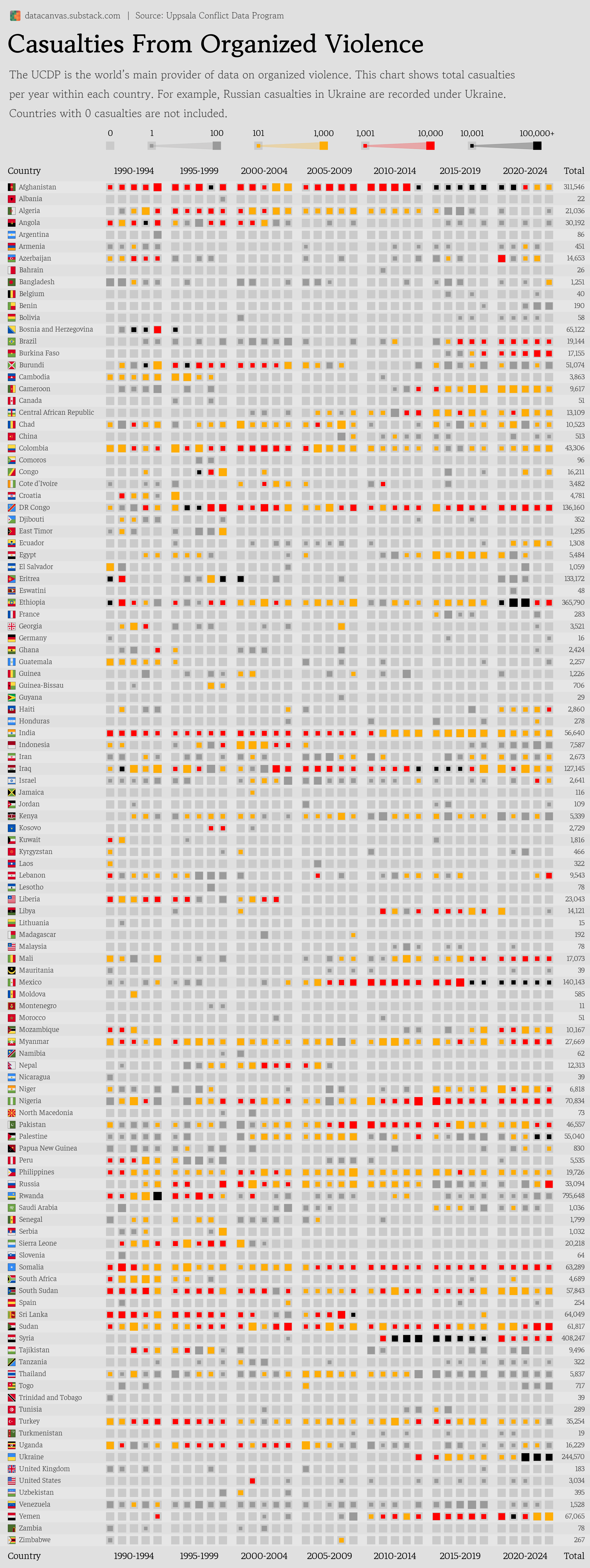
Data source: https://ucdp.uu.se/downloads/ processed by Our World in Data (Deaths in armed conflicts based on where they occurred)
Tools used: Matplotlib
I tried to squeeze as much information into this chart as possible, but I understand if it's a case of information overload.
Note that casualties are recorded based on where they happened, not based on the nationality of the deceased.
This means for example that Russian soldiers killed in the war with Ukraine falls under Ukraine in the chart.
Posted by oscarleo0
10 Comments
Seems a bit unfair that Ukraine’s chart gets all of the Russian casualties included as well, given an important piece of armed conflict context is that one side is usually the aggressor and tens-to-hundreds of thousands of people from another country who are serving that country, get thrown into another country’s stats.
Aren’t Russian casualties past 1 million by now in the Russo-Ukraine war? If we’re going by confirmed deaths then casualty isn’t the word to use. Casualties are confirmed deaths, confirmed injuries, confirmed imprisonments, and missing in action.
Casualties in Germany? What’s that supposed to be?
Questionable data source: The First and Second Congo Wars (1996–2003) have an estimated 5.4 million casualties. I am curious about how the total was calculated.
My only gripe is referring to it as casualties from organized violence rather than deaths in armed conflicts. Casualties include more than deaths and there is organized violence outside of armed military/terrorist conflicts.
I’m going to take Australia’s absence as a good sign lol
Palestine seems like a massive undercount? It was already “officially” at 50k or so at the end of 2024 in the current Gaza Genocide?
Russia losing under 1k in the first years of war is a good joke. And 10k in 2024 as well
Thanks for clarifying! I will indeed treat that as a good sign lol
My main gripe would be with the choice of colours.
Grey-yellow-red-black makes the *worst* conflicts less visually apparent, by assigning them a ‘cooler’ colour. (Despite the traditional western association of black with death, which I assume is what motivated the choice.)
Grey-black-yellow-red might be a more intuitive order. From a distance, what colours would stand out most, and seem to imply the greatest degree of hazard?