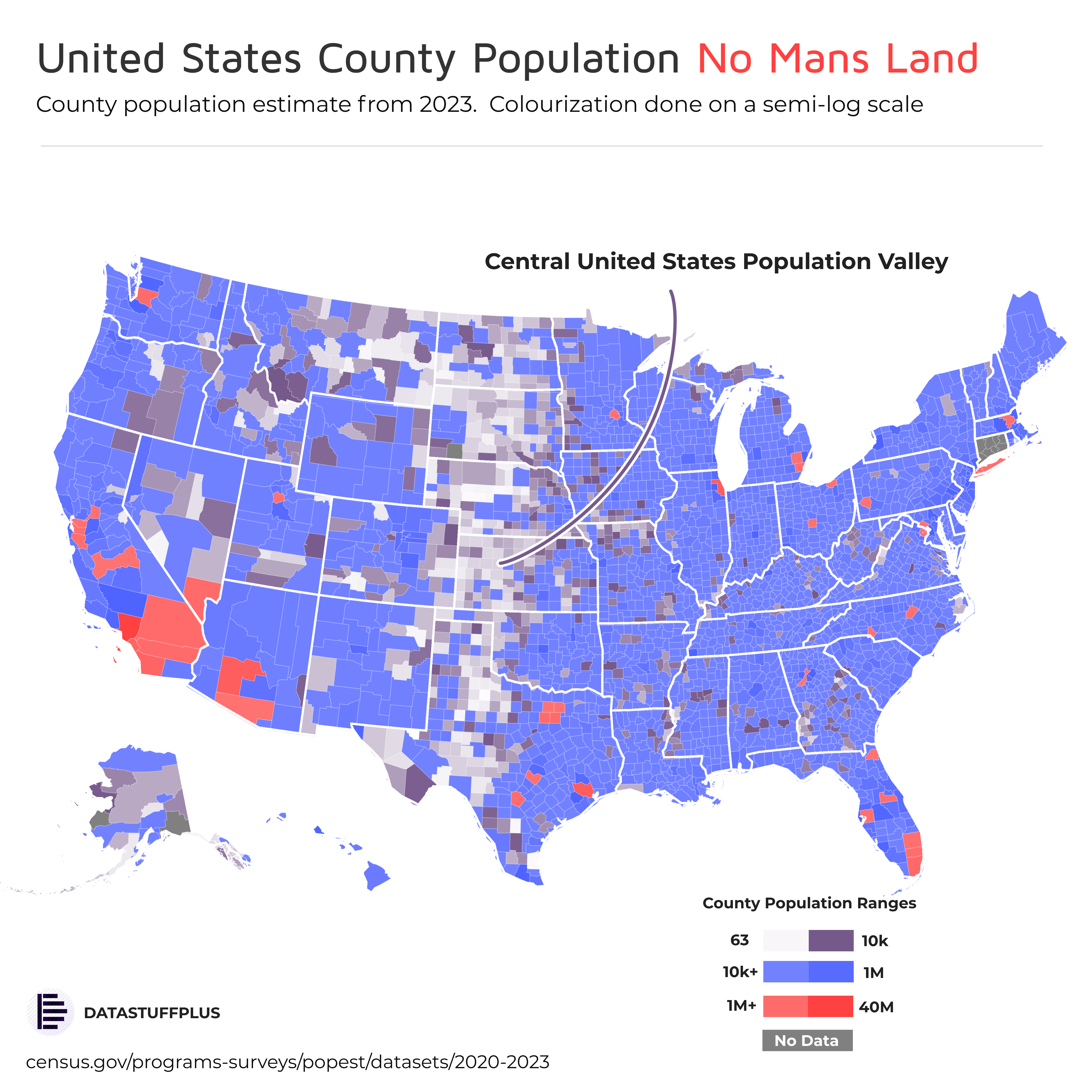
I don’t like the color scale design. This makes a huge difference between greater or less than 1M
turb0_encapsulator on
why don’t they combine some of those ridiculously small counties? it must be redundant and inefficient. 63 people?
bobbysleeves on
There is no county with a population of 40 Million lol, could’ve easily capped it around 10, and even then, LA County has just over 10 million people and the next most populous county doesn’t even reach 5.5M
dds120dds120 on
Does this include illegals?
ComprehensiveOwl9727 on
It’s always crazy to me as a North Texan that those 4 counties that are Dallas/Forth Worth have nearly as many people as Oklahoma, Kansas, Nebraska, and the Dakotas combined.
ramen2581 on
Why isn’t it population density?
NylundHerringLLC on
There’s a green one in South Dakota
Arbiterhark on
For Connecticut you can use county equivalents like Councils of Government. Functionally similar to Boroughs in Alaska or Parishes in Louisiana for statistical purposes.
effrightscorp on
This is a really bad color scale, I can’t differentiate between the greyish purple and no data very easily. I wouldn’t have even realized there were no data sections if it weren’t for CT
EclecticEuTECHtic on
This is a consequence of the Plains states having geographically smaller counties than further west states.
circ-u-la-ted on
I didn’t realize it was called the Bible Belt because a god killed all the people there
mean11while on
Is this not primarily the result of the fact that counties in Nevada, Idaho, Montana, etc., are 5, 10, even 20 times larger than counties in the “no-man’s land”? This “population valley” disappears when you look at population density.
AnOddTree on
63 is an oddly specific number for the bottom of the scale. Lol.
jurisnipper on
Alaska doesn’t have counties.
Worf65 on
I think the size of counties ruins this. The counties from western utah across Nevada are extremely desolate desert and largely uninhabited. But they’re huge compared to those counties showing up as lowest population on here. Population density is almost certainly the more relevant statistic. Or maybe something like largest city.
SmarterThanCornPop on
Number of people named Ty?
nwbrown on
Why do you have three separate color ranges?
masseydnc on
This is distorting the data, I think, by mapping by county population instead of just population density. For example, Wyoming is just as much a “No Man’s Land” as the “valley” you’ve indicated, but because its counties are larger (in area, and thus in population) than the counties of western TX, OK, KS, NE, and SD, it doesn’t show up that way on your coloring method. The same is true with Utah, Nevada, Arizona, New Mexico — if you look at any population density map of the US, you’ll see the valley is about a thousand miles wide with, like, four cities in it.
pvirushunter on
I refuse to believe there at that many people between Albuquerque and El Paso.
agate_ on
Sigh, yet another Reddit map that’s secretly just a population chart. It would be better to plot the data per capita to make it more useful.
😉
Lefty_22 on
The white/gray area represents something like 5% of the entire worldwide crop production zone.
TraditionalParsnip0 on
I feel like it would make more sense if it was normalized to population per unit area, no?
zsdrfty on
I’ve noticed that on every single map of the U.S., for basically any possible statistic you can imagine, this exact line is a stark divider – it’s bizarre, what it is and why is it such a constant force in everything? It’s like you’re in a different country from one side of that thin line to the other
drfsupercenter on
Why is New York City not red?
greenday1237 on
I feel like 10k-1M is such an insane range that it tells me nothing, it’s like if I had a map of earth and was like the blue parts mean 100-1 billion live here
edogg01 on
This is stupid data not beautiful data
SatoshiReport on
What is a Ty population? You may want to spell that out.
sluuuurp on
The colors are meaningless. What’s the boundary between white and purple?
Alarming-Inflation90 on
The near binary gradient is misleading.
Roughneck16 on
New Mexican here. About a third of us live in Bernalillo County, the home of Albuquerque. That’s the only dark blue splotch in the state.

![[OC] A look at United States county ty population (2023 via census.gov)](https://www.byteseu.com/wp-content/uploads/2025/06/qw8p7j7kyc9f1-1536x1536.png "[OC] A look at United States county ty population (2023 via census.gov)")
31 Comments
By not ty*
I don’t like the color scale design. This makes a huge difference between greater or less than 1M
why don’t they combine some of those ridiculously small counties? it must be redundant and inefficient. 63 people?
There is no county with a population of 40 Million lol, could’ve easily capped it around 10, and even then, LA County has just over 10 million people and the next most populous county doesn’t even reach 5.5M
Does this include illegals?
It’s always crazy to me as a North Texan that those 4 counties that are Dallas/Forth Worth have nearly as many people as Oklahoma, Kansas, Nebraska, and the Dakotas combined.
Why isn’t it population density?
There’s a green one in South Dakota
For Connecticut you can use county equivalents like Councils of Government. Functionally similar to Boroughs in Alaska or Parishes in Louisiana for statistical purposes.
This is a really bad color scale, I can’t differentiate between the greyish purple and no data very easily. I wouldn’t have even realized there were no data sections if it weren’t for CT
This is a consequence of the Plains states having geographically smaller counties than further west states.
I didn’t realize it was called the Bible Belt because a god killed all the people there
Is this not primarily the result of the fact that counties in Nevada, Idaho, Montana, etc., are 5, 10, even 20 times larger than counties in the “no-man’s land”? This “population valley” disappears when you look at population density.
63 is an oddly specific number for the bottom of the scale. Lol.
Alaska doesn’t have counties.
I think the size of counties ruins this. The counties from western utah across Nevada are extremely desolate desert and largely uninhabited. But they’re huge compared to those counties showing up as lowest population on here. Population density is almost certainly the more relevant statistic. Or maybe something like largest city.
Number of people named Ty?
Why do you have three separate color ranges?
This is distorting the data, I think, by mapping by county population instead of just population density. For example, Wyoming is just as much a “No Man’s Land” as the “valley” you’ve indicated, but because its counties are larger (in area, and thus in population) than the counties of western TX, OK, KS, NE, and SD, it doesn’t show up that way on your coloring method. The same is true with Utah, Nevada, Arizona, New Mexico — if you look at any population density map of the US, you’ll see the valley is about a thousand miles wide with, like, four cities in it.
I refuse to believe there at that many people between Albuquerque and El Paso.
Sigh, yet another Reddit map that’s secretly just a population chart. It would be better to plot the data per capita to make it more useful.
😉
The white/gray area represents something like 5% of the entire worldwide crop production zone.
I feel like it would make more sense if it was normalized to population per unit area, no?
I’ve noticed that on every single map of the U.S., for basically any possible statistic you can imagine, this exact line is a stark divider – it’s bizarre, what it is and why is it such a constant force in everything? It’s like you’re in a different country from one side of that thin line to the other
Why is New York City not red?
I feel like 10k-1M is such an insane range that it tells me nothing, it’s like if I had a map of earth and was like the blue parts mean 100-1 billion live here
This is stupid data not beautiful data
What is a Ty population? You may want to spell that out.
The colors are meaningless. What’s the boundary between white and purple?
The near binary gradient is misleading.
New Mexican here. About a third of us live in Bernalillo County, the home of Albuquerque. That’s the only dark blue splotch in the state.