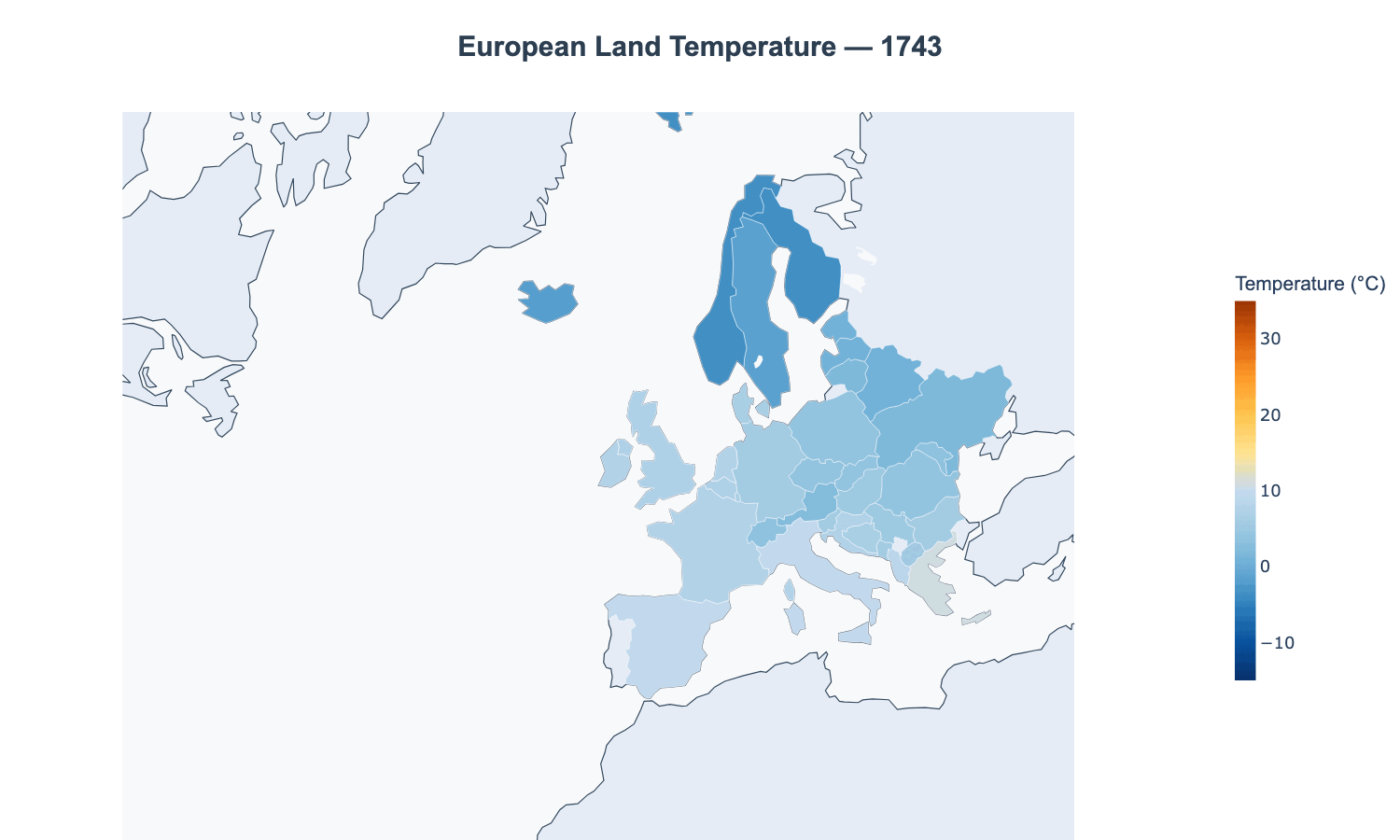
Region: Europe
Data Source: Berkeley Earth
Years Covered: 1743–2013
Metric: Yearly average land surface temperature by country
Posted by SammieStyles

![Watch Europe Heat Up: Average Temperature by Country Since 1743 [OC]](https://www.byteseu.com/wp-content/uploads/2025/06/igl2kr7tku9f1-1024x614.gif "Watch Europe Heat Up: Average Temperature by Country Since 1743 [OC]")
Region: Europe
Data Source: Berkeley Earth
Years Covered: 1743–2013
Metric: Yearly average land surface temperature by country
Posted by SammieStyles
10 Comments
If you included the years 2014-2024, the data wouldn’t be so beautiful anymore.
Edit: Tools used: Python (Matplotlib + geopandas + plotly)
Leftist propaganda let’s keep this sub politically neutral please
I’m a big believer in climate change but this data doesn’t really show Europe heating up all that much on average. The starting year, 1743, seems to be an outlier. If you had started one year later, for example, Spain and Portugal stay that pale yellow color the entire time.
Why is Crimea depicted as ruszian territory?
Am I missing something? Doesn’t appear that much different
Wtf man??? Crimea is Ukraine!
It hasn’t been cold enough in my country for 28 years to do the national long distance ice-skating competition. The rivers just aren’t freezing enough anymore 🙁
What’s the map? Crimea is Ukraine!
I can’t telll anything from this lousy animation and got bored around 1900.
Just use a static line chart if you want to actually convey some information.