
![[OC] My COVID Symptoms (Ridgeline plot)](https://www.byteseu.com/wp-content/uploads/2025/06/h1teiowk72af1-1024x933.jpeg "[OC] My COVID Symptoms (Ridgeline plot)")
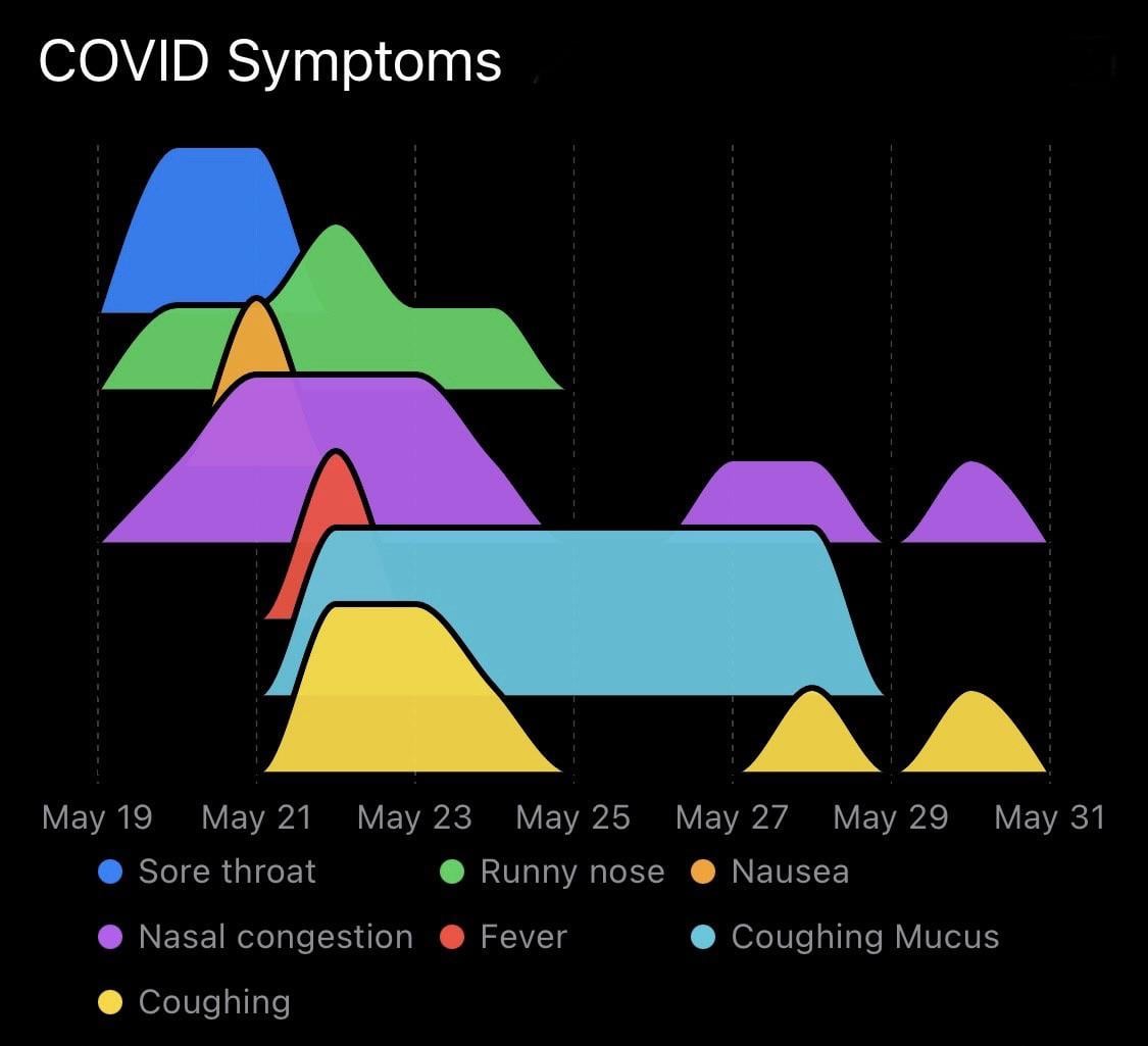
Last month I posted the progression of my COVID symptoms with a line chart, and received a lot of good feedback about how to improve the visualization. One of the suggestions was using a ridgeline plot – I think this looks much clearer than the original. Thanks to all the constructive commenters!
Source: I manually recorded daily symptom intensity data on a 0-4 subjective rating scale.
Tools: The data recording and visualization were performed with Reflect, a personal tracking app I'm developing.
Posted by WarAgainstEntropy
1 Comment
Last month I posted [the progression of my COVID symptoms](https://www.reddit.com/r/dataisbeautiful/comments/1kvzmfg/oc_my_covid_progression_of_symptoms/) with a line chart, and received a lot of good feedback about how to improve the visualization. One of the suggestions was using a ridgeline plot – I think this looks much clearer than the original. Thanks to all the constructive commenters!
**Source:** I manually recorded daily symptom intensity data on a 0-4 subjective rating scale.
**Tools:** The data recording and visualization were performed with [Reflect](https://apps.apple.com/us/app/reflect-track-anything/id6463800032), a personal tracking app I’m developing.