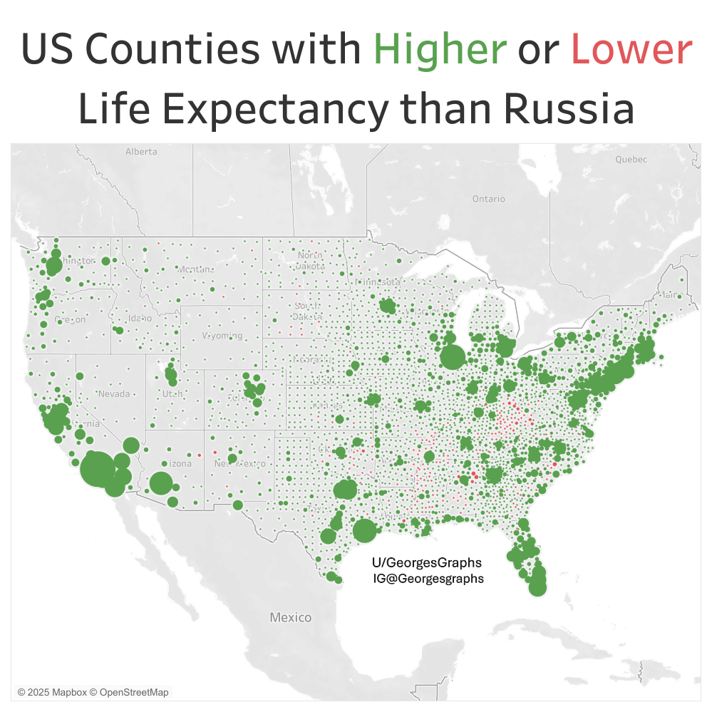
Almost all counties in the US have a higher life expectancy than Russia except for a few patches in Appalachia and the Deep South. I made this map in Tableau using data from the US Census and the University of Wisconsin.
Posted by GeorgesGraphs

Almost all counties in the US have a higher life expectancy than Russia except for a few patches in Appalachia and the Deep South. I made this map in Tableau using data from the US Census and the University of Wisconsin.
Posted by GeorgesGraphs
27 Comments
Also notably Native American areas are real bad.
I’d love if people used scales that aren’t red and green, the most common forms of colorblindness.
Your map is literally a colorblind test that I’m failing
https://preview.redd.it/l49yrhouswaf1.jpeg?width=1200&format=pjpg&auto=webp&s=8807a846ab78c07d1087489a818f161dd41055ab
OC Map created in Tableau [https://public.tableau.com/app/discover](https://public.tableau.com/app/discover) with data from US Census [https://censusreporter.org/](https://censusreporter.org/) and University of Wisconsin Poplation Health Insitute [https://www.countyhealthrankings.org/health-data/population-health-and-well-being/length-of-life/life-span/life-expectancy?year=2025](https://www.countyhealthrankings.org/health-data/population-health-and-well-being/length-of-life/life-span/life-expectancy?year=2025)
[deleted]
Interesting that they’re seems to be higher rates near large cities, why do you think that it?
I mean, Russia isn’t exactly a high bar to set yourself against …
Didn’t know all of US counties are made out of perfect circles.
Shouldn’t this compare the USA to England on our Independence Day?
So what data did you actually use? ” … data from the US Census and the University of Wisconsin” is a bit vague …
EDIT: I’ve just seen your links at the bottom of the comments.
So the dots are the centroids of the counties and their size is proportional to their population?
People should really run their visualizations through color blind tests. It’s something I was taught to always do in college. (Also I’m colorblind)
Ah so the stupid south (WV is just the South of the North)
2nd grade countries in a dick measuring competition. 😅🤣
And soon there will be the updated, red Big Beautiful Map…
So that’s what “almost heaven, West Virginia” means?
Well this explains why they don’t care about Medicaid, they’re not using Medicaid.
Turns out communism is terrible for human flourishing.
Check this comparison between east and west German, which still has drastic differences 30+ years later.
https://www.theguardian.com/world/2020/sep/16/germany-east-west-gaps-persist-30-years-reunification
you can see the exact borders of west virginia even without state lines, this is crazy
Letting Russia beat us in life expectancy to own the libs? Underfunded rural hospitals? Who cares, as long as I can watch Musk with a chainsaw on Fox News.
Most of WV has a life expectancy lower than Russia. Having lived there, I can definitely see that.
Hopefully the red ones are all Trump voters
Now overlay this data with any of the following: median income, insurance rates, and healthcare providers per 10k population. Wouldn’t be surprised to find strong correlations.
Also – bookmark this data and let’s do a comparison in 4 years or so after the results of the GOP’s bill become apparent. Many folks are going to die that otherwise would have lived.
Side note: are there county level mortality rates available?
Rather than population I think this data would look better with the difference in life expectancy. The way this is presented it’s hard to make out the differences and most of the map is just grey.
What happens in West Virginia
This isn’t beautiful. How are we supposed to know what the colors signify, and why they are different sizes? Also, why did you use two colors that are impossible for colorblind people to see?
Neat, how does that map look if 5% of the country loses healthcare?
I am having trouble seeing the red dots