Every line on the map was drawn from 2-minute interval location pings of all buses and trams in Lisbon over an hour. Each line has 15% opacity and a subtle glow around it to accentuate the most commonly used roads.
Weird detail: see those points shooting rays across the map? I though those were bus collection points, signalling a malfunction where a bus stopped transmitting location pings during its route and only resumed once it returned to the collection point, drawing a huge line on the map since its last correct ping, representing the supposed distance travelled on those 2 minutes. But upon further inspection those seem to be random streets without much public transport movement. Any idea why that could happen?

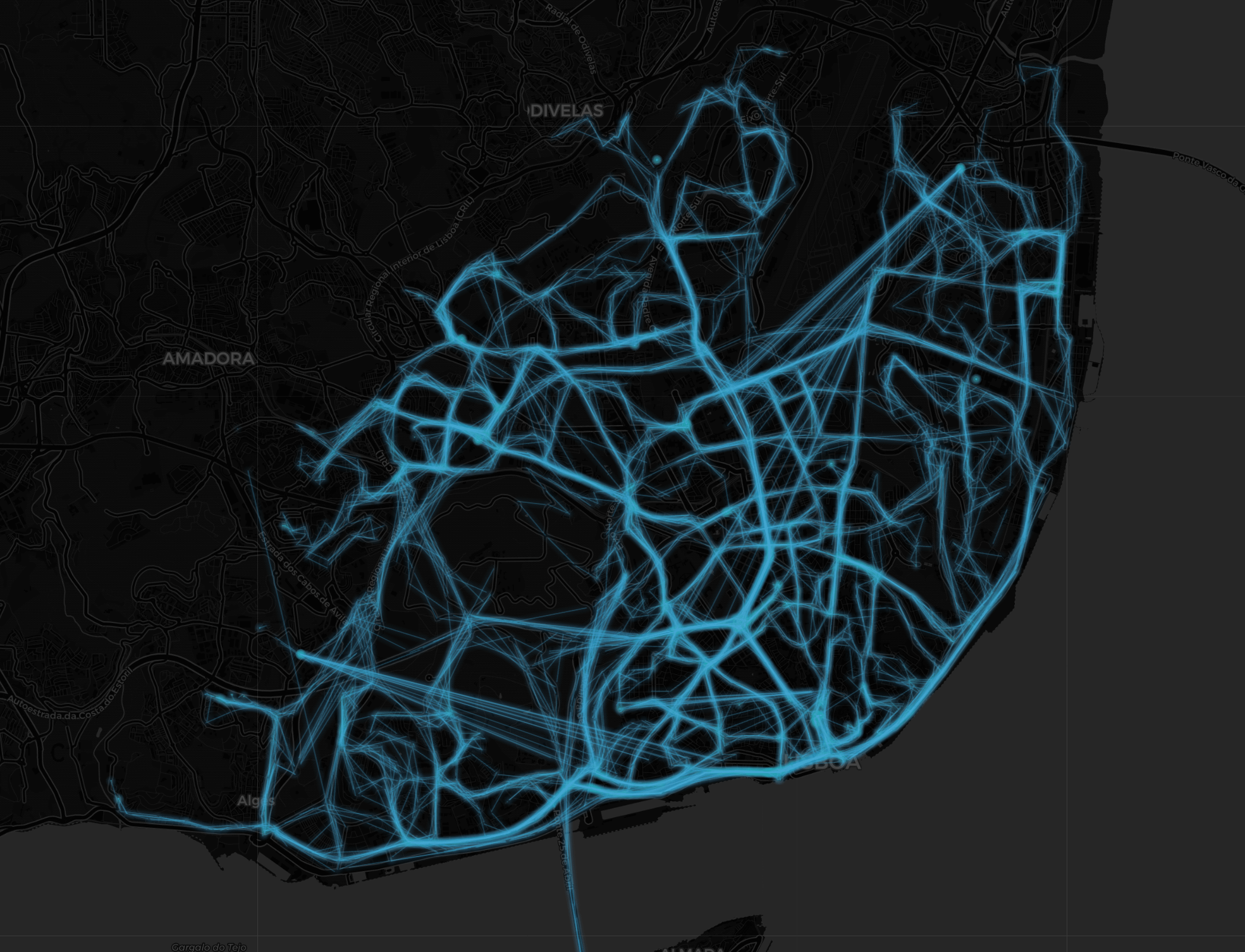
![[OC] Every Bus and Tram in Lisbon Visualized Over the Past Hour](https://www.byteseu.com/wp-content/uploads/2025/07/h0zrf84z6paf1-1536x1174.png "[OC] Every Bus and Tram in Lisbon Visualized Over the Past Hour")
1 Comment
This is a revamp of my [post](https://www.reddit.com/r/dataisbeautiful/comments/1lq38jh/oc_every_bus_and_tram_in_lisbon_right_now_and/) from yesterday, now with a proper cool visualization.
Every line on the map was drawn from 2-minute interval location pings of all buses and trams in Lisbon over an hour. Each line has 15% opacity and a subtle glow around it to accentuate the most commonly used roads.
Weird detail: see those points shooting rays across the map? I though those were bus collection points, signalling a malfunction where a bus stopped transmitting location pings during its route and only resumed once it returned to the collection point, drawing a huge line on the map since its last correct ping, representing the supposed distance travelled on those 2 minutes. But upon further inspection those seem to be random streets without much public transport movement. Any idea why that could happen?
Made in python.