
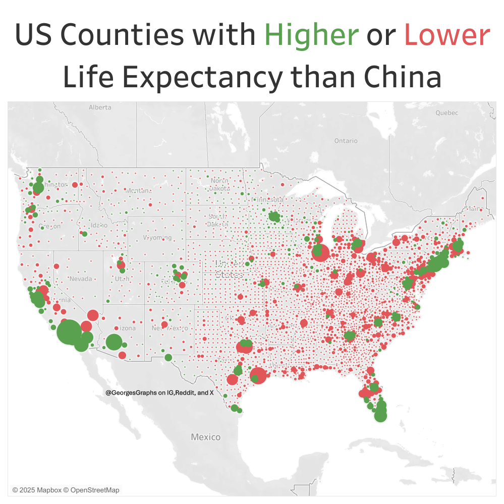
There is an urban rural divide but also plenty of cities with low life expectancy as well, especially in the Great Lakes region where I live. Much of our industry has contracted while China's has expanded and the life expectancy trends reflect that. I made this map in Tableau using data from the US Census, World Bank, and the University of Wisconsin.
Posted by GeorgesGraphs
34 Comments
Doesn’t half of China have a lower life expectancy than China?
The latest source, by World Bank, puts China at 78.2 years and the US at 76.3 years for the year 2021. No idea how much COVID has affected this rate though.
That’s an interesting analysis.
I’m curious does it compare to similar regions in China (For example by population density or average household income) Or is it to the total Chinese average?
Yes, I’m sure the data coming out of China is entirely accurate lol
You need to add breakdowns such as race, ethnicity. In a country like USA, no analysis is complete without that.
I literally cannot see the difference. Red/Green colorblindness is really common in men, friend.
For future reference, please don’t mix red and green. Those who have slight color blindness can’t tell the fucking difference.
*Signed by a slightly color blinded individual*
It’s interesting but considering our current batch of elderly people spent half their lives inhaling lead and nearly half were smokers it’s not surprising. So much of life expectancy is what was going on 40-80 years ago.
Why do some states have red dots of the same size in literal rows/grids lol
Is that showing overall data of the entire state?
but I thought California was the worst place in the world
Given that Asians in the US have the longest life expectancy in the world, it would be interesting to see US counties where Chinese live longer than in China (although, maybe it’s everywhere I guess).
95%+ of Chinese are covered by public health insurance. So there’s that.
Curious the specific reference for this ?
Those rural areas are going to get even worse now. Republicans and Trump made sure of that.
What’s up with the aggression against color blind people?
Just chiming in to let you know that I hate this. (Red green color deficiency)
Interesting. I wonder what a map comparing deaths from alcohol and drugs would between these two and many others.
I’d then make one on deaths from pollution, but that data is less accurate since we’re all on the same planet and pollution doesn’t care about politics or borders.
Hopefully all the red dots are trump voting counties
Could have easily just make the Green circle into Blue and you got your political map.
This is a map of the USA’s biggest cities and where the aging population lives.
Why would you choose the same color for Higher and Lower?
What do the circle sizes represent (I assume the magnitude above/below China average)? Is it broken down by county/district? Where is the scale/legend?
Looks cool, but it’d be a lot cooler if we could get any amount of quantitative information from it. Super difficult to glean any definite trends from how this was arranged.
The red states are also red states on this map
Eh, it’s bad, but it’s also the parts that we already know fall short on many metrics. Mississippi, our poorest, still has a per capita gdp larger than the UK, and that’s what the government here tends to care about more.
Interesting to see how majority of the lower life expectancy counties are in Red States!
RIP red green colorblind besties lol
I wish people would use blue and yellow or something actually easier to see 😭
You can use the same map for people who drive their pickup trucks to check their mail boxes while listening to rush Limbaugh or whoever replaced that scumbag.
Elections have consequences. Elect people who glorify death, violence, and destruction; get a violent, destructive government that kills people. It’s not rocket science.
It’s barely been six months and the States feel like they’re getting ready to Balkanize. It’s sad, but a lot of people in the U.S. are aggressively, proudly stupid. 🤷♂️🤦♂️
If the green dots were blue it’d look like a map of our election outcomes.
Maybe I’m missing something obvious, but why compare to China? Couldn’t you make the same conclusions by showing which areas are higher or lower than the US national average? You’d see the split between urban vs rural etc?
I don’t love how this data is laid out, besides the red-green issue. I know it’s common, but the area of the circle connoting population size is inefficient in conveying the information here – the larger counties all but cover most of the nearby counties. Thus it’s hard to see smaller population centers near the big ones. Would be interesting to see other variants of this, perhaps with bars or some other shape that implies population.
Life expectancy is something I think about a lot. As a generation of people who have been permanently poisoned by PFAS, lead and microplastics. It helps me remember that life expectancy exists based on people who die, and most people who die are much older. There’s no way to really know how our long term health is going to be effected by ingesting a credit card per year, or all the times I cooked on a teflon pan, or had microwave popcorn. The trend seems much more scary and dangerous than the current numbers represent.
If you look at western Michigan, you can see one green blip in Kent county.
Guess the sole county in western Michigan that voted blue in the presidential election last year…
Now overlay a map of US counties with large Chinese ethnicity populations… 😅
https://preview.redd.it/x4lq3irt63bf1.jpeg?width=690&format=pjpg&auto=webp&s=10f8e154f2e908e79d2de1b26d80ebc661438a63