
![Share of Financial Assets Held by the Top 0.1% (99.9th to 100th Wealth Percentiles) [OC]](https://www.byteseu.com/wp-content/uploads/2025/07/nlrmf42akadf1-1024x732.png "Share of Financial Assets Held by the Top 0.1% (99.9th to 100th Wealth Percentiles) [OC]")
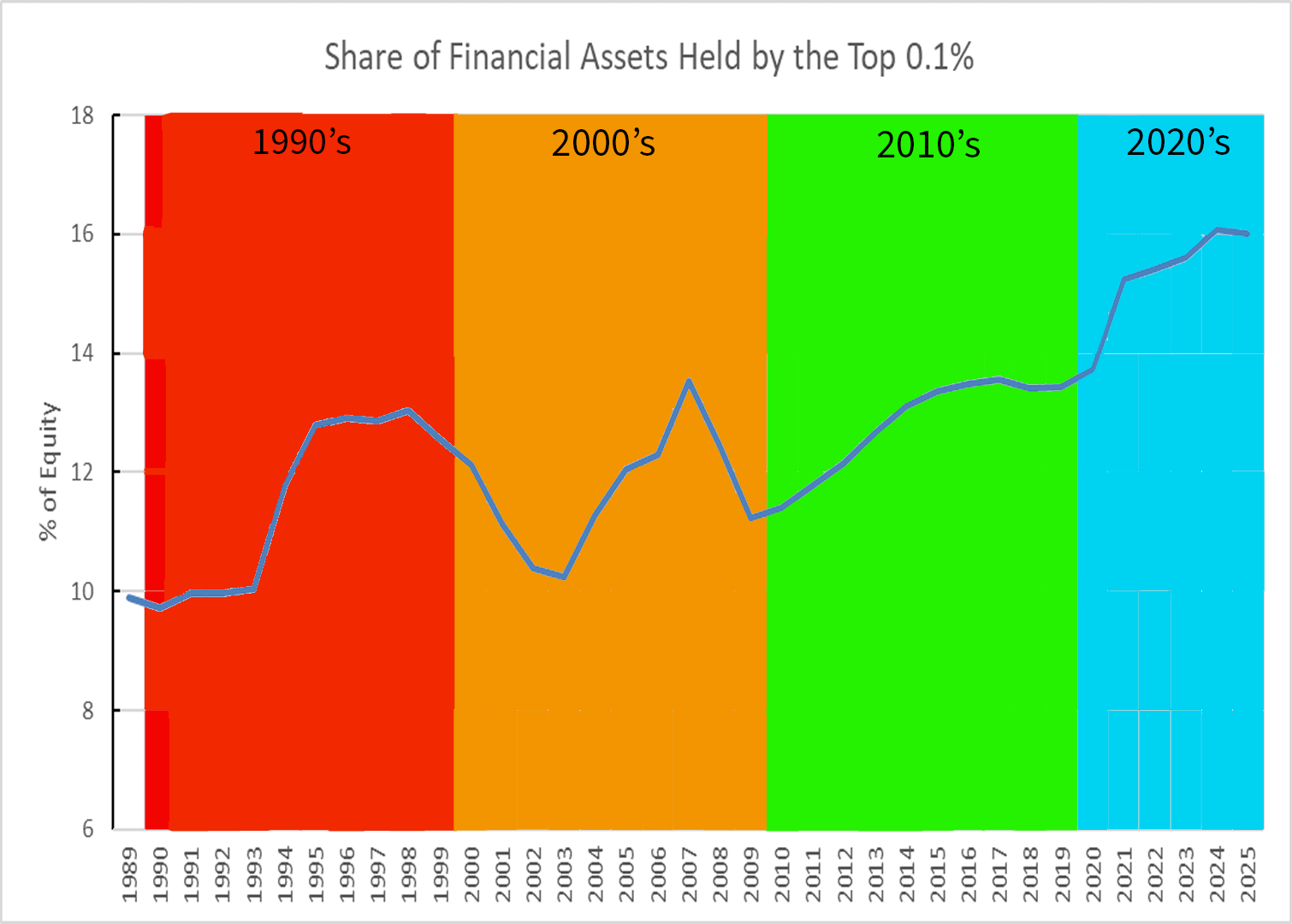
Board of Governors of the Federal Reserve System (US), Share of Financial Assets Held by the Top 0.1% (99.9th to 100th Wealth Percentiles) [WFRBSTP1291], retrieved from FRED, Federal Reserve Bank of St. Louis; https://fred.stlouisfed.org/series/WFRBSTP1291, July 16, 2025.
Posted by Maleficent-Apple2625
7 Comments
That y range is doing a lot of heavy lifting. It went up. But it isn’t like they own most assets now. Nowhere close.
It is interesting that the dot-com crash at the beginning of the 2000s and the junk bond implosion at the end of the 2000s both negatively impacted 0.1%er wealth, but if anything the Covid epidemic had the opposite effect.
Financial assets such as publicly traded bonds and shares? Real estate for sure isn’t shown there. And I also think ownership in private companies isn’t accounted for either because it’s valuation is not as measurable
So 300,000 people control 1 in 6 dollars of wealth
What could go wrong
This is even more shocking if you consider the related dataset, [Share of Net Worth Held by the Top 1%](https://fred.stlouisfed.org/series/WFRBST01134); this has also increased, but not by nearly that much, as a ratio. The wealth-share of the 0.1% has increased by 60%, while the wealth-share of the 99.0% to 99.9% has increased by only 12%. Even the wealthy aren’t receiving much in the form of wealth transfers, it’s only the *uber* wealthy that are really getting ahead.
EDIT: Moreover, the share of wealth held by the 90-99% has actually [GONE DOWN](https://fred.stlouisfed.org/series/WFRBSN09161)! The richest person from your 6th grade class actually has less wealth share than 30 years ago. It’s only the richest person from your *high school* that’s doing better.
What an ugly graph. The bright colors overwhelm the data and the y-axis doesn’t even start at 0.
Misleading because the economy is not a zero sum game. The rich getting richer does not mean that the poor are getting poorer.