
![[OC] The Big Beautiful Bill: Impact on Income by Household income groups](https://www.byteseu.com/wp-content/uploads/2025/07/pmtshck5qldf1-1536x864.png "[OC] The Big Beautiful Bill: Impact on Income by Household income groups")
View on Tableau Public: https://public.tableau.com/app/profile/dom.brady/viz/TheBigBeautifulChangestohouseholdincome/Dashboard1
Built in Tableau.
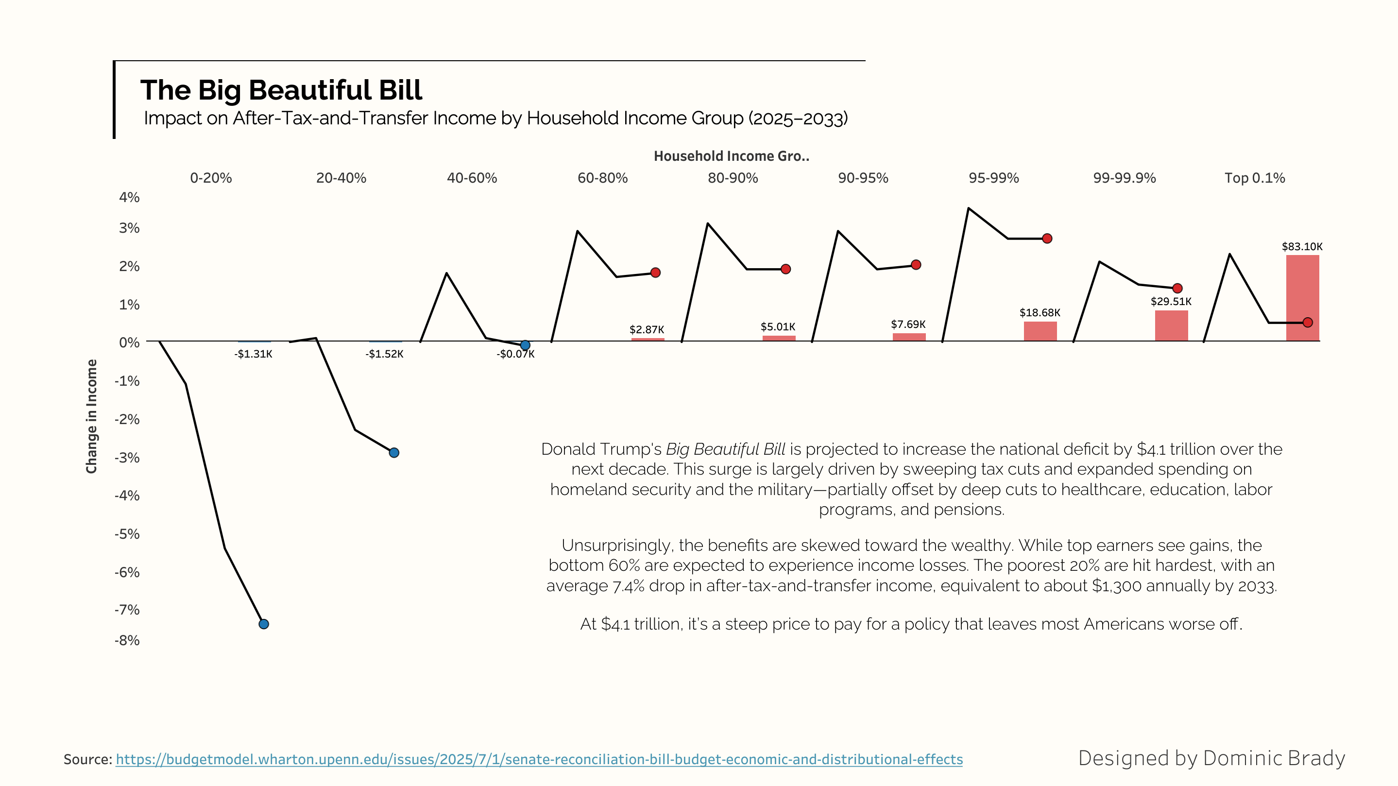
Source: Penn Wharten Budget Model https://budgetmodel.wharton.upenn.edu/issues/2025/7/8/president-trump-signed-reconciliation-bill-budget-economic-and-distributional-effects
Constructive criticism always welcome!
Posted by Neat_Beyond1106
21 Comments
If you’re part of the famous 47% who pay no taxes?
Sorry not sorry. Tired of carrying your ass.
I’d love to see voting overlaid by income to see if there’s any correlation that turkeys have in fact voted for Christmas (or Thanksgiving).
So the people making the least pays to the people who has the most.
Americans already failed that test the last time.
Wharton is a very biased source. I’d like to see this with a compilation of various analyses.
Also, comparing percentage, while maybe the only real way to do this, is going to look pretty crazy, because any minimal amount on those below poverty looks like a huge amount.
This is really well done! I feel like this is the kind of analysis thar should be out in the media more often. We always hear about “hurting the middle class. Helping out the rich”, but this chart, which is simple enough to understand, would really drive home this message.
From a data presentation perspective, there are a couple things that I would change:
1. In addition to percentile range, the actual 2024 income range for each group should be included.
2. I dislike the non-linear x-axis, and I think it undermines the message. It makes it *look* like most people will experience a net benefit. I would either keep the groups consistent in size, or squeeze the high income end onto a linear axis.
What do the lines represent?
To be fair to the rich… They have been very successful at converting the USA into an oligarchy.
Throw money at corrupt politicians to underfund education. Train the population to be stupid and use simple mind tricks to convince them that you’re on their side. Rig elections so that most votes don’t matter. Install a King. Take away everyone’s healthcare so that those that might vote against them simply die. Deport those that grow/pick food so that the poor can’t afford to eat and receive the same outcome. Particularly focus on undereducating and imprisioning blacks.
Soon, the US will only have middle class/elite left and then the US will be richer…
No wait… It will be a wannabe Russian oligarchy with miserable outcomes for all.
What a sad end to the American Dream.
I don’t know how to read the graph.
I’d only be mildly annoyed, except it balloons the deficit as well, so it’s bad for everyone. Nevermind the subset of wealthy people shallow enough to buy the story the graph above is selling.
Not beautiful. I have trouble understanding the data. What are the income ranges? Why does it look like there are three points?
It’s probably worse as the national debt can be considered less wealth per capita which will less percentage of wealth the richer you get.
How does one know what bracket they fall under?
Whatever you are trying to do with the multiple graphs on the poorly labeled x axis is killing your message. The income buckets you have are not equal, and are the lines over time inside each bucket?
Visually, this is not beautiful. Reading the chart is a nightmare.
Our household income is in the 98th percentile and this is just a fucking outrage. It is deeply unfair to the large majority of Americans.
I would love to know what this graph means. This data is not beautiful.
So all people who more or less don’t make 100k will be worse off cool
Is this only taking into account direct, absolute value (e.g. tax changes, welfare reductions, etc.) or is it also trying to quantify knock on economic effects?
Unclear on the graph, but any time there are tax cuts it can only benefit the percentage of the population who actually pay taxes.