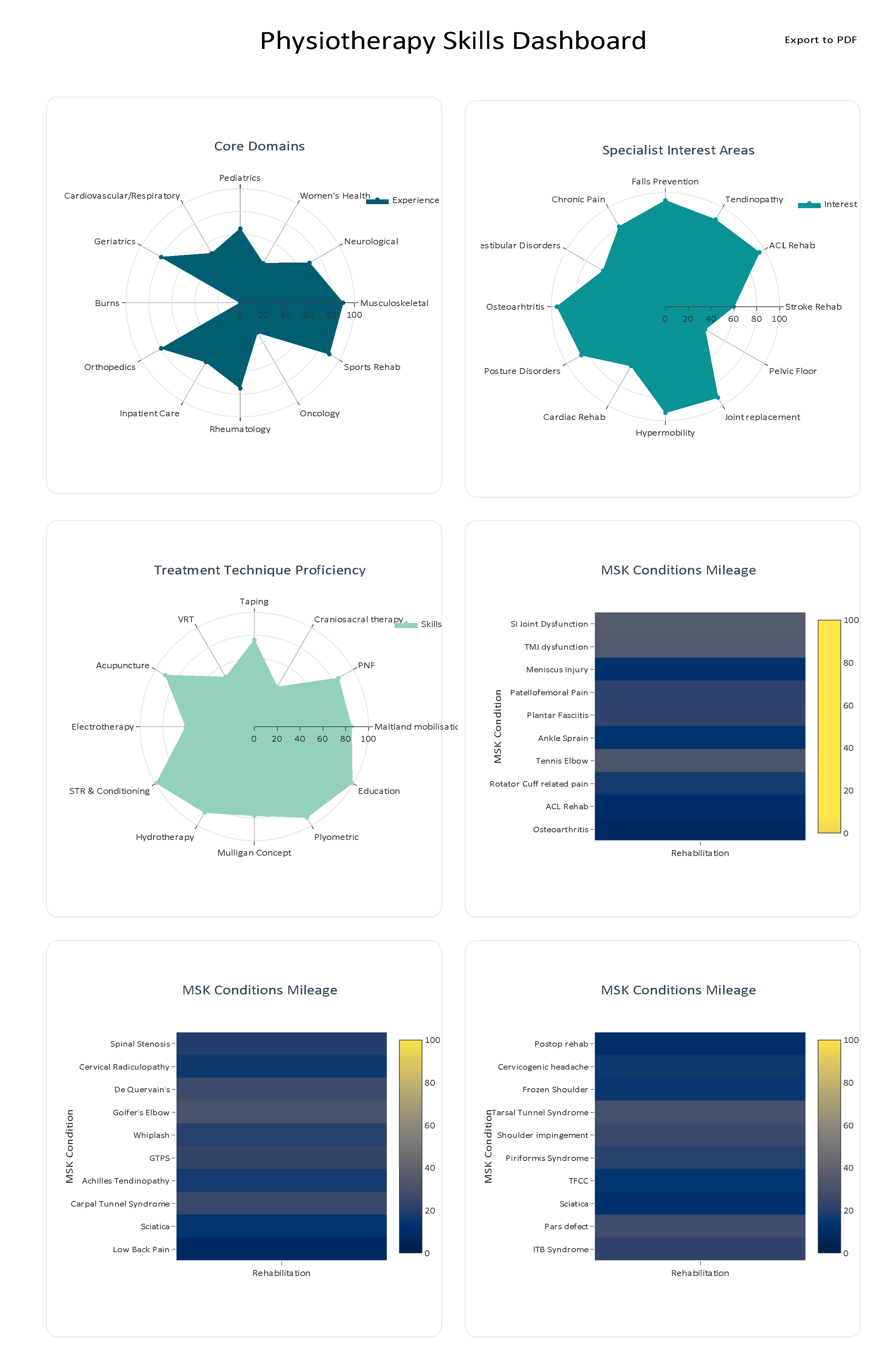
[Source] The data used in this visualisation is based on my professional experience working in both hospital and private clinic settings.
[Tool] This chart was created using Plotly, – radarChart & heatmapChart
WholeConnect5004 on
Colour gradients are hard to read and each category is unconnected so doesn’t really suit this type of chart. Just use a bar chart.
Other charts are ok, the lack of burns really stands out as everywhere else it’s quite uniform
Whathitsss on
What are the mileage charts portraying?
MaxSupernova on
I don’t know what any of this means.
What is MSK?
What is the core domains charts showing? Out of 100 what? Is this you personally? MSK therapy in general? What is this graph supposed to tell us?
How do you measure interest areas? Is this just for you or for your friends, or the entire professional organizations or what? Why are you measuring your interests on a scale? What are we supposed to get from this one?
The units of the proficiency one is cut off. I assume this is just you? Who chooses the categories? What is used to measure proficiency?
The mileage graphs are incomprehensible. The colours are mud. What does “rehabilitation” as an axis label even mean? Are you trying to show the percentages of the total for each category? Percentage of what? What is “mileage” in this context? There’s no colour scale on the first one so I can only assume it’s an axis scale but the graph is bigger than the scale. If there’s no colour scale why were those muddy indistinguishable colours chosen?
I’ll stop there. You presented 6 graphs/charts and I know literally nothing more than when I first saw them. In fact I have more questions than when I started so your charts contain negative information.

![[OC] My experience as a MSK physiotherapist](https://www.byteseu.com/wp-content/uploads/2025/07/e60ej1qva0ef1-995x1536.png "[OC] My experience as a MSK physiotherapist")
4 Comments
[Source] The data used in this visualisation is based on my professional experience working in both hospital and private clinic settings.
[Tool] This chart was created using Plotly, – radarChart & heatmapChart
Colour gradients are hard to read and each category is unconnected so doesn’t really suit this type of chart. Just use a bar chart.
Other charts are ok, the lack of burns really stands out as everywhere else it’s quite uniform
What are the mileage charts portraying?
I don’t know what any of this means.
What is MSK?
What is the core domains charts showing? Out of 100 what? Is this you personally? MSK therapy in general? What is this graph supposed to tell us?
How do you measure interest areas? Is this just for you or for your friends, or the entire professional organizations or what? Why are you measuring your interests on a scale? What are we supposed to get from this one?
The units of the proficiency one is cut off. I assume this is just you? Who chooses the categories? What is used to measure proficiency?
The mileage graphs are incomprehensible. The colours are mud. What does “rehabilitation” as an axis label even mean? Are you trying to show the percentages of the total for each category? Percentage of what? What is “mileage” in this context? There’s no colour scale on the first one so I can only assume it’s an axis scale but the graph is bigger than the scale. If there’s no colour scale why were those muddy indistinguishable colours chosen?
I’ll stop there. You presented 6 graphs/charts and I know literally nothing more than when I first saw them. In fact I have more questions than when I started so your charts contain negative information.