
I am a veterinarian in the North Texas area. Since graduation in 2023 I've kept track of my cases using Google Sheets because I thought it'd be interesting to see how many animals I treat and what they're treated for.
I meant to post this last year and back in June of this year but I kept forgetting to post on Mondays 😅 I'll try to be more consistent in the future. A few notes:
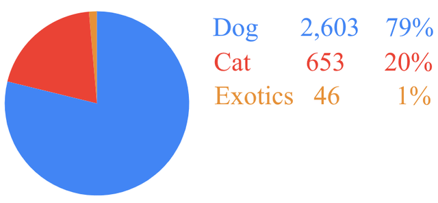
Slide 1 – Animal Species
This only includes animals I've done a doctor exam on or do telemedicine about. Animals that I do not directly interact since the technicians do it (toe nail trims, anal gland expression, blood draws, etc.) are not included.
I have a passion for exotic animals (ferrets, reptiles, rabbits, backyard chickens, etc.) but there is an exotic clinic near me where most of those animals go to, so I don't get to see as many as I'd like. Hopefully in the next few years that'll change.
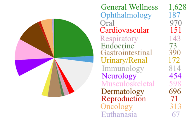
Slide 2 – Body System
I kept track of the body system that was affected during my exams. General wellness includes vaccines, weight management, and discussions about quality of life. For what it's worth, this is about what the problem was, not just the symptoms. If a cat came in for peeing all over the place and it was because the cat was stressed, that was marked as both Neurology as well as Urinary/Renal. The same animal can come in with multiple systems affected, but I only mark a system once per animal (i.e. a dog with urinary stones and a UTI only had "Urinary/Renal" marked once). Here are the most common problems each species came in with:
Dogs – Overweight (General Wellness), allergies (dermatology, immunology), and poor dental health (Oral).
Cats – Stress induced urinary issues (Urinary/Renal)
Ferrets, rabbits, reptiles, & other exotics: Husbandry (please look up how to gutload and calcium dust your reptile's food)
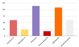
Slide 3 – Procedures
I don't think this one needs me to explain more than what's on the screen but let me know if you've questions.
See you next year!
Posted by IEOsadiaye
6 Comments
Dont use pie charts.
If you still do, sort by something. This is ugly ugly data.
Very interesting stuff but it’s not that well done visually
1. Pie charts don’t really work when you have so much data, better to opt for bar graphs
2. It’s simplistic but in a bad way, just some colorful pie charts with text on a white background
What categories do you enjoy the most and least ? Why? (I’m a Term 6 vet student- about to start clinical year in January)
Have you ever treated a rabies patient?
I’m sorry about the euthanasia. Must have been hard. Hopefully the animals lived a long life and died surrounded by their loving owners.
What are the top 5 things animals are treated for?
The fact that you can’t tell me in three seconds should tell you what you did wrong on chart #2. The options aren’t listed in any order.