
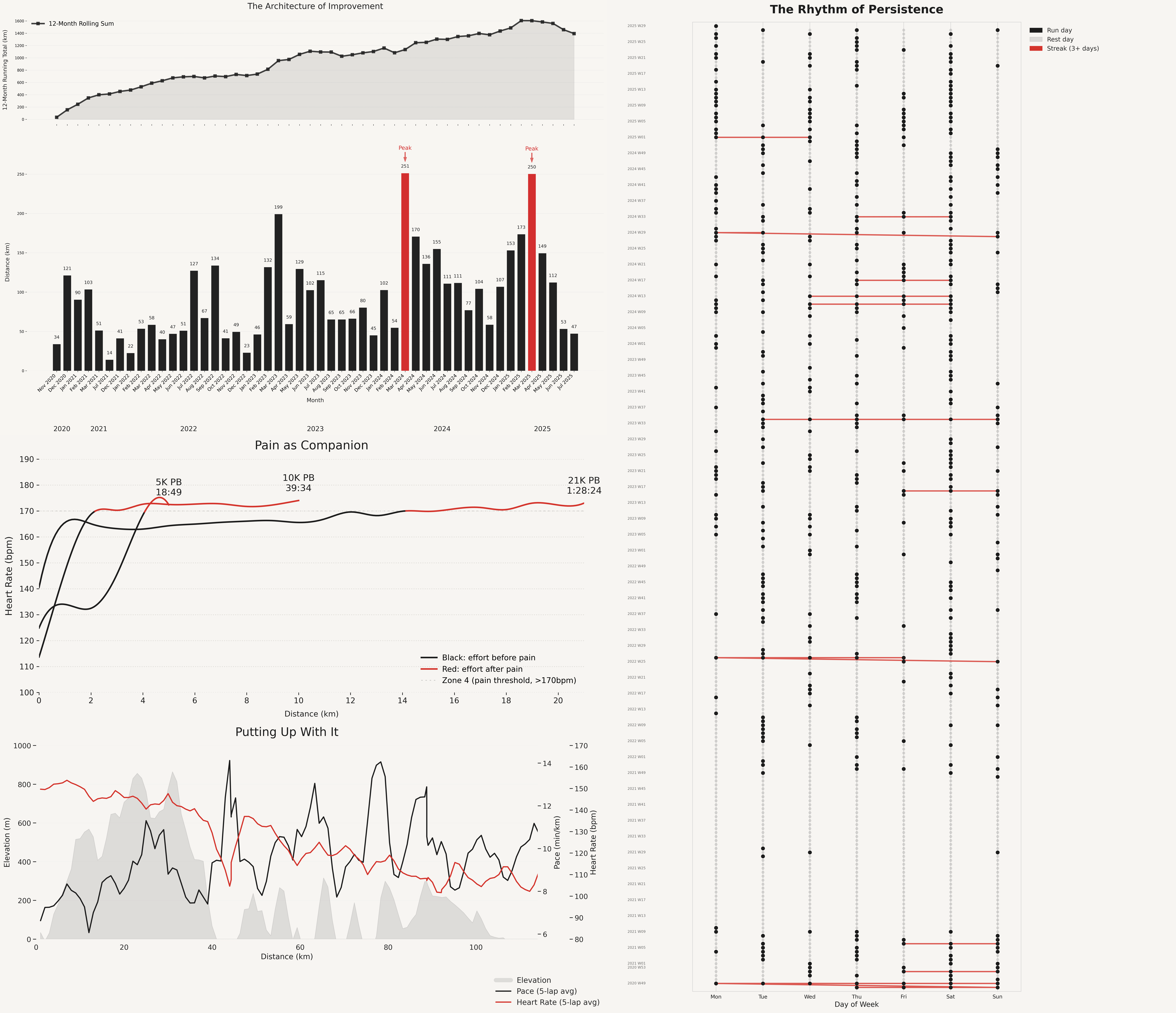
![4 Years of Garmin Running Data: Distance, Peaks, Personal Bests, Ultras, and Streaks [OC]](https://www.byteseu.com/wp-content/uploads/2025/07/sgeyvzwzf5ef1-1536x1322.png "4 Years of Garmin Running Data: Distance, Peaks, Personal Bests, Ultras, and Streaks [OC]")
Data source: Personal Garmin data exported from my account.
Tool: Visualized using the MOSTLY AI Data Intelligence Platform.
Panels (from top left):
- Rolling 12-month average distance
- Actual monthly average with peak months in red
- 5k, 10k, and 21k personal bests (PBs) with zone 4 heart rate in red
- Ultra run with elevation, distance, and heart rate
- Runs, rests, and streaks over the past 4 years
Posted by Formal_Abrocoma6658
3 Comments
Last year I ran 220 km. An average March for you.
Curious – what do you define as “pain”?
Never heard of Mostly but this is really nice looking