
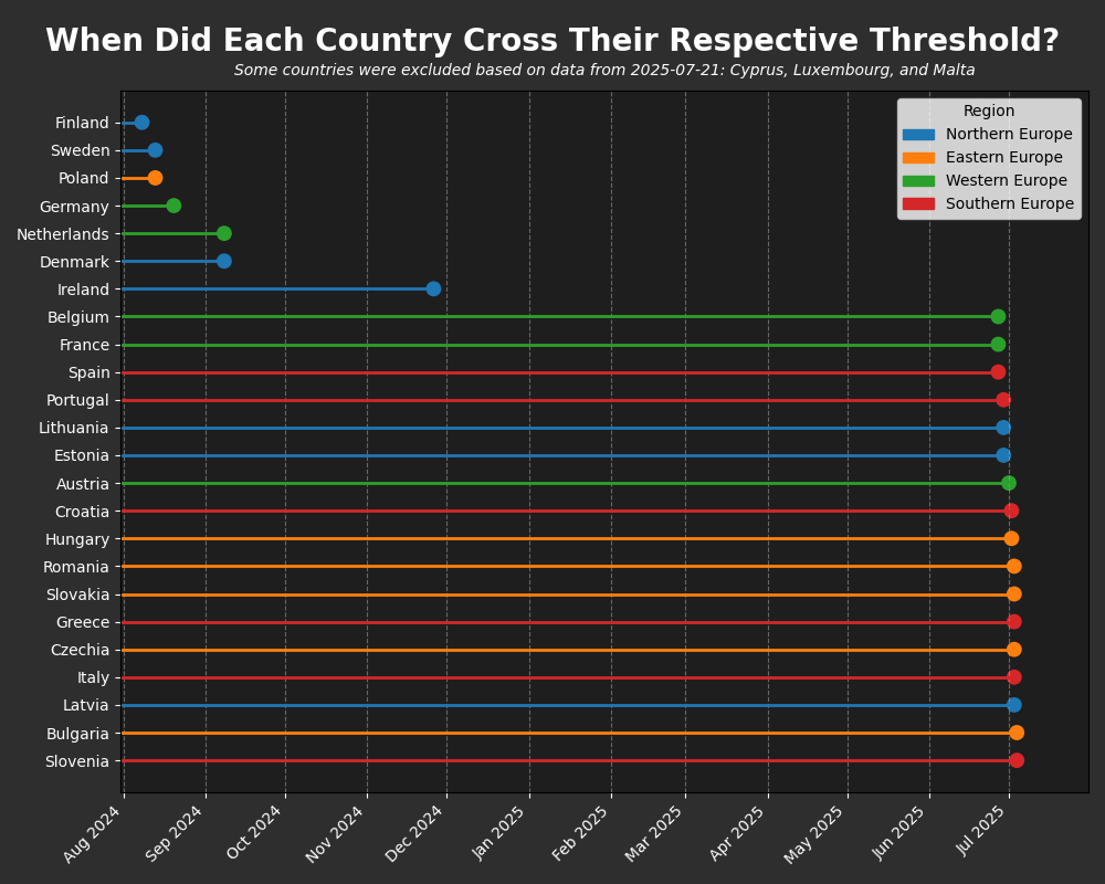
I posted this in r/StopKillingGames and someone mentioned I should post it here. I made a graph to track when each country reached their respective threshold and colored by region using the UN M49 standard. I'm welcome to any feedback 🙂
Posted by bajingjongjames
9 Comments
Data Source: [https://web.archive.org/web/20250000000000*/https://citizens-initiative.europa.eu/initiatives/details/2024/000007_en](https://web.archive.org/web/20250000000000*/https://citizens-initiative.europa.eu/initiatives/details/2024/000007_en)
The snapshot links can be scraped with a Python module like `waybackpy`. The actual data inside those snapshots were scraped with Selenium. The visuals were made with Python, mainly matplotlib and seaborn.
Oh Christ that top right key is gonna cause so many damn problems man
I feel like there’s not enough context in your post or this graph to understand what is going on here. What does “crossing their respective threshold” even mean?
It feels to me like a bar graph isn’t really the best way to show timeline data, either.
What is this even talking about?
Some feedback:
This is ugly and without context I have absolutely, positively, no idea what this is about. I am sure that whatever you’re trying to represent here is not best represented in this format.
What on earth is this even about
Reached their respective threshold of what?
OP
You need to stop, go back to the start, and explain what the topic is that you’ve made a chart about.
Nobody understands what the topic is you are referring to.
Have you considered deleting this