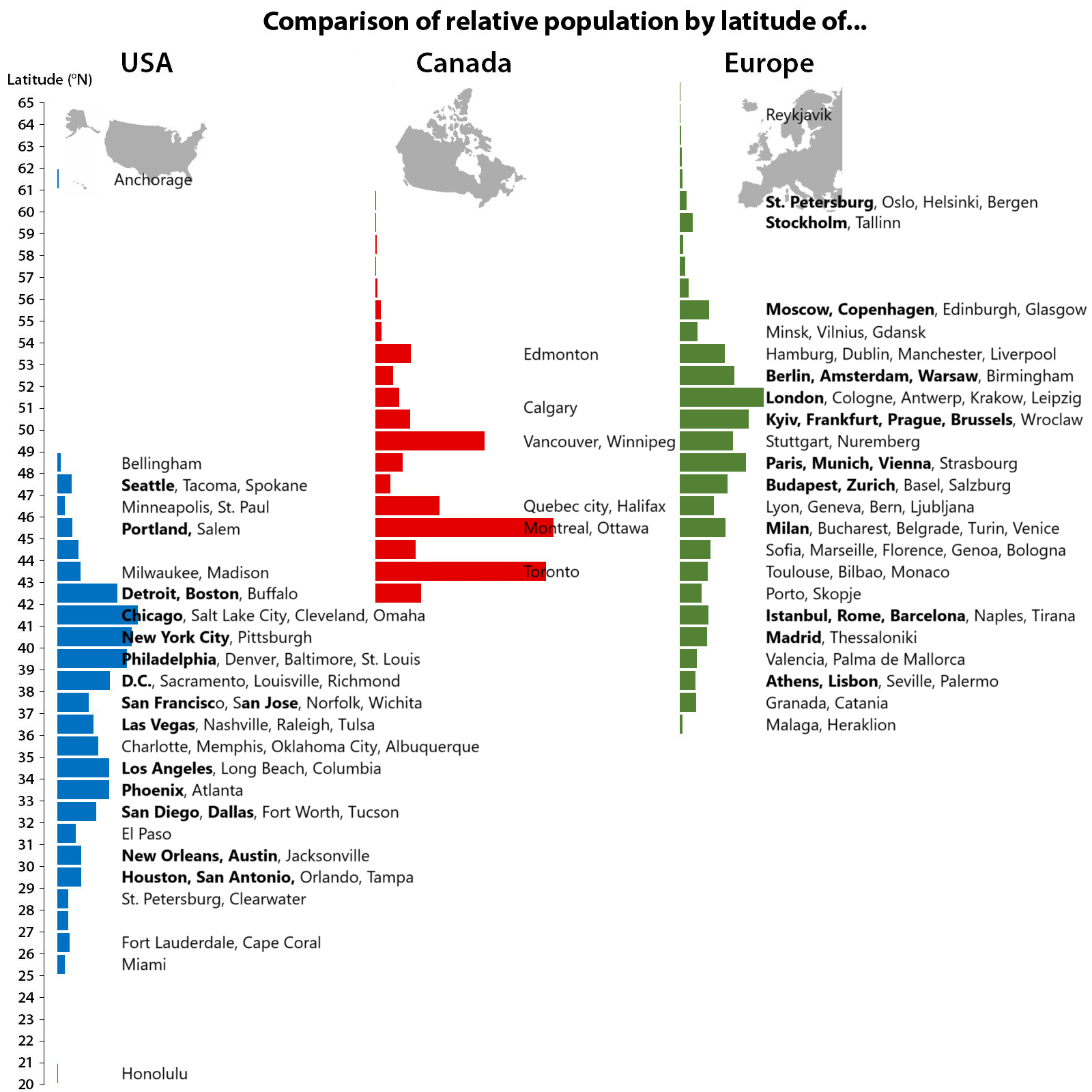
What is the horizontal scale supposed to be? Shouldn’t NYC be a bigger bar than Montreal?
kevinb9n on
I am highly suspicious that each of the three columns/colors might be using a different scale.
For example, perhaps the scale is by “% of that region’s total population”. imho, not a good choice.
KrzysziekZ on
Wrocław is not to the South of Kraków.
OtterishDreams on
Come to the city where the heat is on! Welcome to miami!
AtLeastTryALittle on
Bellingham making the big time!
ElusiveMeatSoda on
It looks like there was a population cutoff and then individual cities were used, but I don’t think that’s very representative of the US part of this in particular.
For instance, MSP is only a bit smaller than Seattle-Tacoma, larger than Portland and Salem’s metros combined, yet appears as half their size.
A quick and dirty way to do this would be to use all the [MSAs](https://en.wikipedia.org/wiki/Metropolitan_statistical_area) and then report them based on the latitude of the central city, or if you were particularly motivated, the actual population-weighted latitude.
enigmaticmischief on
The effect of the jet stream on population has always fascinated me. Agreed with other posters though that it would be interesting to see data scaled as total population instead of proportion. Those Canadian bars would be a lot smaller and would really show the overall relationship of climate on population size.
man-with-potato-gun on
Would love to see this relative with East Asia included too
rickie-ramjet on
The graph is about how the entire populations of these three areas is dispersed at what latitude.
The horizontal bars would add up to 100% of those populations, does not represent actual numbers. It is not a comparison of population between areas. .
As far as results… Europe,s population is going to be farther north in latitude because of the ocean currents warming them up, they are why London is more temperate than NYC… even though it sits on the same latitude as Newfoundland and New York is the same as Lisbon.
Pit-trout on
What’s the criterion for bolding cities? By any population metric I can think of (absolute, relative, metro area, city proper, …), Stockholm and Copenhagen (bolded) are solidly smaller than Toronto and Montreal (not bolded).
Didactic_Tomato on
As somebody who lives in Sacramento but spends a lot of time in North Western Turkey. I really would not have thought Sacramento was further south.
I always thought the heat was just lack of water.
MidnightPale3220 on
What’s with the bars with no cities on them, and why isn’t Riga there, if Vilnius and Tallinn are?
SpoonGuardian on
I take it that when we say Portland, we aren’t talking about Maine 😔
PckMan on
Crazy how Europe’s hottest regions are in the same latitudes as some of North America’s coldest (not counting Canada’s barren expanse in the north pole).
Shows that a lot more influences weather and climate than just latitude.
canisdirusarctos on
This is terrible because bar length isn’t consistently scaled. It doesn’t show just how ridiculous an outlier Seattle/Tacoma is in latitude and population for North America.
McWerp on
I dont like how this chart skews the relative population sizes. Bars should be total pop not relative pop.

![Relative populations by latitude of the United States, Canada and Europe (Updated with major cities) [OC]](https://www.byteseu.com/wp-content/uploads/2025/07/cqwvezirtgff1-1536x1536.png "Relative populations by latitude of the United States, Canada and Europe (Updated with major cities) [OC]")
16 Comments
What is the horizontal scale supposed to be? Shouldn’t NYC be a bigger bar than Montreal?
I am highly suspicious that each of the three columns/colors might be using a different scale.
For example, perhaps the scale is by “% of that region’s total population”. imho, not a good choice.
Wrocław is not to the South of Kraków.
Come to the city where the heat is on! Welcome to miami!
Bellingham making the big time!
It looks like there was a population cutoff and then individual cities were used, but I don’t think that’s very representative of the US part of this in particular.
For instance, MSP is only a bit smaller than Seattle-Tacoma, larger than Portland and Salem’s metros combined, yet appears as half their size.
A quick and dirty way to do this would be to use all the [MSAs](https://en.wikipedia.org/wiki/Metropolitan_statistical_area) and then report them based on the latitude of the central city, or if you were particularly motivated, the actual population-weighted latitude.
The effect of the jet stream on population has always fascinated me. Agreed with other posters though that it would be interesting to see data scaled as total population instead of proportion. Those Canadian bars would be a lot smaller and would really show the overall relationship of climate on population size.
Would love to see this relative with East Asia included too
The graph is about how the entire populations of these three areas is dispersed at what latitude.
The horizontal bars would add up to 100% of those populations, does not represent actual numbers. It is not a comparison of population between areas. .
As far as results… Europe,s population is going to be farther north in latitude because of the ocean currents warming them up, they are why London is more temperate than NYC… even though it sits on the same latitude as Newfoundland and New York is the same as Lisbon.
What’s the criterion for bolding cities? By any population metric I can think of (absolute, relative, metro area, city proper, …), Stockholm and Copenhagen (bolded) are solidly smaller than Toronto and Montreal (not bolded).
As somebody who lives in Sacramento but spends a lot of time in North Western Turkey. I really would not have thought Sacramento was further south.
I always thought the heat was just lack of water.
What’s with the bars with no cities on them, and why isn’t Riga there, if Vilnius and Tallinn are?
I take it that when we say Portland, we aren’t talking about Maine 😔
Crazy how Europe’s hottest regions are in the same latitudes as some of North America’s coldest (not counting Canada’s barren expanse in the north pole).
Shows that a lot more influences weather and climate than just latitude.
This is terrible because bar length isn’t consistently scaled. It doesn’t show just how ridiculous an outlier Seattle/Tacoma is in latitude and population for North America.
I dont like how this chart skews the relative population sizes. Bars should be total pop not relative pop.