
Hi there,
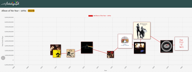
I am building a new website for visualising the discographies of musical artists: https://artistagraph.com.
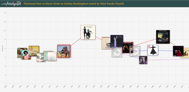
You can also compare artists, and I've built some preset visualisations like rivalries, and solo careers after bands broke up.
Would love you to take a look and see what you think.
I will listen to all feedback (two puns for you there!).
Neil.
Posted by ndharris
2 Comments
This is brilliant and such a good way to visualise discographies!
My only comment is that scaling the albums based on number of listeners sometimes mean that albums released at similar times overlap each other – the example I looked at was Louis Armstrong.
It might work better if you were to have number of listeners on the y-axis and then scale the album size based on its score – at least then there’s a definitive scale and all albums will be fairly visible (number of listeners can vary by over 20x between albums depending on the artist) – just a thought but not to discredit that this is an excellent idea and has been executed very well!
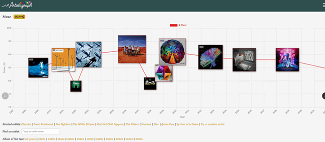
What is the score based on?