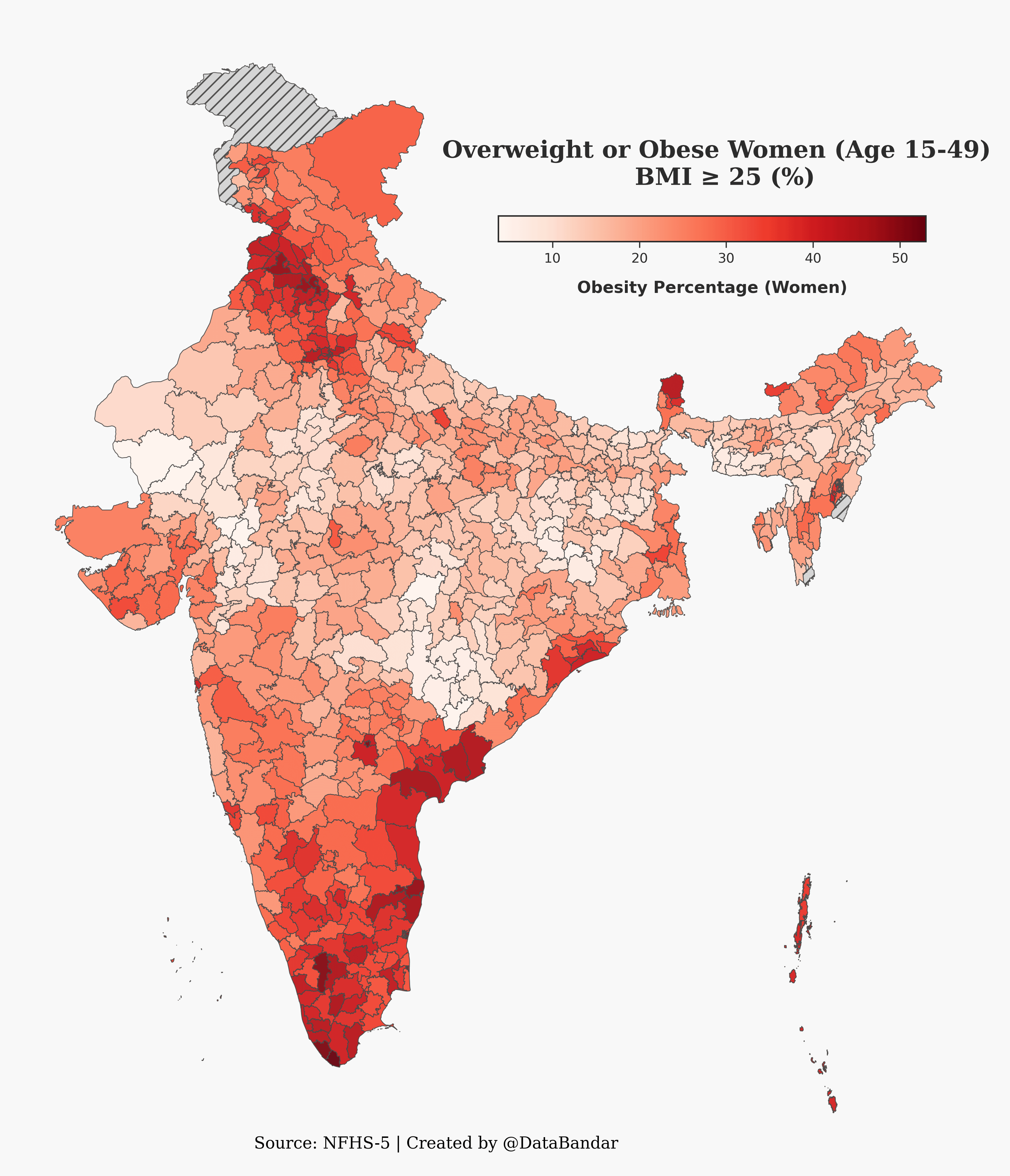
Huh I wonder what about the coast that causes this.
But it more likely has to do with economic conditions with people having more money but not enough for what’s needed to eat better. Well, I guess that’s just a guess.
BaryonHummus on
Seems effectively same as a socio-economic map or human development index map, basically. Surely isn’t a coincidence.
Re-ne-ra on
All the coastal areas with high red seems to be where rivers getting merged. Should have higher crop yeilds
sagramore on
Is it obesity percentage, or overweight and obesity percentage? Because the post title says one thing and the chart title says something else.
Tripton1 on
First you get the money…. Then you get the food… Then you get fat…
swimchris100 on
Oddly not far from meat consumption heat map in India

![[OC] Obesity prevalence across Indian districts.](https://www.byteseu.com/wp-content/uploads/2025/08/8e2ft96vc8if1-1320x1536.png "[OC] Obesity prevalence across Indian districts.")
7 Comments
Source: [https://www.data.gov.in/resource/india-districts-factsheets-national-family-health-survey-nfhs-5-2019-2021](https://www.data.gov.in/resource/india-districts-factsheets-national-family-health-survey-nfhs-5-2019-2021)
Tools : Python, Geopandas
Huh I wonder what about the coast that causes this.
But it more likely has to do with economic conditions with people having more money but not enough for what’s needed to eat better. Well, I guess that’s just a guess.
Seems effectively same as a socio-economic map or human development index map, basically. Surely isn’t a coincidence.
All the coastal areas with high red seems to be where rivers getting merged. Should have higher crop yeilds
Is it obesity percentage, or overweight and obesity percentage? Because the post title says one thing and the chart title says something else.
First you get the money…. Then you get the food… Then you get fat…
Oddly not far from meat consumption heat map in India