
![[OC] Where the Class of 2021 Went: A Look at Post-Graduation Plans from a Long Island High School that I attended.](https://www.byteseu.com/wp-content/uploads/2025/08/pzffd15wh9if1-1024x521.png "[OC] Where the Class of 2021 Went: A Look at Post-Graduation Plans from a Long Island High School that I attended.")
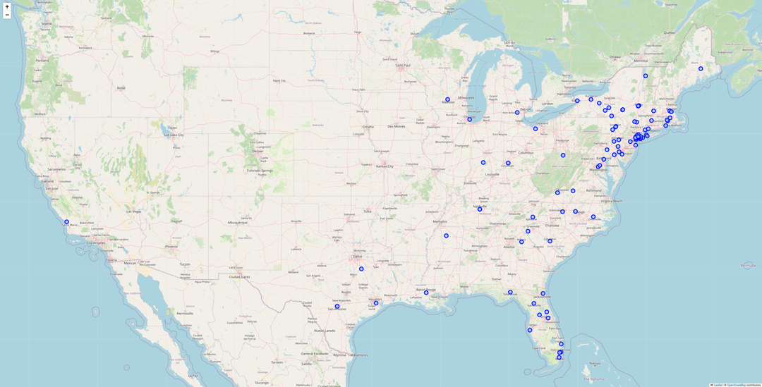
Its a interactive map so when you hover over some of the dots it show how many people went to that specific college. It prints a individual dot no matter if its 1 or 10 people going to the same college. I'm just not sure if there's a good way to show that? Perhaps color coding but it would get confusing. I can prob make the html a viewable link if anyone is curious to see. This was just a quick stab while I continue to learn python.
Posted by Synfinium
14 Comments
Data source : the commencement paper I got when graduating with name and post secondary plans.
tools used : python pandas to read the csv file of the names and schools from the pamphlet which i scanned with my phone which I converted into a csv. then i used something called geopy and follium
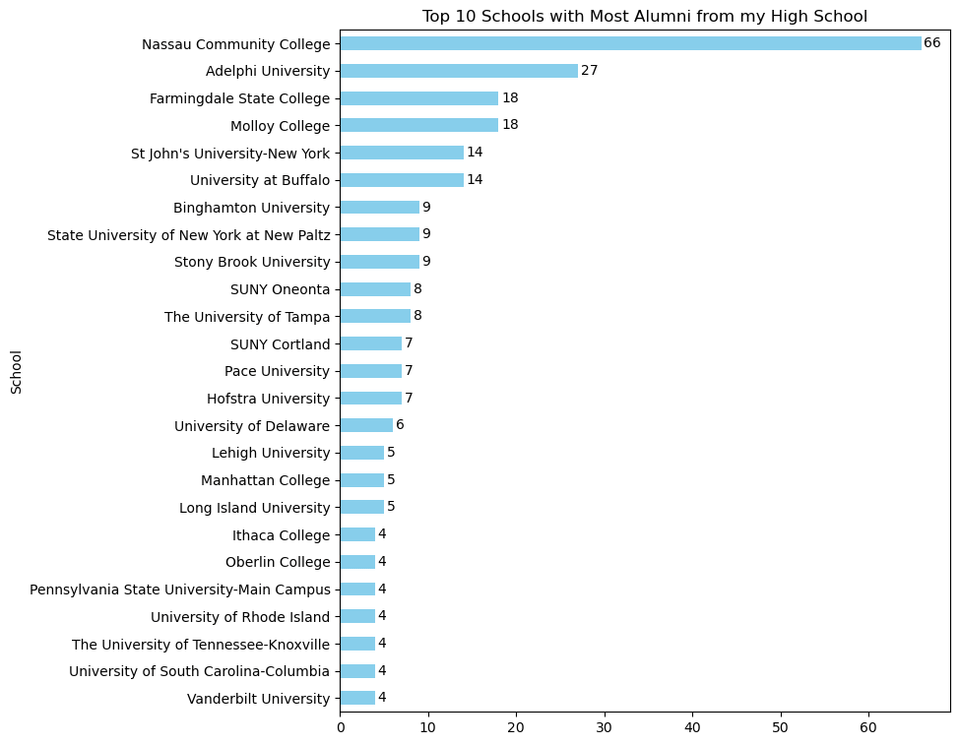
ugh excuse the second title of the barh graph its supposed to read top 25 not top 10!
Hah of course Madison is represented.
why is the image quality so bad
Idk if this is a hot take but SUNY vs CUNY is kind of confusing
4 kids when to UT Knoxville, but you don’t have a dot there.
Shout out to the one kid going to Cal Poly SLO.
You can scale the size of the circle to visualize number of people for each dot. Bigger circle = more people.
Roll Hats, I see the one Stetson kid haha
Shoutout to the Rowan prof
And my local school, the University of Tampa! Serving the Northeastern US college bound for at least 20 years. haha.
Top 10 schools with most alumni should actually only have 10 schools regardless of the repetition of student count
What’s with the dot in The Villages west of Orlando? Also you said 4 went to Penn State University Park but there’s no dot there.
Is the kid at Texas A&M Commerce – Navarro College playing baseball there? Odd choice otherwise.