
![How an ACL tear changes an NFL player's career [OC]](https://www.byteseu.com/wp-content/uploads/2025/08/l0aw6q86mjif1-1536x890.png "How an ACL tear changes an NFL player’s career [OC]")
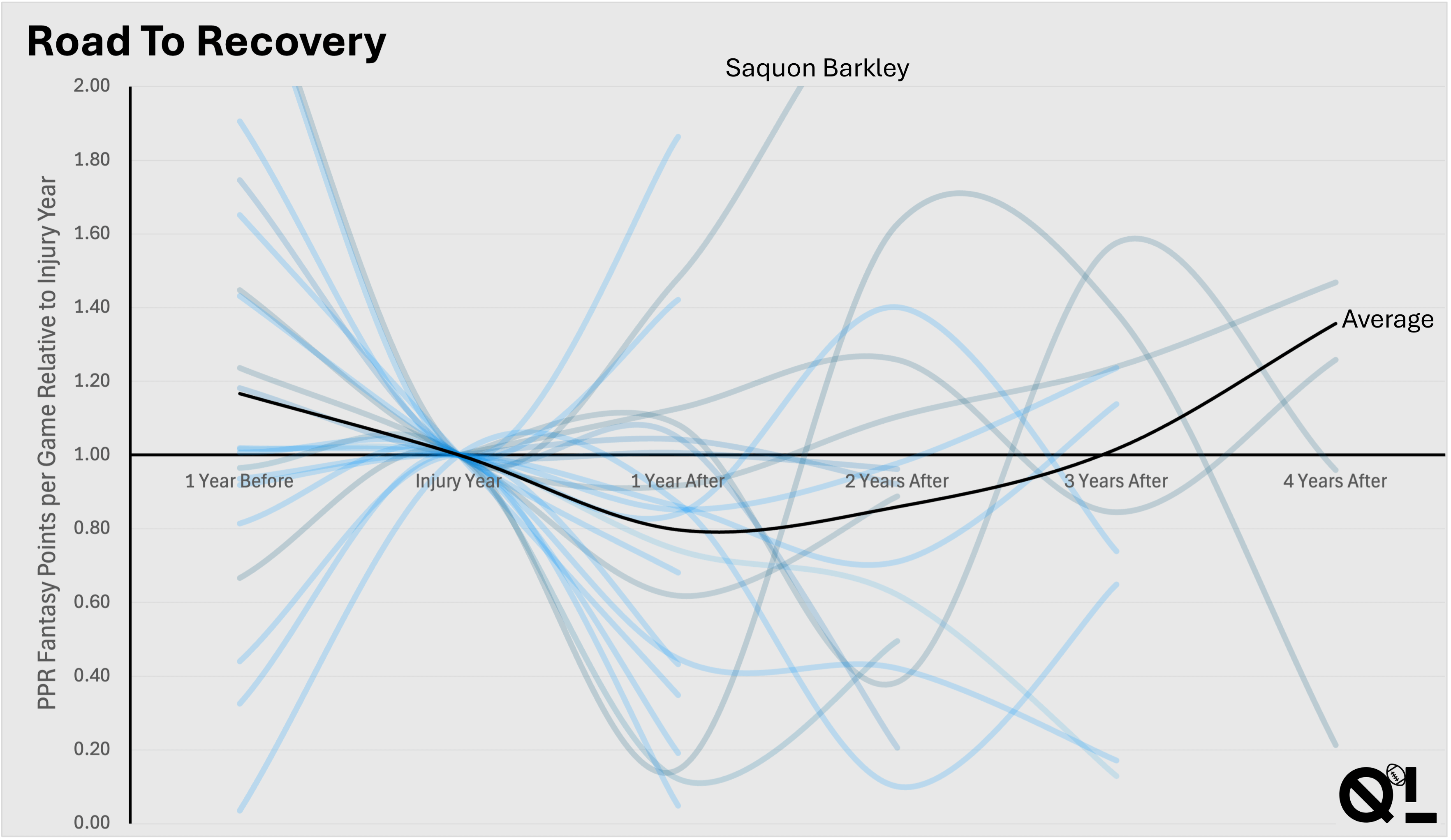
This shows fantasy points per game (a proxy for performance) relative to injury year, as an index. If you're at all interested in statistics in sport (specifically American football), consider checking out my article! https://fantasyfootballquantlab.substack.com/p/injuries-and-the-acl
Posted by FFQuantLab
9 Comments
I see a plot depicting points over time. Grey and blue lines go up and down and all cross the one point line at the same x axis point in time. There is a black line for the average.
I do not see where any of these lines go after the injury year since they all have the same colour scheme.
I learn nothing from it.
I suggest clustering all lines starting from 0-0.5, 0.5-1, 1-1.5, 1.5-2 and show the average from them in different colours
Source: Went through [fantasydata.com](http://fantasydata.com) per player with an ACL tear since the 2018 season. e.g. for Daniel Jones: [https://fantasydata.com/nfl/daniel-jones-fantasy/20841/](https://fantasydata.com/nfl/daniel-jones-fantasy/20841/)
Does each line represent a specific player? Why are the lines so smooth? How did anyone managed to tear an ACL and get better within the first 6 month!?
I don’t get much from this either. Where is the actual data points on this, is it at the year marking and spline between them?
It would be interesting to compare people with similar data before the injury to people that didn’t get injured. What impact did the injury have, compared to people with similar career without the injury?
It’s honestly a miracle what they can do with acl surgery now a days. In the past, that was a walk with a cane for the rest of your life type injury. Now, it can be fixed and people can go on to live normal, non debilitated lives.
That black line average curve? Doesn’t seem right. Because if 75% dipped out to never come back and 5% climbed high to just crash doesn’t make a middle road.
So many lines ended a year after injury. Does that mean they played 1 more year and they’re done?
An actual good looking graph. Nice. (Btw people in here only complain these days)
As a professional data analyst*, I’d like to share a couple comments based on the data presented here.
1. If you’re an NFL player, you want to avoid tearing your ACL.
2. That’s unless you’re Saquon Barkley, who clearly ought to tear his ACL on the last play of every season.
*Not really a professional data analyst.