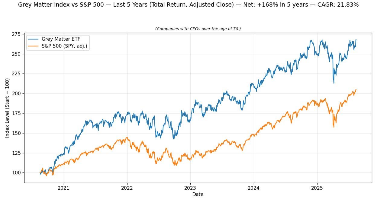
Data source is yahoo finance, tools are python and matplotlib
[Constituent Weights] (as of last monthly rebalance)
Sanmina Corporation: 6.67%
Aflac Incorporated: 6.67%
The Walt Disney Company: 6.67%
Capital One Financial Corporation: 6.67%
Westlake Corporation: 6.67%
Freeport-McMoRan Inc.: 6.67%
Blackstone Inc.: 6.67%
Enterprise Products Partners L.P.: 6.67%
Air Products and Chemicals, Inc.: 6.67%
Watsco, Inc.: 6.67%
Skechers U.S.A., Inc.: 6.67%
Penske Automotive Group, Inc.: 6.67%
Berkshire Hathaway Inc.: 6.67%
BlackRock, Inc.: 6.67%
LVMH Moët Hennessy Louis Vuitton SE: 6.67%
not-picky on
The effect seems most pronounced at exactly the start of the chart. Are we sure we haven’t simply selected a date range that most produces this outcome?
elijha on
I would theorize that you’re flipping the causation here. Being a CEO over 70 doesn’t mean you’ll outperform. Being a CEO over 70 who *doesn’t* outperform means you’ll get put out to pasture by the board.
szakee on
correlation is not causation.
hungarian_conartist on
Do the returns not not index. If you started this plot in the middle of 2021 instead of 2020 it might be the S&P500 outperforming grey matter.
Morisior on
How much of this outperformance survives if you disregard Berkshire Hathaway?
RolandSnowdust on
That time frame is not statistically significant.
lucianw on
Hot take: if you plot a graph like this of several time series and you arbitrarily pick t=0 as the point at which they’re all equal, then you must also plot four other graphs where you pick different dates on which they’re equal.
That way you get more intellectual rigor in determining whether the stories the graphs tell are true, or just a visual artifact of your arbitrary starting point.
Hattix on
Instead of using absolute age as a proxy, use the CEO’s length of service directly.
egoVirus on
“Hello, Correlation? Hi, my name is Causation, have you got a minute?”
AnyPaint9989 on
To add to the other comments talking about causality, companies with an older CEO are (probably) more likely to be the founders themselves, making these companies generally older and more “established” in recovering against market downturns.
The graph starts after the 2020 Covid market crash, so established companies with more experience and stability were always expected to recover better than current S&P 500s.
Infamous_Alpaca on
The Boeing CEO is 68 so this is basically cheating.
SteelyLan on
Hmm, looks like they outperformed in the first half of 2021 and then performed pretty representative of S&P500 from then.
thisisnahamed on
The timeline is too short to come to a conclusion (it’s only 5 years). It would be great to see a chart over the last decades.
The markets have nothing been but irrational since COVID.
ConsequenceExpress39 on
Boomers are winning, we are losing.
YoRt3m on
How old they were when they became CEOs? maybe the successful ones managed to stay
arbitrageME on
Is this the Warren Buffet ETF?
morkalla on
Where can we find the information about “Grey Matter ETF”? I would like to check which companies are included.
nasted on
Nuh-uh: correlation is not causation.
Fun-Pace-4636 on
For those asking this is across a longer period of time (as far back as I can get the data) – note that we’re normalising the “grey matter” index and S&P 500 to 100, and the index level shows total return growth over time, meaning it accounts for both price changes and dividends.
1. The age of 70 is arbitrary. There is no significant reason to use that age range.
2. The chosen time frame is arbitrary and heavily influenced by macroeconomic factors such as COVID and the war in Ukraine.
3. It’s unclear whether this completely accounts for *every* company with a leader over 70. It’s also unclear whether it includes leaders who turned 70, turned 80, died, or were appointed during this time frame.
4. The comparison is lacking. Yes, the selected group outperforms the S&P, but do they outperform other age ranges? Is this consistent over other time periods? What about other stock exchanges?
5. As mentioned elsewhere, this is rife with unmitigated bias: selection, survivorship, and more.
6. This could be a poster child for correlation is not causation. Even if the aforementioned problems were accounted for, there are far too many factors at play for this to mean anything.
papajo_r on
for these particular 4 years yes.
shumpitostick on
4 years is a very short timeframe
BadHairDayToday on
If you group companies together over a plethora of categories you will find some that beat the S&P500:Tech companies, The magnificent seven, Defense stocks. In fact even the fact that we reflexively compare with the S&P500 already shows this survivorship bias, it should really be the All-World Index.

![[OC] Companies with CEOs over the age of 70 outperform the S&P 500](https://www.byteseu.com/wp-content/uploads/2025/08/do3lvveno4kf1-1024x550.jpeg "[OC] Companies with CEOs over the age of 70 outperform the S&P 500")
24 Comments
Data source is yahoo finance, tools are python and matplotlib
[Constituent Weights] (as of last monthly rebalance)
Sanmina Corporation: 6.67%
Aflac Incorporated: 6.67%
The Walt Disney Company: 6.67%
Capital One Financial Corporation: 6.67%
Westlake Corporation: 6.67%
Freeport-McMoRan Inc.: 6.67%
Blackstone Inc.: 6.67%
Enterprise Products Partners L.P.: 6.67%
Air Products and Chemicals, Inc.: 6.67%
Watsco, Inc.: 6.67%
Skechers U.S.A., Inc.: 6.67%
Penske Automotive Group, Inc.: 6.67%
Berkshire Hathaway Inc.: 6.67%
BlackRock, Inc.: 6.67%
LVMH Moët Hennessy Louis Vuitton SE: 6.67%
The effect seems most pronounced at exactly the start of the chart. Are we sure we haven’t simply selected a date range that most produces this outcome?
I would theorize that you’re flipping the causation here. Being a CEO over 70 doesn’t mean you’ll outperform. Being a CEO over 70 who *doesn’t* outperform means you’ll get put out to pasture by the board.
correlation is not causation.
Do the returns not not index. If you started this plot in the middle of 2021 instead of 2020 it might be the S&P500 outperforming grey matter.
How much of this outperformance survives if you disregard Berkshire Hathaway?
That time frame is not statistically significant.
Hot take: if you plot a graph like this of several time series and you arbitrarily pick t=0 as the point at which they’re all equal, then you must also plot four other graphs where you pick different dates on which they’re equal.
That way you get more intellectual rigor in determining whether the stories the graphs tell are true, or just a visual artifact of your arbitrary starting point.
Instead of using absolute age as a proxy, use the CEO’s length of service directly.
“Hello, Correlation? Hi, my name is Causation, have you got a minute?”
To add to the other comments talking about causality, companies with an older CEO are (probably) more likely to be the founders themselves, making these companies generally older and more “established” in recovering against market downturns.
The graph starts after the 2020 Covid market crash, so established companies with more experience and stability were always expected to recover better than current S&P 500s.
The Boeing CEO is 68 so this is basically cheating.
Hmm, looks like they outperformed in the first half of 2021 and then performed pretty representative of S&P500 from then.
The timeline is too short to come to a conclusion (it’s only 5 years). It would be great to see a chart over the last decades.
The markets have nothing been but irrational since COVID.
Boomers are winning, we are losing.
How old they were when they became CEOs? maybe the successful ones managed to stay
Is this the Warren Buffet ETF?
Where can we find the information about “Grey Matter ETF”? I would like to check which companies are included.
Nuh-uh: correlation is not causation.
For those asking this is across a longer period of time (as far back as I can get the data) – note that we’re normalising the “grey matter” index and S&P 500 to 100, and the index level shows total return growth over time, meaning it accounts for both price changes and dividends.
https://preview.redd.it/rh0drthl65kf1.png?width=1248&format=png&auto=webp&s=c45f793e3aff23761352b80b4b5c13924383270a
This is bad data science.
1. The age of 70 is arbitrary. There is no significant reason to use that age range.
2. The chosen time frame is arbitrary and heavily influenced by macroeconomic factors such as COVID and the war in Ukraine.
3. It’s unclear whether this completely accounts for *every* company with a leader over 70. It’s also unclear whether it includes leaders who turned 70, turned 80, died, or were appointed during this time frame.
4. The comparison is lacking. Yes, the selected group outperforms the S&P, but do they outperform other age ranges? Is this consistent over other time periods? What about other stock exchanges?
5. As mentioned elsewhere, this is rife with unmitigated bias: selection, survivorship, and more.
6. This could be a poster child for correlation is not causation. Even if the aforementioned problems were accounted for, there are far too many factors at play for this to mean anything.
for these particular 4 years yes.
4 years is a very short timeframe
If you group companies together over a plethora of categories you will find some that beat the S&P500:Tech companies, The magnificent seven, Defense stocks. In fact even the fact that we reflexively compare with the S&P500 already shows this survivorship bias, it should really be the All-World Index.