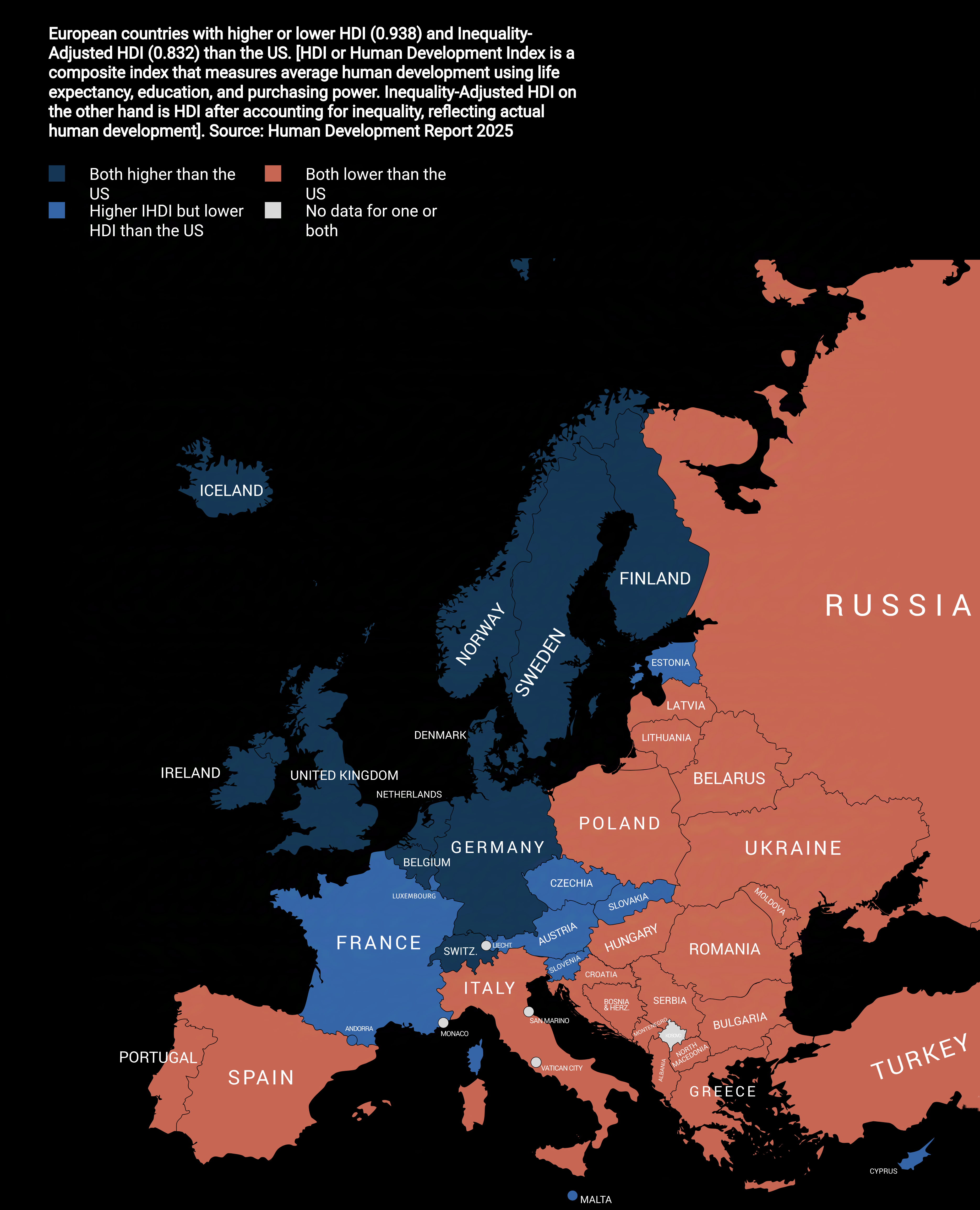
Dark blue: Countries that are colored as dark blue score higher in both Human Development Index and Inequality-Adjusted Human Development Index. This means that in these countries the both the average human development and the actual human development are higher than the US.
Light blue: Countries that are colored as light blue score lower in average human development but due to high disparity in the US, the actual human development when adjusted for inequality is higher these countries.
US HDI— 0.938 (19th globally)
US IHDI— 0.832 (29th globally)
G0ldenfruit on
‘Hdi is higher’ is not something easy to understand. Nice looking map and colours but not explained well
Tiddex on
U.S. redditor claiming the data is flawed in
3…
2…
1…
ziplock9000 on
But… but.. but, they have lots of tanks, bombs and MAGA hats!
Addative-Damage on
Okay firstly, no one come for me, this is just my personal experience. If you have a different one, that’s okay. No hate intended here, just what I’ve felt/seen
Grew up in the US, moved to Germany at 30. For me, the quality of life difference has been extremely noticeable.
Nowhere is perfect, but to me it’s blatantly obvious how much more general economic and environmental stress people have in the US, and how much it impacts their overall mental and physical health.
I try to explain it to Germans, but they look at the size of paychecks in the US and don’t understand how people can be struggling. In the U.S.:
-Rent is insanely expensive near cities
-public transit is shit and cities are built around cars (meaning cars are essential, which is both expensive and terrible for air quality + health)
-medical and dental care is often nearly unaffordable (even with pricy private insurance)
-Family leave is nearly non existent
-Work-life balance is only a thing on paper for any high paying job (as well as plenty of low paying ones)
-Less workers rights
-Etc etc etc
spaceporter on
The only country I am surprised by is Lithuania. I would have thought it was in light blue, but maybe I am biased by working specifically with tech companies in the country previously and being surprised to learn from colleagues how well things have been going there recently.
guiserg on
Always positively surprised by Estonia’s development. They seem to have done a really good job overall in the last few decades.
Amber2718 on
Release the Epstein files
Smile-Nod on
I don’t think this is particularly controversial. But, comparing US states is probably more interesting and granular given many U.S. states have GDP and/or populations larger than European countries.
Actually, you could do the inverse map as well. American states with HDI above EU average.
eilif_myrhe on
Inequality adjusted HDI was a really welcome improvement to the traditional metric, even if my country looks worse on it.
tripsd on
Anecdotally I have lived in the US and UK and have come to the conclusion I’d rather be poor in the UK and rich in the US.
sant2060 on
Data is actually from 2023, even the actuall report is done in 2025.
Totally normal, we can only get retro data, but maybe worth noting.
Because even though it has “2025” title, it’s a snapshot of situation 2 years back.
The other thing that always annoyed me is things like this partially being based on “income”.
Years of schooling, life expectancy, things like that, that’s apples to apples.
But then we come to the “income”. Wtf is income? There are countries where your income can be 1$, but somehow you are also the richest person in the world.
HDI then does adjustment by “income inequality”, but here we go again, if the most of one country richest persons have formal income of 1$, we are adjusting for what exactly?
There are countries where you arent allowed to do that “magic”, there are countries that do allow that “magic”.
If we really want to capture how 98% live, maybe we should cut top and bottom 1%, from stats by wealth, not declared income.

![[OC] How European countries compare to the US in HDI vs Inequality-Adjusted HDI (2025)](https://www.byteseu.com/wp-content/uploads/2025/08/illyqcfl4dkf1-1245x1536.png "[OC] How European countries compare to the US in HDI vs Inequality-Adjusted HDI (2025)")
13 Comments
Source: [Human Development Report 2025](https://hdr.undp.org/system/files/documents/global-report-document/hdr2025reporten.pdf)
Tools: [Mapchart.net](https://www.mapchart.net/)
Dark blue: Countries that are colored as dark blue score higher in both Human Development Index and Inequality-Adjusted Human Development Index. This means that in these countries the both the average human development and the actual human development are higher than the US.
Light blue: Countries that are colored as light blue score lower in average human development but due to high disparity in the US, the actual human development when adjusted for inequality is higher these countries.
US HDI— 0.938 (19th globally)
US IHDI— 0.832 (29th globally)
‘Hdi is higher’ is not something easy to understand. Nice looking map and colours but not explained well
U.S. redditor claiming the data is flawed in
3…
2…
1…
But… but.. but, they have lots of tanks, bombs and MAGA hats!
Okay firstly, no one come for me, this is just my personal experience. If you have a different one, that’s okay. No hate intended here, just what I’ve felt/seen
Grew up in the US, moved to Germany at 30. For me, the quality of life difference has been extremely noticeable.
Nowhere is perfect, but to me it’s blatantly obvious how much more general economic and environmental stress people have in the US, and how much it impacts their overall mental and physical health.
I try to explain it to Germans, but they look at the size of paychecks in the US and don’t understand how people can be struggling. In the U.S.:
-Rent is insanely expensive near cities
-public transit is shit and cities are built around cars (meaning cars are essential, which is both expensive and terrible for air quality + health)
-medical and dental care is often nearly unaffordable (even with pricy private insurance)
-Family leave is nearly non existent
-Work-life balance is only a thing on paper for any high paying job (as well as plenty of low paying ones)
-Less workers rights
-Etc etc etc
The only country I am surprised by is Lithuania. I would have thought it was in light blue, but maybe I am biased by working specifically with tech companies in the country previously and being surprised to learn from colleagues how well things have been going there recently.
Always positively surprised by Estonia’s development. They seem to have done a really good job overall in the last few decades.
Release the Epstein files
I don’t think this is particularly controversial. But, comparing US states is probably more interesting and granular given many U.S. states have GDP and/or populations larger than European countries.
Actually, you could do the inverse map as well. American states with HDI above EU average.
Inequality adjusted HDI was a really welcome improvement to the traditional metric, even if my country looks worse on it.
Anecdotally I have lived in the US and UK and have come to the conclusion I’d rather be poor in the UK and rich in the US.
Data is actually from 2023, even the actuall report is done in 2025.
Totally normal, we can only get retro data, but maybe worth noting.
Because even though it has “2025” title, it’s a snapshot of situation 2 years back.
The other thing that always annoyed me is things like this partially being based on “income”.
Years of schooling, life expectancy, things like that, that’s apples to apples.
But then we come to the “income”. Wtf is income? There are countries where your income can be 1$, but somehow you are also the richest person in the world.
HDI then does adjustment by “income inequality”, but here we go again, if the most of one country richest persons have formal income of 1$, we are adjusting for what exactly?
There are countries where you arent allowed to do that “magic”, there are countries that do allow that “magic”.
If we really want to capture how 98% live, maybe we should cut top and bottom 1%, from stats by wealth, not declared income.
France letting the side down