Just every state that keeps voting for the same. The difference will never change.
New_Ad_3010 on
Now overlay that with amount of republican MAGAts. It won’t be surprising.
Helpful_Door_7468 on
How those republican values workin out for ya? ☠️
Kind-Handle3063 on
The states of less government don’t seem to be doing very well for some unknown reason
LurkersUniteAgain on
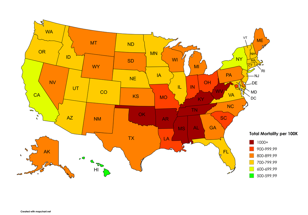
what does total mortality per 100k mean?? wouldnt it be 100k per 100k for every state??
EggyChickenEgg88 on
Didnt know it was this high in the US. On average its 9 deaths per 100 000 in Europe, highest in Cyprus with 68.
Notallowedhe on
Without the Bible Belt the US would be so much better in every stat
TooManySteves2 on
So stay away from AR, MS, and AL. Better yet, just avoid the People’s Republic of America entirely.
voxadam on
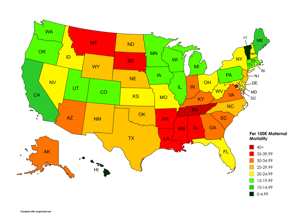
Hawaii is just showing off with their universal healthcare.
underlander on
Why is this a divergent color scheme with red/green instead of a single color which fades with low mortality? Green as a color signifies “good” or “desirable.” This is saying that 500+ maternal deaths per 100K is acceptable? A single color (red, for instance) fading into blank/white would avoid this problem and be colorblind friendly. All states would be at least a light light shade of pink because realistically we’ll never get maternal mortality down to zero, but it’d avoid the Hawaii problem here of saying 500 per 100K is acceptable and we should stop there cuz we’ve peaked.
Danyboii on
Wonder how close this tracks to obesity.
AThousandBloodhounds on
The South is cursed (by right-wing politicians). Move away before you die an early death.
Life expectancy is probably easier to understand than annualized mortality. I live in WI, kids born here today are expected to live ~5 years longer than kids born in MS, or ~1 year shorter than kids born in HI.
berolo on
Always a trend on these types of maps
HoonterOreo on
And they want to turn the rest of the country into that..
TheKen42 on
What is the Maternal Mortality map trying to convey here?
FairwayFrank44 on
Should just go ahead and make the color scales go from deep red to deep blue to save everyone the mental leap
rewt127 on
Im curious to see what the maternal mortality rates of MT would be if you just removed the reservations in their entirety. Do we have an epidemic of people dying in childbirth. Or is it… well… the reservations again skewing our stats.
Onagan98 on
I find anything not darkish green disturbing, basically all should be coloured green.
laxaddict11 on
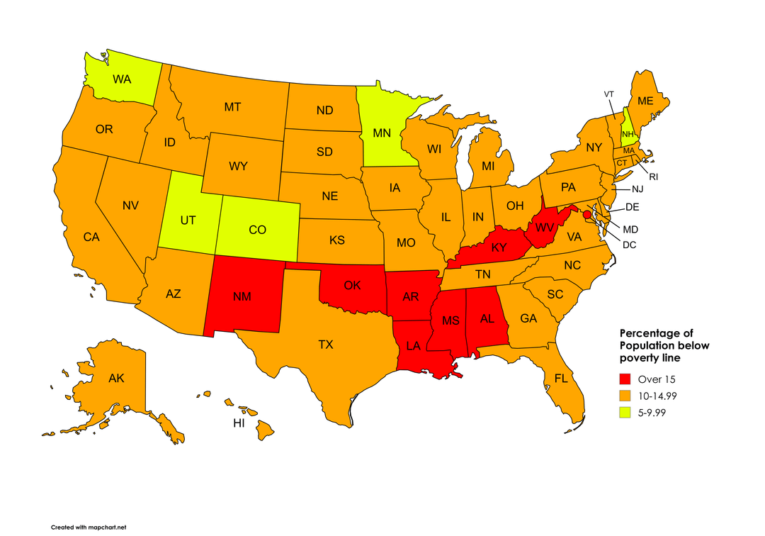
Does anyone know why DC seems like an anomaly here? Poverty line makes a bit of sense I guess, but the mortality rates seem unusual.
Go_Gators_4Ever on
Now show the Trump v Biden voting map, pretty much the same result.
gc3 on
Isn’t total mortality 100 percent everywhere by definition.? I think you are missing a qualifier
007meow on
This is basically every statistical map of the US.
forealman on
Can we also get a visual of the Bible belt
velovader on
Post civil war reconstruction was given up on too soon and you can still see the echoes today

![[OC] Total mortality, maternal mortality and amount poverty by state](https://www.byteseu.com/wp-content/uploads/2025/09/yv8nq94p9rnf1-1024x717.png "[OC] Total mortality, maternal mortality and amount poverty by state")
26 Comments
https://hdpulse.nimhd.nih.gov/data-portal/mortality/table?age=001&age_options=age_11&cod=247&cod_options=cod_15&comparison=states_to_us&comparison_options=comparison_statename_to_us&race=00&race_options=race_6&ratetype=aa&ratetype_options=ratetype_2&ruralurban=0&ruralurban_options=ruralurban_3&sex=0&sex_options=sex_3&statefips=00&statefips_options=area_states&yeargroup=5&yeargroup_options=yearmort_2
https://worldpopulationreview.com/state-rankings/maternal-mortality-rate-by-state
https://www.cdc.gov/nchs/fastats/state-and-territorial-data.htm# Per year so number was divided by 4
https://worldpopulationreview.com/state-rankings/poverty-rate-by-state
Just every state that keeps voting for the same. The difference will never change.
Now overlay that with amount of republican MAGAts. It won’t be surprising.
How those republican values workin out for ya? ☠️
The states of less government don’t seem to be doing very well for some unknown reason
what does total mortality per 100k mean?? wouldnt it be 100k per 100k for every state??
Didnt know it was this high in the US. On average its 9 deaths per 100 000 in Europe, highest in Cyprus with 68.
Without the Bible Belt the US would be so much better in every stat
So stay away from AR, MS, and AL. Better yet, just avoid the People’s Republic of America entirely.
Hawaii is just showing off with their universal healthcare.
Why is this a divergent color scheme with red/green instead of a single color which fades with low mortality? Green as a color signifies “good” or “desirable.” This is saying that 500+ maternal deaths per 100K is acceptable? A single color (red, for instance) fading into blank/white would avoid this problem and be colorblind friendly. All states would be at least a light light shade of pink because realistically we’ll never get maternal mortality down to zero, but it’d avoid the Hawaii problem here of saying 500 per 100K is acceptable and we should stop there cuz we’ve peaked.
Wonder how close this tracks to obesity.
The South is cursed (by right-wing politicians). Move away before you die an early death.
https://preview.redd.it/ndr8l033frnf1.jpeg?width=1300&format=pjpg&auto=webp&s=9943c842240514034fd87453702f93965855a7f2
Life expectancy is probably easier to understand than annualized mortality. I live in WI, kids born here today are expected to live ~5 years longer than kids born in MS, or ~1 year shorter than kids born in HI.
Always a trend on these types of maps
And they want to turn the rest of the country into that..
What is the Maternal Mortality map trying to convey here?
Should just go ahead and make the color scales go from deep red to deep blue to save everyone the mental leap
Im curious to see what the maternal mortality rates of MT would be if you just removed the reservations in their entirety. Do we have an epidemic of people dying in childbirth. Or is it… well… the reservations again skewing our stats.
I find anything not darkish green disturbing, basically all should be coloured green.
Does anyone know why DC seems like an anomaly here? Poverty line makes a bit of sense I guess, but the mortality rates seem unusual.
Now show the Trump v Biden voting map, pretty much the same result.
Isn’t total mortality 100 percent everywhere by definition.? I think you are missing a qualifier
This is basically every statistical map of the US.
Can we also get a visual of the Bible belt
Post civil war reconstruction was given up on too soon and you can still see the echoes today