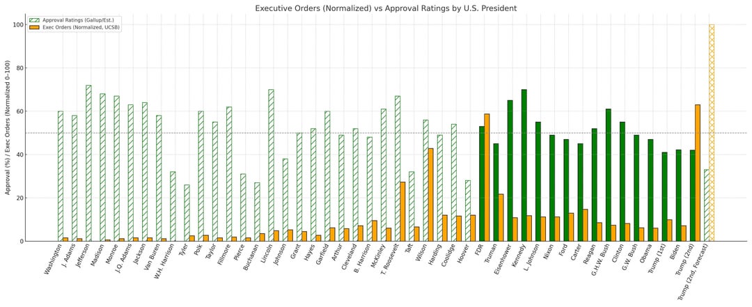
Here’s a link to the study I made that shows where I got the data from and how I estimated historical approval ratings.
Jeoshua on
Really doesn’t look like there *is* a relationship between these two things. They aren’t dependent on each other. More EOs doesn’t make a president any more or less popular, and more popular presidents don’t make more or less EOs than less popular ones.
FaultierSloth on
Most interesting/surprising thing here for me is how low Washington’s estimated approval rating there is. I would have expected it to be ridiculously high, but it’s pretty much in line with modern politicians.
steelmanfallacy on
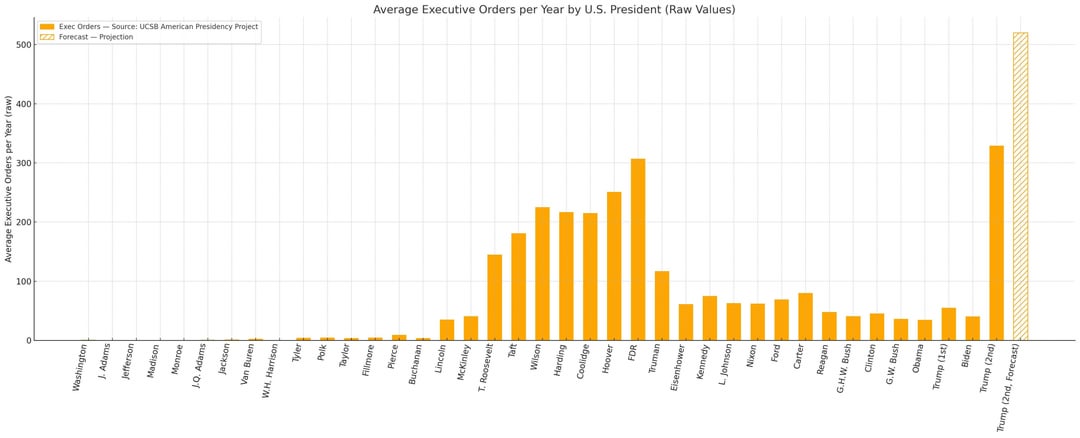
What’s interesting is that Trump has both houses in GOP control so it’s surprising to me that there isn’t a more concerted push to get big legislation through before the midterms next year. The tax cut seems small ball for GOP having all the branches. But then, perhaps that’s the game. Leave the culture war stuff unresolved and just do tax cuts.
wwarnout on
How about a chart showing EOs that were not overturned by the courts?
DesperateDig1209 on
Well I like it a lot, but I can help noticing that “Approval ratings” look big for all Presidents. Not sure how you normalized them.
I don’t mind that there isn’t a correlation though. Data can still be beautiful, even if it doesn’t “tell a story.”
DesperateDig1209 on
Trump gets what he wants to hear, if it’s from someone he can fire.
He can’t fire the Supreme Court, hehe.
ndfb47 on
Very interesting data set to look into. I am curious why you chose an intermingled bar plot to try to show a correlation (or lack thereof). I generally pick my visualization approach based on the story I am trying to tell. Given that you’re trying to tell a story about correlation, a scatter plot seems the obvious choice. But of course, people are allowed to think differently about data so I’m curious why you made the choices you did.
vttale on
One other relevant metric, but needs finer granularity: congressional control.
Trump is doing this while his own party controls the legislature. This makes his excess even more stark.


9 Comments
https://drive.google.com/file/d/15XCESPhvwXuHemK7zh6fI7zLZHAhbvkQ/view?usp=drivesdk
Here’s a link to the study I made that shows where I got the data from and how I estimated historical approval ratings.
Really doesn’t look like there *is* a relationship between these two things. They aren’t dependent on each other. More EOs doesn’t make a president any more or less popular, and more popular presidents don’t make more or less EOs than less popular ones.
Most interesting/surprising thing here for me is how low Washington’s estimated approval rating there is. I would have expected it to be ridiculously high, but it’s pretty much in line with modern politicians.
What’s interesting is that Trump has both houses in GOP control so it’s surprising to me that there isn’t a more concerted push to get big legislation through before the midterms next year. The tax cut seems small ball for GOP having all the branches. But then, perhaps that’s the game. Leave the culture war stuff unresolved and just do tax cuts.
How about a chart showing EOs that were not overturned by the courts?
Well I like it a lot, but I can help noticing that “Approval ratings” look big for all Presidents. Not sure how you normalized them.
I don’t mind that there isn’t a correlation though. Data can still be beautiful, even if it doesn’t “tell a story.”
Trump gets what he wants to hear, if it’s from someone he can fire.
He can’t fire the Supreme Court, hehe.
Very interesting data set to look into. I am curious why you chose an intermingled bar plot to try to show a correlation (or lack thereof). I generally pick my visualization approach based on the story I am trying to tell. Given that you’re trying to tell a story about correlation, a scatter plot seems the obvious choice. But of course, people are allowed to think differently about data so I’m curious why you made the choices you did.
One other relevant metric, but needs finer granularity: congressional control.
Trump is doing this while his own party controls the legislature. This makes his excess even more stark.