
Hey everyone,
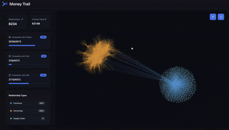
We’ve been working on a project called moneytrail.ai — a 3D interactive map of financial and commercial connections. The idea is to make the flow of money visual and explorable, instead of buried in spreadsheets.
A couple things to know:
- Too many connections: Some companies have hundreds or even thousands of financial links. To keep the UI usable, we don't show all the trails at one time, but only the top 100. With time this number will change based on performance and UI improvements. If you want more, you can click a company node and see the full list in the overview panel.
- Starting point: We had to begin somewhere, so we randomly chose the US government as the seed node. From there, the dataset branches out. (Totally arbitrary choice — not political!)
It’s early and free, and we’d love your feedback:
- Does the 3D visualization make sense?
- What would you add/change to make it more insightful?
- Any datasets we should explore next?
Check it out here → moneytrail.ai
And if you have any questions or suggestions you can email – [Info@moneytrail.ai](mailto:Info@moneytrail.ai)
Posted by Tankpopper
5 Comments
* SEC public API, usaspending **(Source)**
* Financial modeling prep **(Tool)**
It needs a black hole to depict crypto and governmental slush funds
Possibly useful insight: Identifying top most profitable feedback loops. I.e. A pays x to B, B pays y to C, and C pays z to A, where z > x.
First of all, supercool project. I love the idea of using a 3d connected web as a representation of economics and I think you’re doing great!
Is it possible to do:
– adjusted width of connection by amount transacted and adjusted sphere size for total worth of the entity?
– maybe a funny and interesting thing is to give the options to wiggle, with incentive to move together entities with same input sources closer together, to visualize parallel streams of money. Might be a bit too much to do a more dynamic sim. Thought it’d be cool to visualize the bigger streams like a 3d-flowchart, the untangled web of economic dynamics
That’s a very cool visualization! Just curious, did you manage to get any insights from it? Or for now it’s nothing more than a visualization, which is not bad?