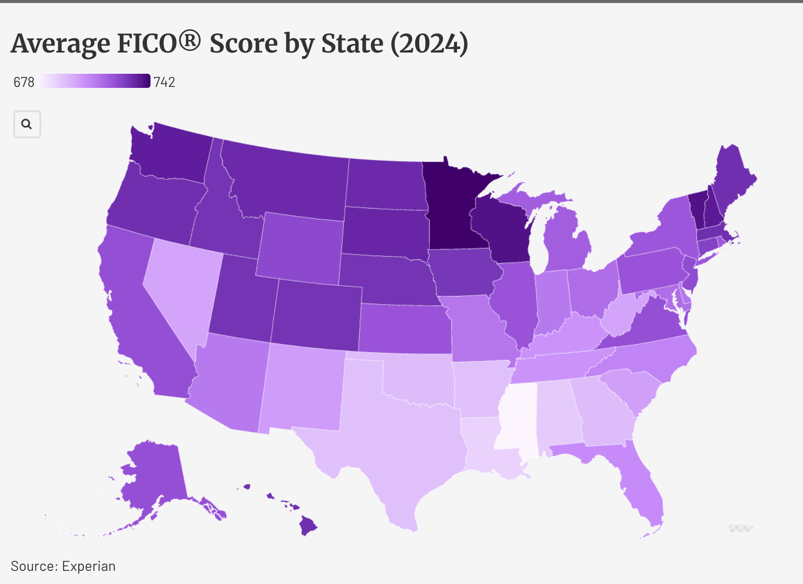
Hey look, something else for Mississippi to be bottom at.
snakkerdudaniel on
Mississippi! and Alabama and Louisiana
stanolshefski on
I would guess that age (except Utah), average income, and either homeownership rate or average number of years living in the same household that is not your parents predicts 95% plus of this.
13hockeyguy on
This could also be a “current BAC levels” map. 😂
SteveTheUPSguy on
FICO version what? 6, 7, 8? They all have different algorithms with a meaningful spread between the versions
rook119 on
someone needs to overlap this map w/ % of nissan owners.
prosa123 on
Really not much of a range from low to high.
dxkx on
There should just be a sub for maps where Minnesota is the best on it.
swarmy1 on
It’s interesting how correlated with latitude this is.
locke314 on
Most “comparing US states” map I see consistently puts MN a near the best. I wish we would just find a way to be our own independent entity. We have manufacturing, mining, energy, healthcare, tech, engineering, agriculture, education, etc.
I’m proud to be a Minnesotan and glad to see us be the best!
shinypieceofcoal on
FICO/credit scores scores really shouldn’t be averaged as it’s ordinal.
Bdowns_770 on
Why must Mississippi be at the bottom of EVERY list?
BarryAllensMom on
There’s something very amusing about these stats because where I live, the Mississippi is a beautiful blue river. And where it ends? Yuck.
Just like these maps.
moretodolater on
Higher average heat and humidity is bad for credit.
CFLuke on
Another map of educational attainment, or gun violence, or infant mortality rate, or traffic deaths, or political alignment…
Except Utah, like always.
Real-Psychology-4261 on
Hey look, another reason Minnesota is the best.
Kesshh on
Not a fan of this presentation.
1. The score range of 678-742 is really not that big but forcing it into a spectrum made it look really bad for the southern states when the score difference is only 64 points.
2. FICO score is never the sole determining factor for whatever it is used for, credit card approval, loan approval, car/mortgage, etc. Without augmenting it with some additional indicator paints an unfavorable picture of the south when the reality is that people with lower FICO score is everywhere.
Verity41 on
Yes! We are awesome. Maybe all that cash is keeping us warm like goose down🥶🧊


19 Comments
Hey look, something else for Mississippi to be bottom at.
Mississippi! and Alabama and Louisiana
I would guess that age (except Utah), average income, and either homeownership rate or average number of years living in the same household that is not your parents predicts 95% plus of this.
This could also be a “current BAC levels” map. 😂
FICO version what? 6, 7, 8? They all have different algorithms with a meaningful spread between the versions
someone needs to overlap this map w/ % of nissan owners.
Really not much of a range from low to high.
There should just be a sub for maps where Minnesota is the best on it.
It’s interesting how correlated with latitude this is.
Most “comparing US states” map I see consistently puts MN a near the best. I wish we would just find a way to be our own independent entity. We have manufacturing, mining, energy, healthcare, tech, engineering, agriculture, education, etc.
I’m proud to be a Minnesotan and glad to see us be the best!
FICO/credit scores scores really shouldn’t be averaged as it’s ordinal.
Why must Mississippi be at the bottom of EVERY list?
There’s something very amusing about these stats because where I live, the Mississippi is a beautiful blue river. And where it ends? Yuck.
Just like these maps.
Higher average heat and humidity is bad for credit.
Another map of educational attainment, or gun violence, or infant mortality rate, or traffic deaths, or political alignment…
Except Utah, like always.
Hey look, another reason Minnesota is the best.
Not a fan of this presentation.
1. The score range of 678-742 is really not that big but forcing it into a spectrum made it look really bad for the southern states when the score difference is only 64 points.
2. FICO score is never the sole determining factor for whatever it is used for, credit card approval, loan approval, car/mortgage, etc. Without augmenting it with some additional indicator paints an unfavorable picture of the south when the reality is that people with lower FICO score is everywhere.
Yes! We are awesome. Maybe all that cash is keeping us warm like goose down🥶🧊
https://preview.redd.it/5am6e603kgof1.jpeg?width=1206&format=pjpg&auto=webp&s=36ed6b2177c32f665a2ccc3e2c74097ab2424e35
Literally a screenshot from my AmEx app – I’ve lived in MN for 27 years now