
![[OC] - How often do US house reps vote against their own party in 2025? Heatmap % + party affiliations](https://www.byteseu.com/wp-content/uploads/2025/09/ntm8qo0xlmof1-1024x576.png "[OC] – How often do US house reps vote against their own party in 2025? Heatmap % + party affiliations")
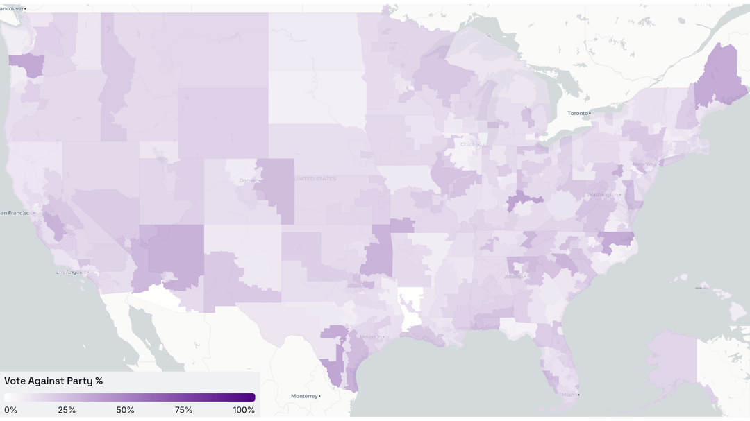
Pic 1: Heatmap representing the frequency at which house reps broke party lines during US House votes. 0% (white) means that they always voted with their party, while 100% (darkest purple) means that they always voted against their party. 50% means that the rep voted with their party half the time.
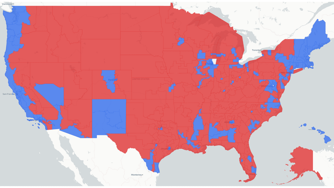
Pic 2: Map representing rep's party affiliation. Blue = Democratic, red = Republican.
- StatePulse interactive dashboard: https://www.statepulse.me/dashboard -> districts -> toggle representative heatmap on -> vote against party
- Source legislation data: https://www.statepulse.me/legislation
- Representatives: https://www.statepulse.me/representatives
Note: voting data is only available for congress people so far on StatePulse.
If you want more detailed views, please check the dashboard linked above and feel free to fiddle around. You can also click on districts to find who your reps are!
Source voting data (from January 2025 to now): https://www.senate.gov/legislative/votes_new.htm and https://api.congress.gov/#/
StatePulse is also a free/open source platform that tracks legislation, representatives, and political trends. Every person should have access to what's actually being passed in legislative chambers as possible, especially considering how polarized the environment has become. As an incoming college freshman majoring in Computer Science, I think technology can be a great aid in helping regular folks like me learn.
Source code below; donations are also appreciated!
- Github repo: https://github.com/lightningbolts/state-pulse
- Buy me a coffee: https://buymeacoffee.com/timberlake2025
Special thanks to: OpenStates for their legislative data/scrapers, Congress for providing a free public api, MapLibre GL for map rendering, and more!
Posted by TheMatrix2025
4 Comments
this is really cool, but the color scale choice makes it bland. maybe a diverging color scale to see the clumps of party hardliners vs “rebels”
Two things:
The first map really needs a different color setup. It all mostly blends together.
The second map should be population densities with size representation based on population size. Blanketing large swaths of empty land with any color is stupid. And land coverage without scaling in population size just skews the content.
Reference:
[https://engaging-data.com/county-electoral-map-land-vs-population/](https://engaging-data.com/county-electoral-map-land-vs-population/)
On a side note…
A graph I’d like to see is voting results of an election and then that same result set rebalanced based on voting power of each area. One of the biggest things forgotten is that your vote and my vote is NOT 1 vote. We don’t even have the same amount of voting power.
Reference:
[https://www.maps.com/how-much-voting-power-does-each-us-state-have/](https://www.maps.com/how-much-voting-power-does-each-us-state-have/)
There’s also skew of voting power based on imbalance of electoral seats:
[https://www.reddit.com/r/MapPorn/comments/1f8d9th/how_many_electoral_votes_every_state_would/](https://www.reddit.com/r/MapPorn/comments/1f8d9th/how_many_electoral_votes_every_state_would/)
And then you have gerrymandering which further offsets vote representation and voting power simply based on what location you live at. Go 5 miles in any direction, and your voting power could be very different.
Complex concept, evaluation, and how do you even make it fair.
[https://en.wikipedia.org/wiki/Gerrymandering](https://en.wikipedia.org/wiki/Gerrymandering)
It comes down to partisan efficiency and what efficiency gaps exist for a voter. On a more macro level, this can be state wide, but the data can show down to the district level showing exactly how much…or little…your specific vote matters.
A paper on partisan efficiency:
[https://lawreview.uchicago.edu/sites/default/files/04%20Stephanopoulos_McGhee_ART.pdf](https://lawreview.uchicago.edu/sites/default/files/04%20Stephanopoulos_McGhee_ART.pdf)
And a map of this partisan efficiency gap:
[https://www.reddit.com/r/MapPorn/comments/w7x5u4/us_states_by_their_efficiency_gap_difference/](https://www.reddit.com/r/MapPorn/comments/w7x5u4/us_states_by_their_efficiency_gap_difference/)
When comparing to raw population voting, these modifiers have a dramatic result on effective voting power.
So an interesting graph to make would be one showing raw popular vote and then total skew of voting power through these various systems. 1 person, 1 vote, becomes…what? 2.4? 0.55?
Looks like Thomas Massie is winning.
And, surprisingly, Boebert.
I’m gonna need you all to stop using geographical maps to show Congressional districts. It’s heavily skewed by large low density districts and makes dense populous districts hard to see, if not impossible. Either make each district roughly the same size or use a different presentation entirely.