This maps show 2024 state-level individual full-time incomes adjusted into July 2025 dollars. Median individual earnings (for those 16+ employed full-time) are normalised using Bureau of Economic Analysis Regional Price Parities, which account for housing, food, education, transportation, and other goods and services to reflect real purchasing power. Data come from the new Census release of September 2025.
As someone who lives in Florida, I knew it was bad, but fuck, I didn’t realize we were dead last
Pizza_Casalinga on
Its my turn to post this. Fuck I’ve seen this 10 times in 2 days.
irrelevantusername24 on
Our society is so unequal these graphics do far more to confuse than to understand. Even a map that has far more granular data, such as this one that goes county level:
Any dataset requires some amount of “normality” in order to say anything. A dataset with large extremes, large outliers, tells you nothing. So if those extremes and outliers are separated into another dataset… then your original dataset tells you less, even if you specify there were some outliers taken out. This is how when inequality becomes as extreme as it is, in a really kinda crazy way, it makes [reality literally distorted](https://www.reddit.com/r/law/comments/1nf44vc/comment/ndtrhqb/). It makes the things we use to communicate less capable of communicating. Because the numbers don’t tell you anything at this point and actually more often than not do more to provide a false understanding of the reality than if you never saw these numbers/maps.
Because the the wealth distribution, *if the top quintile had roughly twice as much as the bottom* looks like this:
|quintile|total wealth|per person|per person, age 18-65|
|:-|:-|:-|:-|
|0-20% (68.02 million people)|$4.8T|$70,567|$112,150|
|20-40%|$7.01T|$103,058|$163,785|
|40-60%|$12.85T|$188,915|$300,234|
|60-80%|$21.65T|$318,289|$505,140|
|80-99% (64.88 million people)|$75.91T|$1,170,006|$1,867,232|
|99-100% (3.14 million people)|$38.13T|$12,143,312|$17,782,758|
Though the percentage of people and whatnot – very minor technicalities relative to the overall point I am communicating – are slightly mistaken. I have shared this a few times – because neither of these tables are ever how this distribution is displayed, for what should be obvious reasons – but [see here](https://www.reddit.com/r/economy/comments/1n7mcyu/comment/ncg7r4h/) for the conversation where someone helpfully pointed out my mistakes. But generally speaking, regarding the main point (the inequality is fucking criminal) these numbers are accurate.
Lars0 on
Having lived in both, Washington and Colorado are good places to live.
nstutzman28 on
Interesting use of heatmap coloring (is this mpl-magma?) to have the “hot” mean less. In my intuition, a heat gradient starting from yellow would end in the red for “hot”; going to purple makes it loop around and seem “cold” again.
Nanocephalic on
State-level isn’t great – this would be better at the county level.
Seattle is just a bit pricier than Yakima.
Kesshh on
Florida is of course distorted because of the % of retired people. But looks right.
AssimilateThis_ on
It might be good for an overall trend but the only useful way to approach this is to have a county level map, get CoL figures for a certain baseline, and then have people use that to evaluate the incomes they can make in each spot with their particular situation. If you happen to be in investment banking, for example, you’re probably better off in Manhattan long term than Colorado.
sudoSancho on
Where did all our money go
Brighter_rocks on
So, no need to chase $90k in nyc/sf when rent eats it up. grab remote gigs from “expensive” companies, live in low-col states – you’ll keep way more)
thirteensix on
I’d love to see this at the county or metro area level. States have weird artifacts in their shape and levels of urbanization.
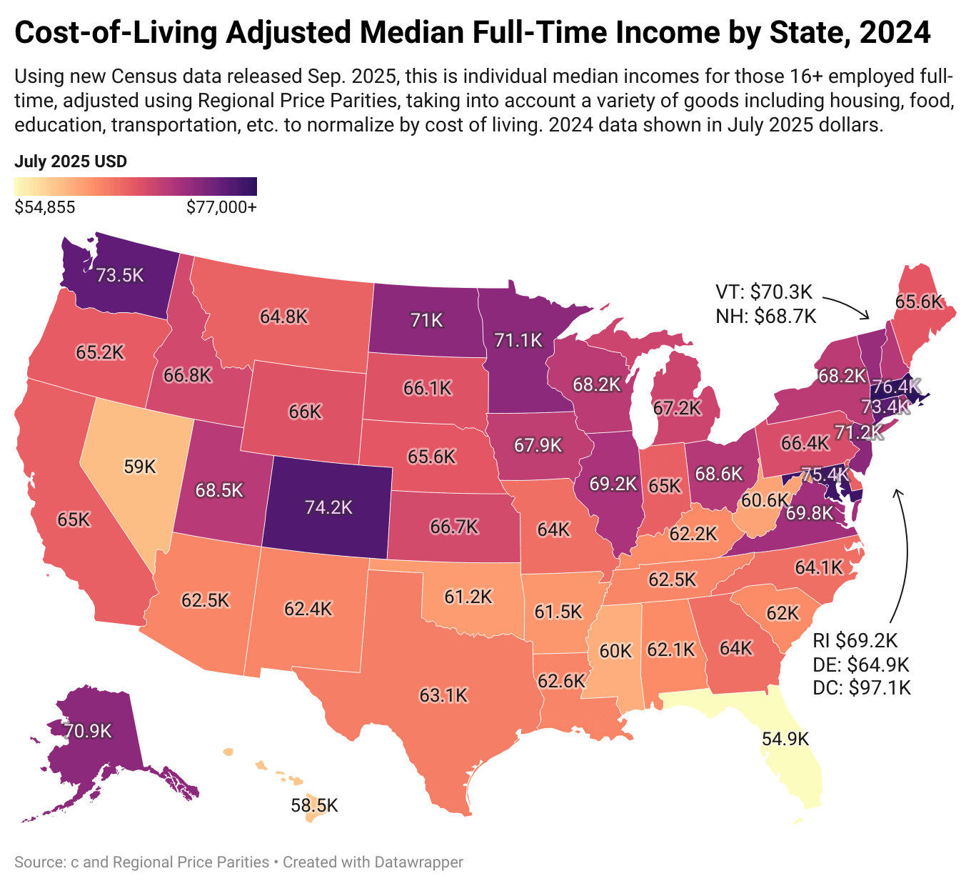

![[OC] Cost-of-Living Adjusted Median Full-Time Individual Incomes by State, 2024](https://www.byteseu.com/wp-content/uploads/2025/09/kvp3g4zcwuof1-1024x934.png "[OC] Cost-of-Living Adjusted Median Full-Time Individual Incomes by State, 2024")
13 Comments
This maps show 2024 state-level individual full-time incomes adjusted into July 2025 dollars. Median individual earnings (for those 16+ employed full-time) are normalised using Bureau of Economic Analysis Regional Price Parities, which account for housing, food, education, transportation, and other goods and services to reflect real purchasing power. Data come from the new Census release of September 2025.
RPP data from: [https://www.bea.gov/data/prices-inflation/regional-price-parities-state-and-metro-area](https://www.bea.gov/data/prices-inflation/regional-price-parities-state-and-metro-area)
Individual income data from table S2412 of the ACS: [https://data.census.gov/table?q=S2412&g=010XX00US$0400000](https://data.census.gov/table?q=S2412&g=010XX00US$0400000)
As someone who lives in Florida, I knew it was bad, but fuck, I didn’t realize we were dead last
Its my turn to post this. Fuck I’ve seen this 10 times in 2 days.
Our society is so unequal these graphics do far more to confuse than to understand. Even a map that has far more granular data, such as this one that goes county level:
[https://eig.org/distressed-communities/](https://eig.org/distressed-communities/)
Doesn’t really say much of anything.
Any dataset requires some amount of “normality” in order to say anything. A dataset with large extremes, large outliers, tells you nothing. So if those extremes and outliers are separated into another dataset… then your original dataset tells you less, even if you specify there were some outliers taken out. This is how when inequality becomes as extreme as it is, in a really kinda crazy way, it makes [reality literally distorted](https://www.reddit.com/r/law/comments/1nf44vc/comment/ndtrhqb/). It makes the things we use to communicate less capable of communicating. Because the numbers don’t tell you anything at this point and actually more often than not do more to provide a false understanding of the reality than if you never saw these numbers/maps.
Because the the wealth distribution, *if the top quintile had roughly twice as much as the bottom* looks like this:
|quintile|total wealth|per person|per person, age 18-65|
|:-|:-|:-|:-|
|0-20%|$22T|$323,434|$514,000|
|20-40%|$26.2T|$385,181|$612,000|
|40-60%|$31.1T|$457,218|$727,000|
|60-80%|$37T|$543,958|$864.500|
|80-100%|$44T|$646,869|$1,027,100|
And **the actual distribution** looks like this:
|quintile|total wealth|per person|per person, age 18-65|
|:-|:-|:-|:-|
|0-20% (68.02 million people)|$4.8T|$70,567|$112,150|
|20-40%|$7.01T|$103,058|$163,785|
|40-60%|$12.85T|$188,915|$300,234|
|60-80%|$21.65T|$318,289|$505,140|
|80-99% (64.88 million people)|$75.91T|$1,170,006|$1,867,232|
|99-100% (3.14 million people)|$38.13T|$12,143,312|$17,782,758|
Though the percentage of people and whatnot – very minor technicalities relative to the overall point I am communicating – are slightly mistaken. I have shared this a few times – because neither of these tables are ever how this distribution is displayed, for what should be obvious reasons – but [see here](https://www.reddit.com/r/economy/comments/1n7mcyu/comment/ncg7r4h/) for the conversation where someone helpfully pointed out my mistakes. But generally speaking, regarding the main point (the inequality is fucking criminal) these numbers are accurate.
Having lived in both, Washington and Colorado are good places to live.
Interesting use of heatmap coloring (is this mpl-magma?) to have the “hot” mean less. In my intuition, a heat gradient starting from yellow would end in the red for “hot”; going to purple makes it loop around and seem “cold” again.
State-level isn’t great – this would be better at the county level.
Seattle is just a bit pricier than Yakima.
Florida is of course distorted because of the % of retired people. But looks right.
It might be good for an overall trend but the only useful way to approach this is to have a county level map, get CoL figures for a certain baseline, and then have people use that to evaluate the incomes they can make in each spot with their particular situation. If you happen to be in investment banking, for example, you’re probably better off in Manhattan long term than Colorado.
Where did all our money go
So, no need to chase $90k in nyc/sf when rent eats it up. grab remote gigs from “expensive” companies, live in low-col states – you’ll keep way more)
I’d love to see this at the county or metro area level. States have weird artifacts in their shape and levels of urbanization.
Wow, what’s going on in Massachusetts?