
![[OC] Infant Deaths per 1,000 Live Births by State and Province](https://www.byteseu.com/wp-content/uploads/2025/09/ouuaq7fqdtpf1-1536x1476.png "[OC] Infant Deaths per 1,000 Live Births by State and Province")
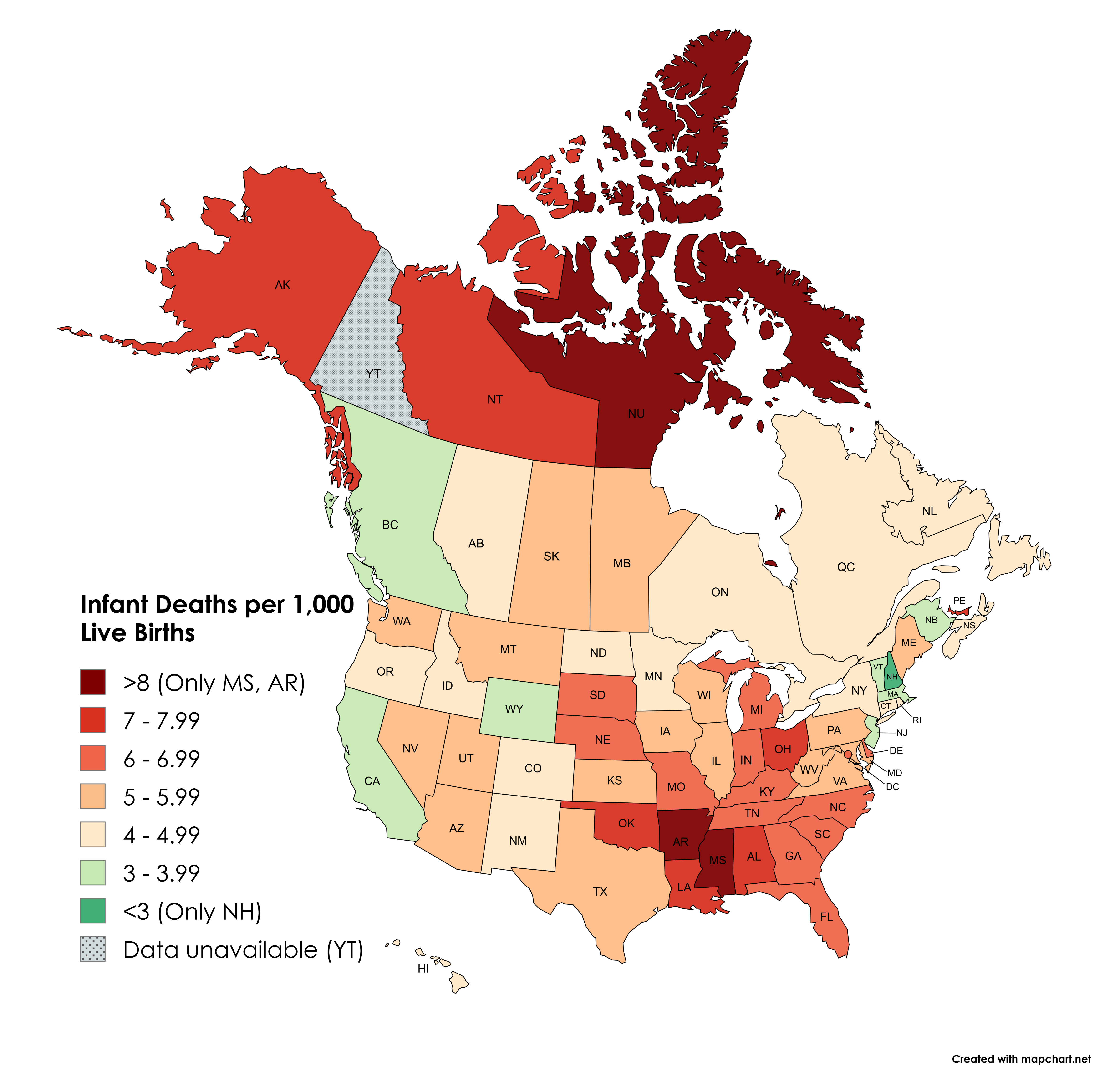
DATA USA: https://www.cdc.gov/nchs/state-stats/deaths/infant-mortality.html (Data from 2023)
DATA Canada: https://www150.statcan.gc.ca/t1/tbl1/en/tv.action?pid=1310007801&pickMembers%5B0%5D=2.1&pickMembers%5B1%5D=4.2&cubeTimeFrame.startYear=2015&cubeTimeFrame.endYear=2015&referencePeriods=20150101%2C20150101 (Data from 2015)
Both data sets define infant mortality as deaths within a year of birth
Tool: Mapchart (https://www.mapchart.net/usa-and-canada.html)
Posted by snakkerdudaniel
25 Comments
DATA USA: [https://www.cdc.gov/nchs/state-stats/deaths/infant-mortality.html](https://www.cdc.gov/nchs/state-stats/deaths/infant-mortality.html) (Data from 2023)
DATA Canada: [https://www150.statcan.gc.ca/t1/tbl1/en/tv.action?pid=1310007801&pickMembers%5B0%5D=2.1&pickMembers%5B1%5D=4.2&cubeTimeFrame.startYear=2015&cubeTimeFrame.endYear=2015&referencePeriods=20150101%2C20150101](https://www150.statcan.gc.ca/t1/tbl1/en/tv.action?pid=1310007801&pickMembers%5B0%5D=2.1&pickMembers%5B1%5D=4.2&cubeTimeFrame.startYear=2015&cubeTimeFrame.endYear=2015&referencePeriods=20150101%2C20150101) (Data from 2015)
Both data sets define infant mortality as deaths within a year of birth
Tool: Mapchart (https://www.mapchart.net/usa-and-canada.html)
EDIT: yes, I should have added NU to the “(Only MS, AR)” label
The first rule about the Yukon is that we don’t discuss what goes on in the Yukon…
Red states are red. Who knew.
Ohio…yeah that checks.
Mississippi back on top!
This pretty much mirrors all the other political/quality of life maps. The only thing that stands out is PEI. Why so bad?
Jesus Christ why commit to the divergent color scheme to measure unipolar data? Again
Northwest Territories and Nunavut is a little surprising… though I guess maybe not. I’m guessing because those places are pretty remote?
Those darned baby-killing liberal states and their…. *checks notes*… significantly lower infant mortality rates.
British Columbia: Canada’s California
Alberta: Canada’s Nevada
Comparing data from 2023 vs 2015 is an interesting choice. Why was that?
Honestly over 8 is horrifically high for any state in a developed country. Russia, which has a much lower GDP per capita, a slightly lower HDI, and is considered a far worse country to live in overall that states like Mississippi is estimated by the CIA factbook to have a IMR of 6.5.
Just wait until all these states pull their vaccine mandates. 🤣
The US counts infant mortality differently than other countries.
If the fetus/baby makes it to 22 weeks, 500 grams, or shows any “signs of life” it is a birth and counts as an infant mortality. Signs of life can even be assisted or frankly imaginary.
Most/all other countries do not follow these standards… they only count babies carried to full term (past 37 (or more) weeks) and those that had unassisted life in their infant mortality stats.
It would be more interesting to compare the current US map to one from the Roe v Wade era, so we can see the impact of abortion bans.
Why does it say “Only MS, AR” if there clearly is a third?
Every US graph ever looks somewhat like this yet those same *red* states keep voting for the same people and expect different results
It says only Mississippi and Arkansas are >8 in the legend but then Nunavut is given the same color.
And here’s [the obesity rate by state](https://www.cdc.gov/obesity/data-and-statistics/adult-obesity-prevalence-maps.html). We know about the complicating factor of obesity in child birth.
Now do maternal deaths.
It’s as if the slave states and the red states hate people.
Funny thing, every map showing bad things has the same SE corner look…
Every time I see a data map, NH just seems like the literal best state in the country.
(Only MS, AR) …and whoops, NU
Turns out abortion is important
What the fuck Arkansas and Missouri?