
“In short, if making monetary policy is like driving a car, then the car is one that has an unreliable speedometer, a foggy windshield, and a tendency to respond unpredictably and with a delay to the accelerator or the brake.” -Ben Bernanke, Dec 2004
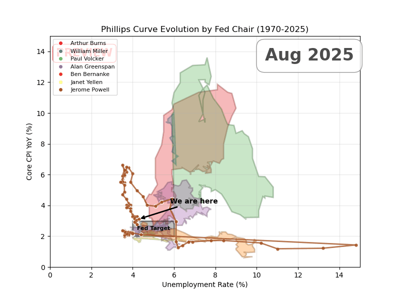
X-axis is unemployment, Y-axis is core CPI
The goal of each Fed chair is to be as close to the target zone as possible. I shaded 2–3% inflation and 4–6% unemployment as the rough ‘target zone’ — 2% is the official goal, and most NAIRU estimates land around 4–6%.
All I can say is, Greenspan truly was the GOAT.
Posted by DataVizHonduran
44 Comments
Source: Fred, Tools: Python and Matplotlib. TIL matplotlib is eons faster than plotly at rendering animations.
Why fill in these shapes? The first and last point for each Fed Chair is unconnected in time and I don’t think the area enclosed by these curves is meaningful.
Greenspan had it easy. Powell has a pretty comparable profile aside from COVID. And Powell had to deal with Trump.
Thanks for sharing this. Would you be able to layer in target rate chanfe with a colour instead of the fed minister
This is one of the better posts I’ve seen recently. Thanks.
It’s not a game where the person who gets closest wins. It’s who can overcome dire economic headwinds and lead the economy through it, as much as getting closest to target.
That’s why Ben Bernanky would have my vote over Alan Greenspan. Led the US out of an incredibly difficult spot.
People don’t have any idea how important a competent independent reserve bank is, look at Türkiye…
Volcker is the goat.
Greenspan didn’t need to do the hard shit he did because Volcker did it.
And for context, raising the fed rate is expected to move the point down and to the right, while lowering the fed rate is expected to move the curve up and to the left.
There is no simple policy that we know of that consistently moves the point down and to the left.
Greenspan and Yellen the only ones to keep it remotely near the box
If anything this is more ammo that the Phillips Curve is a lie
This is beautiful! Why isn’t this how the data is always shown, fantastic job!
Did you also post the static image with boxes representing each Chair’s inflation and unemployment ranges? This is an outstanding follow up. It’s an absolutely great visualization.
I wonder if there is a good fiscal policy follow up. Perhaps the high and low bounds of GDP growth and budget deficit/surplus? They aren’t targets per se like 2% inflation and remaining within the NAIRU but do represent the effectiveness of spending/tax collection well.
Finally, some beautiful data presented in a beautiful way.
This is a great illustration of the maxim “soldiers are always preparing to fight the last war”. Every chair has had very different conditions, and every significant deviation from target has been in a different direction, so the lessons learned from the last one don’t directly apply to the next one.
Cool way to present this data. I might use this idea
Wow this is great! I love the different color segments.
It’s definitely one of the best presentations I have seen!
One small note to make about this visualization is that its using core CPI while the Fed targets core PCE. CPI tends to be overestimate inflation a little bit compared to PCE, so this would look slightly different with PCE vs CPI.
This is truly a first rate post. Well done.
Weird cut but watching this felt like playing Kerbal Space Program with a rocket that’s way too fucking big.
Come on, just keep it on the ~~prograde vector~~ fed target, come on, nearly there, fuck fuck fuck shit fuck dammit fuck, okay we got this, ease it back around, alright, FUCK
I’m ngl, I’m so chronically online that I thought I was looking at CS Spray patterns
Man for all the hate Greenspan got he seemed to do the best over all under him at staying. The target.
Presidenta and congressional acts make huge impacts on the economy. Do not forget who was captaining those behemoth ships.
We actually have good posts today. What is happening?!?!?
Finally some beautiful data
I thought that the Fed only recently put in the 2% inflation target? Around 2008-2013 is when they established it, after the financial crisis.
Volcker was fighting some battles man what a job he did, sorta looking like Powell is going through the same thing
Great job. Very creative way to show this data.
Powell’s handling of COVID was a masterclass
I’d love to see a 3D model and where the z-axis is the Fed funds rate during these data points.
Yellen was really good at it too.
Would love to see recent years too. Nice work.
Excellent visualization. I think it highlights the slippery slide of increasing CPI and transitional decreases in unemployment before full blown curving to higher inflation and unemployment. Looks like Powell successfully navigated back down that “spiral”.
This is awesome. Only critique is I would have left the final state up longer at the end of the animation, but yeah.
Wow.
cool graph! do you have github?
This is one of the best visualizations I’ve ever seen.
If this chart is used to describe the country….
I’m assuming last year(2024) was pretty good?
r/mapmaking just found new inspiration
Question for clarification – where does the 4-6% unemployment rate target come from? I know they are mandated to target “maximum employment”, but didn’t realise it had been formalised into that range.
Very cool. Slow it down a bit and that’s it for me
Surprised about Yellen, actually handled it better than I thought
You can make a lot of money presenting data like this to corporations.
This is a great post. And by the way, we can see that the Phillips curve is anything but a curve
[https://en.wikipedia.org/wiki/Phillips_curve](https://en.wikipedia.org/wiki/Phillips_curve)
Scottish political economist Mark Blyth (I don’t agree with everything he’s said since then, in fact I think he went a little off the deep end since I last looked him up but my point:) coined the term “trumpism” and in one of his talks he explains how we couldn’t have a “trump” without Ben Bernanke. Benjamin did this thing called “quantitative easing”, some of you may remember the 2008 housing crisis an instead of helping the people losing their houses, he saved Fannie Mae & Freddie Mac, all the banks who sold bad loans to people under Glass–Steagall’s repeal – which Clinton repealed. I mean I could go on about how the pandemic was the largest transfer of wealth in history, which wouldn’t be possible without the fed’s incessant need to protect the wealthy and their corporate interests but that doesn’t solve our problems right now today.
We know how they work now and how they operate, we need to get money out of politics. All they care about is money, a general strike would hurt them in their wallets because that’s all they care about. All those Corporate Ceo’s and their bean counters with MBAs love denying you health care or providing a living wage or caring if you have housing, food or an education. People need to stop supporting all the billionaires trying to consolidate power with a russian puppet in the white house. They’re a gang of crooks who never worked a day in their life, I find it difficult to believe they can’t be out organized for normal everyday citizens who care about their communities.
ELI5: why is that the target? I understand that *some* inflation is good, and *some* unemployment is good. But why are those numbers the target? Inflation I understand better than unemployment, so to take it further: why would 3% unemployment be less desirable than 4%? Why is 6% more desirable than 7%?
Follow-up: how does one increase or decrease inflation? How does one increase or decrease unemployment? I understand that outside forces will act upon the system, but why isn’t it as easy as: “if [inflation/unemployment] is too [low/high], automatically [do the thing to counteract it].”?