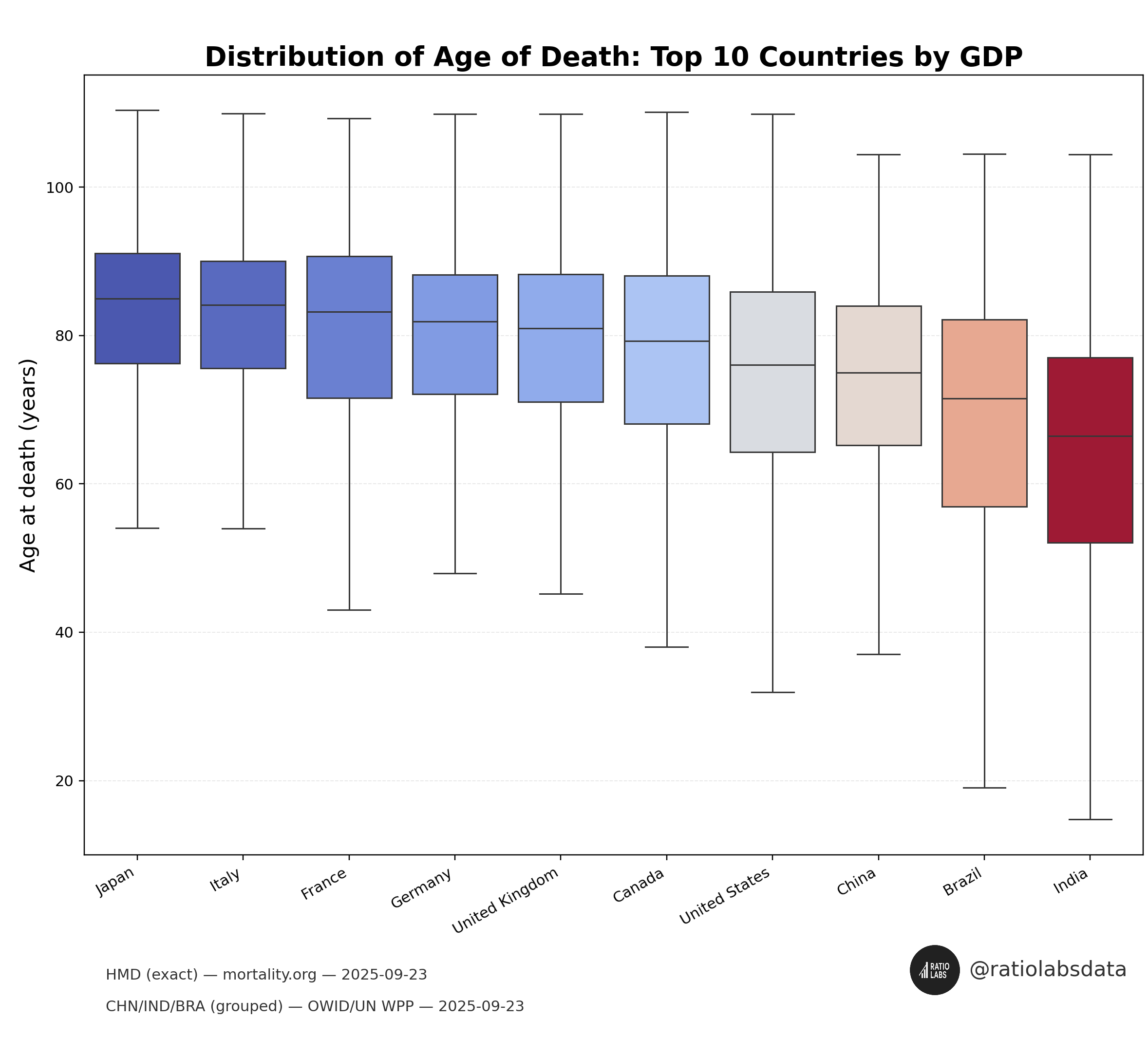
Source: Human Mortality Database (mortality.org); China/India/Brazil grouped from UN World Population Prospects via Our World in Data (ourworldindata.org/grapher/annual-deaths-by-age). Accessed 2025-09-23. Made with seaborn.
Bth-root on
Why have the axis labels and tick labels so tiny when they’re crucial to the data? Otherwise this just looks a like a paint palette.
Lumpy_Dentist_5421 on
Can you explain what the shaded squares and the lines leading of them mean?
In the absence of this, the graph is meaningless.
MasterOfBarterTown on
The highest point of these age whiskers seems very high – like 110+ years? Also people die at all ages from 0 and up, so what is the criteria for the lowest age wisker — ie the beginning of the death ranges?
NeoLearner on
By GDP or GDP/capita? For something like this – which is on a per person basis – I would go off GDP/capita?
redsterXVI on
Are you trying to tell me, nobody below age ~57 has ever died in Japan or Italy?

![[OC] Distribution of Age of Death: Top 10 Countries by GDP](https://www.byteseu.com/wp-content/uploads/2025/09/ubrmx75qwtqf1-1536x1389.png "[OC] Distribution of Age of Death: Top 10 Countries by GDP")
6 Comments
Source: Human Mortality Database (mortality.org); China/India/Brazil grouped from UN World Population Prospects via Our World in Data (ourworldindata.org/grapher/annual-deaths-by-age). Accessed 2025-09-23. Made with seaborn.
Why have the axis labels and tick labels so tiny when they’re crucial to the data? Otherwise this just looks a like a paint palette.
Can you explain what the shaded squares and the lines leading of them mean?
In the absence of this, the graph is meaningless.
The highest point of these age whiskers seems very high – like 110+ years? Also people die at all ages from 0 and up, so what is the criteria for the lowest age wisker — ie the beginning of the death ranges?
By GDP or GDP/capita? For something like this – which is on a per person basis – I would go off GDP/capita?
Are you trying to tell me, nobody below age ~57 has ever died in Japan or Italy?