Life Expectancy Gap Between Indigenous and Non-Indigenous Populations in Australia and Canada, in Years [OC]
Posted by Fluid-Decision6262

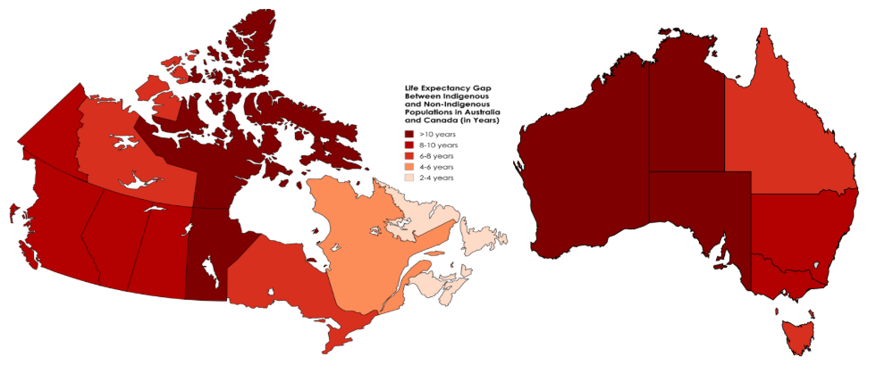
Life Expectancy Gap Between Indigenous and Non-Indigenous Populations in Australia and Canada, in Years [OC]
Posted by Fluid-Decision6262
9 Comments
Oof. Well made for today.
What data are you using here?
Compare to the murder rate for native population in the same regions, it’s the same map. Quebec, Newfoundland and Laborador are doing something right.
I’m not sure if this data is available but I’d be curious to see how the gap changes if the populations are assessed separately based on whether they live in a metropolitan/urban area vs a rural area. Or better yet, see if there’s a correlation between life expectancy and distance to nearest hospital (for both indigenous and non indigenous populations).
[Life Expectancy, Indigenous vs Non-Indigenous (Canada)](https://www150.statcan.gc.ca/t1/tbl1/en/tv.action?pid=1710016001&pickMembers%5B0%5D=1.9&pickMembers%5B1%5D=2.1&cubeTimeFrame.startYear=2016+%2F+2021&cubeTimeFrame.endYear=2016+%2F+2021&referencePeriods=20160101%2C20160101) – 9 years lower for Indigenous people vs Non-Indigenous people nationwide
[Life Expectancy, Indigenous vs Non-Indigenous (Australia)](https://www.abs.gov.au/statistics/people/aboriginal-and-torres-strait-islander-peoples/aboriginal-and-torres-strait-islander-life-expectancy/latest-release#:~:text=Aboriginal%20and%20Torres%20Strait%20Islander%20life%20expectancy,less%20than%20for%20non%2DIndigenous%20females%20(83.8%20years)) – 11 years lower for Indigenous people vs Non-Indigenous people nationwide
Australia and Canada are two countries who share a ton in common with each other, but perhaps the most sobering similarity between the two are the socio-economic discrepancies that both Indigenous peoples continue to face today, even 3+ centuries following the early days of British colonialism in both nations. This is especially omnipresent when it comes to access to healthcare and healthcare-related results like life expectancy.
While Canada and Australia have two of the highest life expectancies in the world from nationwide perspective, the same cannot be said for the Indigenous people in both nations.
**Life Expectancy Gap in Australia between Indigenous vs Non-Indigenous (in years):**
1. Northern Territory (15.4 years)
2. South Australia (13 years)
3. Western Australia (12.6 years)
4. New South Wales (8.6 years)
5. Victoria (8.4 years)
6. Queensland (7.8 years)
7. Tasmania (7.5 years)
**Life Expectancy Gap in Canada between Indigenous vs Non-Indigenous (in years):**
1. Nunavut (11.5 years)
2. Manitoba (11 years)
3. Yukon (9.3 years)
4. Alberta (9 years)
5. British Columbia (8.3 years)
6. Saskatchewan (8.1 years)
7. Ontario (7.8 years)
8. Northwest Territories (7.5 years)
9. Quebec (4 years)
10. Atlantic Provinces (2.1 years)
Because the ones in Australia drink themselves to death. Sure stats might be correct but there’s reasons behind it. They get the same health care, before white Australians.
Nice map, I’d be interested to see this broken down further into health regions, and with a comparison to overall life expectancy.
Like the maritimes do well here but why? I first assumed that they had lower life expectancy across the board but that’s incorrect so I’m not sure – maybe they really do have more equitable healthcare systems?
Quebec also seems to do well here but then again northern Quebec (which has a large indigenous population) has the absolute lowest life expectancy in Canada at 66 (!).
Overall rural areas with large indigenous populations have the worst healthcare outcomes (and like.. shamefully bad) but I’m curious if the *differences* in life expectancy are most pronounced there or in urban areas, which is a little hard to say from this map.
It’s interesting to me that for Canada at least the map also roughly translates to the proportion of population that’s indigenous. There are very few in the Atlantic provinces whereas they make up a much larger percentage of the population in Manitoba and the NWT.
Quebec is lowest because they have had 200 more years to get with the program.
Are indigenous people doing relatively well in Newfoundland, or is it the other thing.