And this is where someone I know will take credit for the cease fire..
imaginary_num6er on
If the western nations were smart, they would just rotate their vetos so it helps them politically internationally and domestically
Unique_Carpet1901 on
Wish there was more info on what resolution is being proposed on each ballot.
Sheyvan on
My Red Green Colorblindness hates this.
Extension_Wheel9540 on
So 7 out of 9 Non adopted decisions are solely due to one of the permanent UN members decided to give 🔴 cause of rivalry.
royalhawk345 on
So the November 20th one was proposed collectively?
DynamicHunter on
Name a more useless organization than the UN. You know, the collective that was supposed to maintain world peace after WW2?
halberdierbowman on
This is beautiful, but I think a significantly stronger visualization would be a spreadsheet.
With rows and columns, it would be very easy to parse this data. You’d be able to compare how each country voted by looking at its row, and you’d be able to compare how each vote went by looking at its column.
As for represention, you’d be able to use symbols or text rather than colors, making it easier for everyone to read without needing the legend, but especially so for color blind people. Also, you’d be able to record a much larger part of the visual to the data that actual matters: the votes. Currently, the overwhelming majority of the chart is spend on showing extraneous information, like repeating each country’s flag, even though the order stays consistent the entire time. Even just swapping this chart to put the flag labels in the tiny circles and the vote colors into the pie segments would be a nice upgrade.
any_old_usernam on
I do kinda wish the flags for the E10 were shown as well, especially for the Nov 2024 resolution.
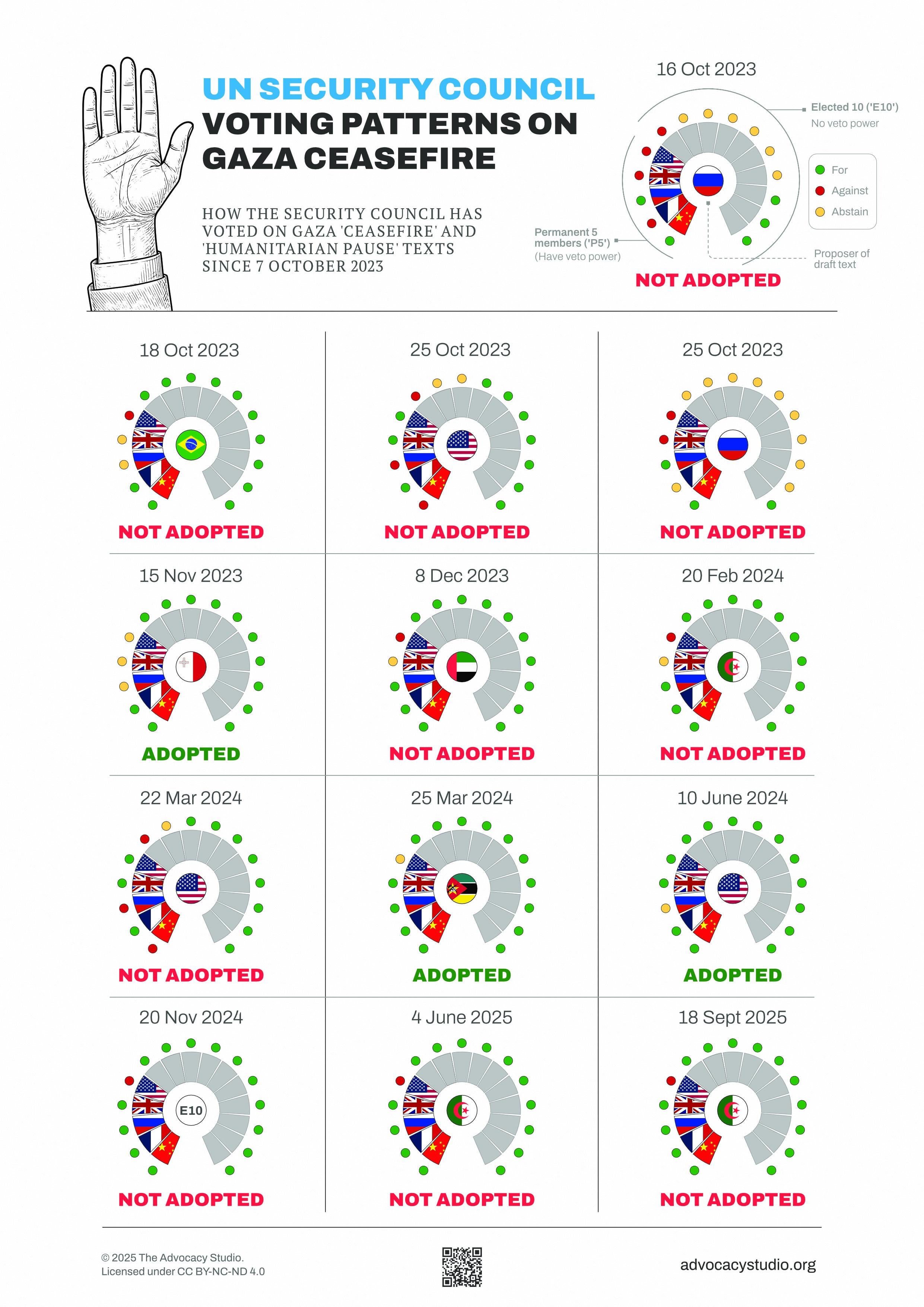

![How the UN Security Council has voted on Gaza 'ceasefire' resolutions [OC]](https://www.byteseu.com/wp-content/uploads/2025/10/jnlzq4rfzssf1-1086x1536.jpeg "How the UN Security Council has voted on Gaza ‘ceasefire’ resolutions [OC]")
9 Comments
And this is where someone I know will take credit for the cease fire..
If the western nations were smart, they would just rotate their vetos so it helps them politically internationally and domestically
Wish there was more info on what resolution is being proposed on each ballot.
My Red Green Colorblindness hates this.
So 7 out of 9 Non adopted decisions are solely due to one of the permanent UN members decided to give 🔴 cause of rivalry.
So the November 20th one was proposed collectively?
Name a more useless organization than the UN. You know, the collective that was supposed to maintain world peace after WW2?
This is beautiful, but I think a significantly stronger visualization would be a spreadsheet.
With rows and columns, it would be very easy to parse this data. You’d be able to compare how each country voted by looking at its row, and you’d be able to compare how each vote went by looking at its column.
As for represention, you’d be able to use symbols or text rather than colors, making it easier for everyone to read without needing the legend, but especially so for color blind people. Also, you’d be able to record a much larger part of the visual to the data that actual matters: the votes. Currently, the overwhelming majority of the chart is spend on showing extraneous information, like repeating each country’s flag, even though the order stays consistent the entire time. Even just swapping this chart to put the flag labels in the tiny circles and the vote colors into the pie segments would be a nice upgrade.
I do kinda wish the flags for the E10 were shown as well, especially for the Nov 2024 resolution.