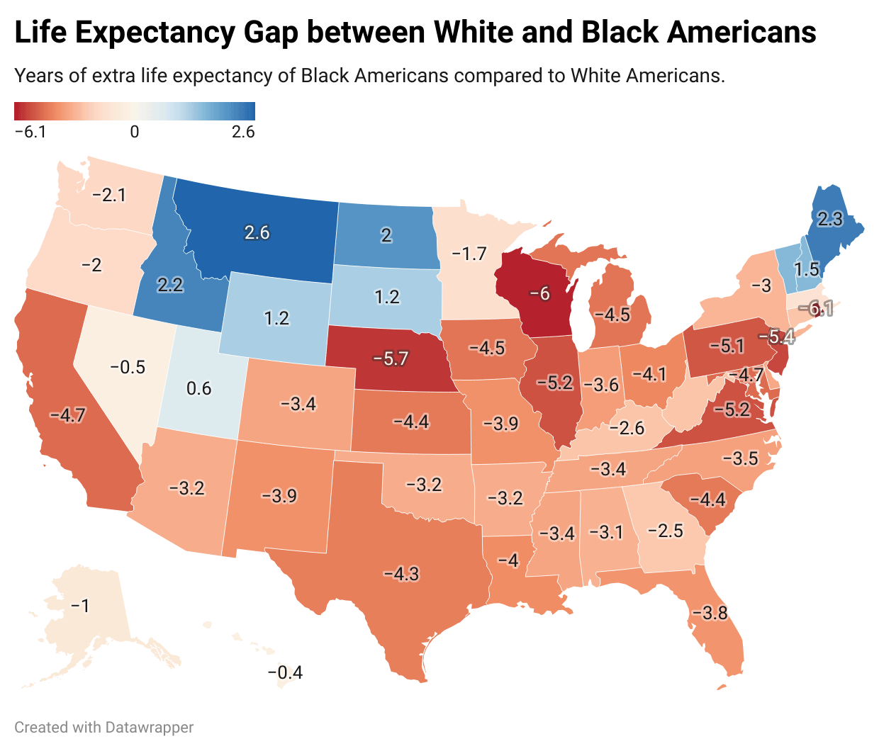
Northern New England and the Northern Rockies/Great Plains areas don’t really have violent hoods like how the other states do. That in itself is a major mortality risk for black people, who are often the victims there. Another possibility might be access to food in those areas. Black people in those areas also tend to know how to hunt or farm, or they don’t have the same worries about food deserts as a black person in the South or an inner city might. That means more nutritious food and less processed junk foods in their diet.
They also are sparsely populated by black people, so a few of them that are living well will make a significant change to the rates.
Although, I have 0 idea why Nebraska is so negative.
AwareLaw0 on
Montana has less than **7,000** black people…in the entire state. 0.6% of the population. The state is 89% white.
This is like saying my emissions from private jet travel is 0 lmao
314per on
A different map!
It’s the US with data about something but the colours are in different places!
😲😲😲
BC_explorer1 on
the blue states here are obviously noise
beingblunt on
I wonder what this would look like without homicides included.
thestraycat47 on
Data for DC isn’t shown and it’s not looking good.
ManufacturerVivid164 on
Wow, it looks like the safest place for black people is among white republicans. Who knew?
13588jdjdjdjdf on
Black and Hispanic women live longer than white men. The difference in life expectancy is stark when comparing women to men. The most profound difference is comparing white women to black men when the life expectancy gap is the highest.
My guess is that a higher percentage of black people moved to those states specifically for jobs and tend to be higher income.
thicksalarymen on
Wisconsin what’s going on…
dancingbanana123 on
Looking at this made me realize something: if you’re a researcher trying to figure out if race plays a significant role in someone’s ability to survive a disease, or maybe just survive illness as they age in general, how would you go about setting up that study while making sure to adjust for social impacts in a country like the US, with historic issues like red zoning and such? Like there *are* diseases where race plays a significant role, but how do you actually adjust for that?
lil_jordyc on
What is going on in Wisconsin
Edit: and Rhode Island
Legendary_Lamb2020 on
There are so few Black people in Montana, and the only time I cross paths with them are in the cities near our handful of full sized hospitals. But I think the data set is so small its uninformative.
Aaron_Hamm on
After looking at this map I’m super curious how much of this comes from white people being less concentrated in cities
Timely-Group5649 on
Those blue states don’t count.
You cannot extrapolate this statistic in states that have fewer than a dozen POC at any one time.
EndorphnOrphnMorphn on
This feels like a poor visualization to me. If the vast majority of the country has a longer life expectancy for white americans than black americans, why show a map of “here’s where and how much black americans live longer” with mostly negative numbers? Why not just invert the map?
BicarbonateBufferBoy on
California being worse than literally every southern state
YoRt3m on
The question is, does the gap grow because 1 thing is higher or lower than usual? or both sides are going to 2 different directions? like, who’s at fault for the gap?
Blade_Shot24 on
Wonder if folks are aware of the history of the Great migration
DigitalArbitrage on
OP was obviously trying to make this into a political argument by choosing red and blue. The states that showed up as red and blue are just different than expected.
nuke_em_danno on
Proves that Like expectancy is correlated with population density.
Groundblast on
So, I’m pretty sure I can explain this one.
The blue states are all relatively or very rural. Also, they are the furthest away from the core of the southeast (at least by difficulty of travel, boats helped a lot prior to automobiles) and have an extremely different climate.
Only richer people could afford to move there. Lots of people from the south wouldn’t event want to move there. So, the black people in those states were probably more wealthy to begin with and most likely chose to move there because of a significant economic opportunity. No one in Georgia moves to Montana to be a janitor.
There’s also the fact that rural life is dangerous. Accidents, exposure to chemicals, and lack of access to healthcare all shorten life expectancy.
So, you have factors lowering life expectancy for white people and massively raising it for black people.

![[OC] Life Expectancy Gap between White and Black Americans](https://www.byteseu.com/wp-content/uploads/2025/10/m9jp6i3wsitf1-1024x875.png "[OC] Life Expectancy Gap between White and Black Americans")
25 Comments
Very few black people in the blue states
Source Data. https://en.wikipedia.org/wiki/Race_and_health_in_the_United_States#Life_expectancy
Northern New England and the Northern Rockies/Great Plains areas don’t really have violent hoods like how the other states do. That in itself is a major mortality risk for black people, who are often the victims there. Another possibility might be access to food in those areas. Black people in those areas also tend to know how to hunt or farm, or they don’t have the same worries about food deserts as a black person in the South or an inner city might. That means more nutritious food and less processed junk foods in their diet.
They also are sparsely populated by black people, so a few of them that are living well will make a significant change to the rates.
Although, I have 0 idea why Nebraska is so negative.
Montana has less than **7,000** black people…in the entire state. 0.6% of the population. The state is 89% white.
This is like saying my emissions from private jet travel is 0 lmao
A different map!
It’s the US with data about something but the colours are in different places!
😲😲😲
the blue states here are obviously noise
I wonder what this would look like without homicides included.
Data for DC isn’t shown and it’s not looking good.
Wow, it looks like the safest place for black people is among white republicans. Who knew?
Black and Hispanic women live longer than white men. The difference in life expectancy is stark when comparing women to men. The most profound difference is comparing white women to black men when the life expectancy gap is the highest.
https://www.cdc.gov/mmwr/preview/mmwrhtml/mm6335a8.htm
Is that really a racial thing or a poverty thing
My guess is that a higher percentage of black people moved to those states specifically for jobs and tend to be higher income.
Wisconsin what’s going on…
Looking at this made me realize something: if you’re a researcher trying to figure out if race plays a significant role in someone’s ability to survive a disease, or maybe just survive illness as they age in general, how would you go about setting up that study while making sure to adjust for social impacts in a country like the US, with historic issues like red zoning and such? Like there *are* diseases where race plays a significant role, but how do you actually adjust for that?
What is going on in Wisconsin
Edit: and Rhode Island
There are so few Black people in Montana, and the only time I cross paths with them are in the cities near our handful of full sized hospitals. But I think the data set is so small its uninformative.
After looking at this map I’m super curious how much of this comes from white people being less concentrated in cities
Those blue states don’t count.
You cannot extrapolate this statistic in states that have fewer than a dozen POC at any one time.
This feels like a poor visualization to me. If the vast majority of the country has a longer life expectancy for white americans than black americans, why show a map of “here’s where and how much black americans live longer” with mostly negative numbers? Why not just invert the map?
California being worse than literally every southern state
The question is, does the gap grow because 1 thing is higher or lower than usual? or both sides are going to 2 different directions? like, who’s at fault for the gap?
Wonder if folks are aware of the history of the Great migration
OP was obviously trying to make this into a political argument by choosing red and blue. The states that showed up as red and blue are just different than expected.
Proves that Like expectancy is correlated with population density.
So, I’m pretty sure I can explain this one.
The blue states are all relatively or very rural. Also, they are the furthest away from the core of the southeast (at least by difficulty of travel, boats helped a lot prior to automobiles) and have an extremely different climate.
Only richer people could afford to move there. Lots of people from the south wouldn’t event want to move there. So, the black people in those states were probably more wealthy to begin with and most likely chose to move there because of a significant economic opportunity. No one in Georgia moves to Montana to be a janitor.
There’s also the fact that rural life is dangerous. Accidents, exposure to chemicals, and lack of access to healthcare all shorten life expectancy.
So, you have factors lowering life expectancy for white people and massively raising it for black people.