Data: CDC (https://www.cdc.gov/nchs/data-visualization/state-life-expectancy/index\_2021.htm)
Tool: Mapchart (https://www.mapchart.net/usa.html)
Posted by snakkerdudaniel

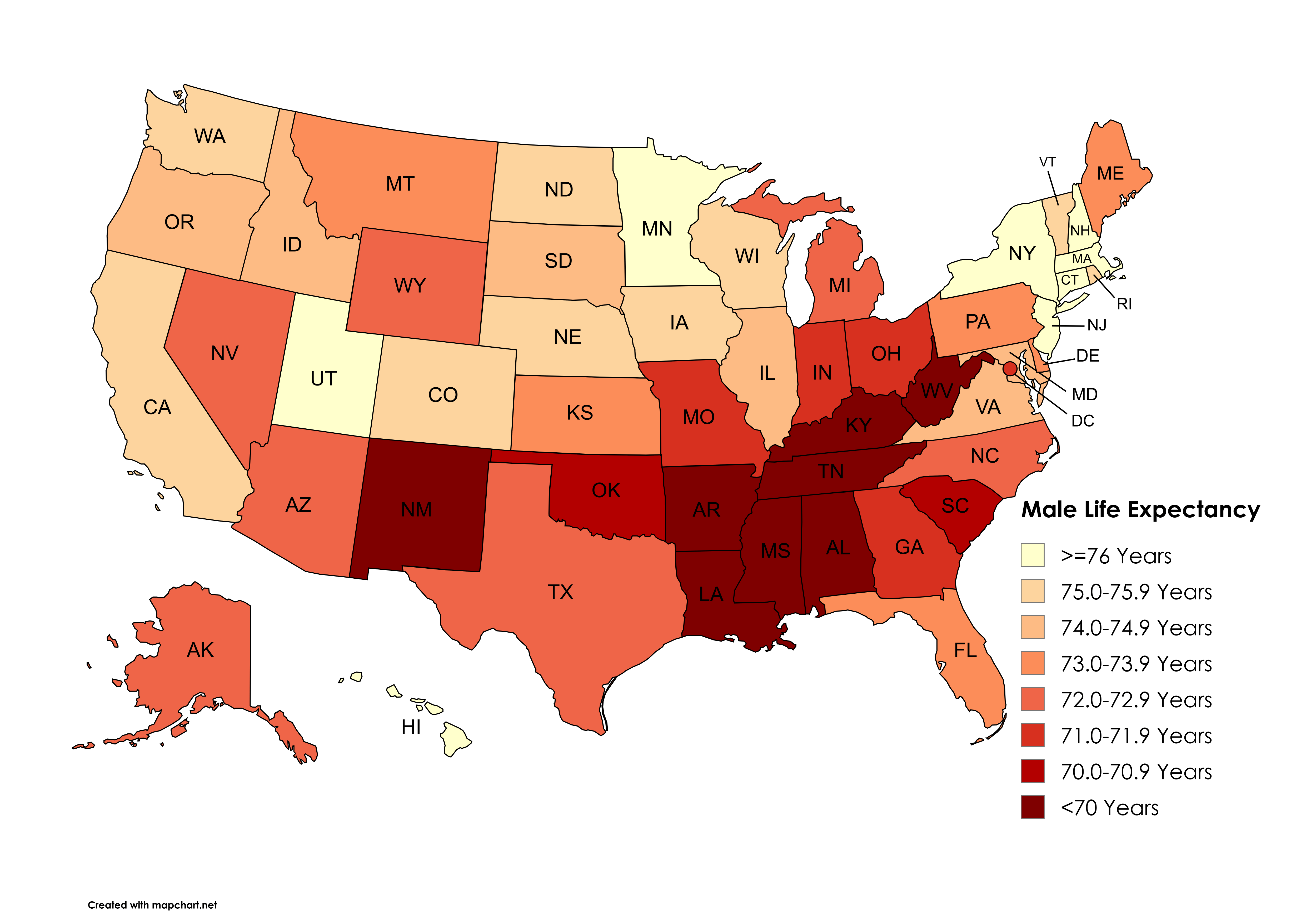
![[OC] Male Life Expectancy by State (2021)](https://www.byteseu.com/wp-content/uploads/2025/10/k86ssmx5zrtf1-1536x1075.png "[OC] Male Life Expectancy by State (2021)")
Data: CDC (https://www.cdc.gov/nchs/data-visualization/state-life-expectancy/index\_2021.htm)
Tool: Mapchart (https://www.mapchart.net/usa.html)
Posted by snakkerdudaniel
18 Comments
Data: CDC ([https://www.cdc.gov/nchs/data-visualization/state-life-expectancy/index_2021.htm](https://www.cdc.gov/nchs/data-visualization/state-life-expectancy/index_2021.htm))
Tool: Mapchart ([https://www.mapchart.net/usa.html](https://www.mapchart.net/usa.html))
People make a lot of jokes about New Jersey, but almost every one of these maps makes me feel like, “huh. Maybe that’s the direction to go.”
This is the same as the obesity map and education maps. More fast food, poor health care, lack of education on health in general. More die
These pictures need to be banned. At least bring in some other variable, *anything*, whether it’s income, race, or beaver population.
Like, thank you, I know black people and natives have low life expectancies, but this map causes people to just assume it’s political affiliation.
Ugh this is depressing to see at 41
I’m guessing Utah is partially due to Mormons abstaining from alcohol, so you’d see less chronic illness from that and fewer automotive fatalities.
Australia 2021-23: 81.1. All six states over 80 but Northern Territory 76.4.
In a normal year the US will have higher numbers but Covid hit them hard in 20-21.
[deleted]
I wonder how Florida would fair if they only did native Floridians and excluded anyone who moved there when they were already old, which may skew the average life expectancy upwards.
Across the board, the South drags down the US and not just related to this instance.
It’s always the same map of the Confederacy.
https://preview.redd.it/grc9hsda8stf1.jpeg?width=1080&format=pjpg&auto=webp&s=8ccfe7f340415fcf5f2b4ee51bbaa437427f0ed0
Imma just put this here
Is this for people born today or people at that age already?
My family genetics doing it’s best to keep NY’s numbers down.
Oh look another US map that looks the same!
So you’re saying more wives and more lakes
If you move from a low state to a high state when you’re 69, then move back to a low state when you’re 75, you will live forever.
Too difficult to discern the shades of orange.