
![[OC] Population Growth of New York and Texas Metro Areas (2022-2024)](https://www.byteseu.com/wp-content/uploads/2025/10/70fzuxu2ivtf1-1536x668.png "[OC] Population Growth of New York and Texas Metro Areas (2022-2024)")
Graphic by me, created in Excel using Census Bureau data here: https://www.census.gov/data/tables/time-series/demo/popest/2020s-total-metro-and-micro-statistical-areas.html
I created this graphic to highlight the stark difference in population trends between these two states, using the most recent two years of data.
What do you think is responsible for these differences? Will these trends continue?
Posted by TA-MajestyPalm
5 Comments
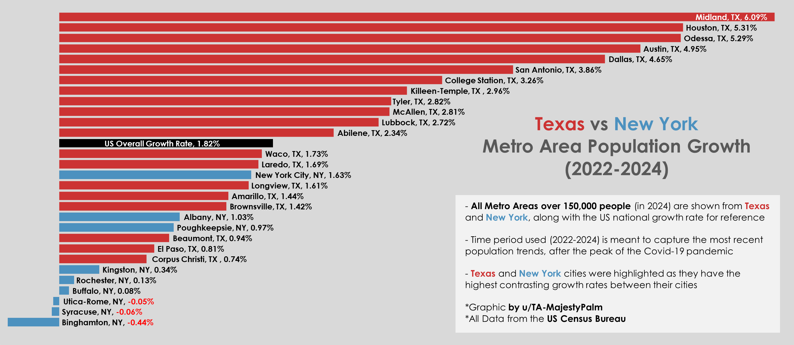
Graphic by me, created in Excel using Census Bureau data here: https://www.census.gov/data/tables/time-series/demo/popest/2020s-total-metro-and-micro-statistical-areas.html
I created this graphic to highlight the stark difference in population trends between these two states, using the most recent two years of data. I included the overall population growth of the entire US for reference.
What do you think is responsible for these differences? Will these trends continue?
Buffalo and Albany aren’t really part of the new york metropolitan area. The official area includes many counties in new jersey, which have grown in recent years.
It’s two fold
1. Businesses that don’t require highly skilled workers like red states for business friendly and worker hostile environments
2. Texas is cheap to live in, drawing people who need housing and can’t afford it in more desirable areas
There are (currently) roughly 85 times the amount of people in NYC than Tyler, TX. So I find the data at most, morbidly curious
Here’s a PSA to those hell-bent to live on top of the oil patch, and especially in fragrant Midland.
If you have a history of cancer in your family, particularly bladder cancer, you might want to periodically get screened for the omnipresent Benzene.
It’s not that the other VOC’s you’re inhaling aren’t bad(they are).
It’s that Benzene is one of the most potent carcinogens released in fossil production and refining.
It’s why we now pump our own gas(except OR and NJ) to socialize the exposure.