
![Public Sector Employment Share [OC]](https://www.byteseu.com/wp-content/uploads/2025/10/ksi8cuuri5vf1-1024x755.png "Public Sector Employment Share [OC]")
Visualization by OptiGnos, a public service tool I created in React (frontend) and Python (backend).
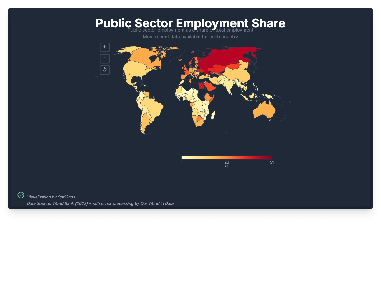
Data Source: World Bank (2022) – with minor processing by Our World in Data
From latest data available in this study, US employed 12.9% of its workforce in the public sector, vs. 34% in Denmark, 21% in Canada, and 44.9% in Russia.
Posted by Odd_Bit268
5 Comments
Click [link](https://www.optignos.com/topic/share/Public%20Sector%20Employment%20Share/4236309633/0576d270-4395-4d6b-a89c-b8d7c49f488f) to show top20/bottom20 bar charts or trend graphs from this same dataset.
Russia being 50% is crazy. how much of that is just the military vs regular government services?
I wonder how much of this is taken up with public health/education depending on how those staff are classified.
My 2 cents: can you use all the screen width for the plot? It seems theres a lot of wasted space and I have to zoom to see the chart from mobile
I want to see the data in Brazil