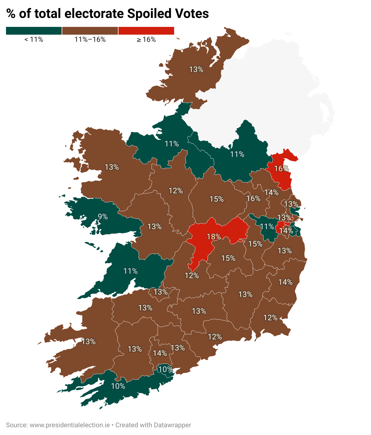
Percentage of spoilt votes per turnout in the recent Irish Presidential Election [OC]
Posted by Stressed_Student2020

![Percentage of spoilt votes per turnout in the recent Irish Presidential Election [OC]](https://www.byteseu.com/wp-content/uploads/2025/10/b8r57x8aaoxf1-872x1024.png "Percentage of spoilt votes per turnout in the recent Irish Presidential Election [OC]")
Percentage of spoilt votes per turnout in the recent Irish Presidential Election [OC]
Posted by Stressed_Student2020
6 Comments
What is going on in Ireland that 10 percent of votes not counting is normal?
Weird ranges with 11-16 and greater than or equal to 16.
What is with the color ranges? It feels both incredibly arbitrary and incredibly specific.
It bothers me that the title of the post and the chart use different spellings:
Spoiled / spoilt
The color mapping here might be literally the least color-blind friendly mapping I’ve ever seen.
I think the labelling of “% of total electorate” is wrong here, it’s only the % of the electorate that turned up to vote. There are c.3.4m registered voters, and 200k spoiled their votes, indicating around 6% of the total electorate.