
![Hurricane Melissa Wind Speed [OC]](https://www.byteseu.com/wp-content/uploads/2025/10/71rtaybrdpxf1-1024x920.png "Hurricane Melissa Wind Speed [OC]")
Data Source: HWRF data from the NCEP NOMADS server
Analysis Tools: Python and ParaView
Data link: https://nomads.ncep.noaa.gov/pub/data/nccf/com/hwrf/
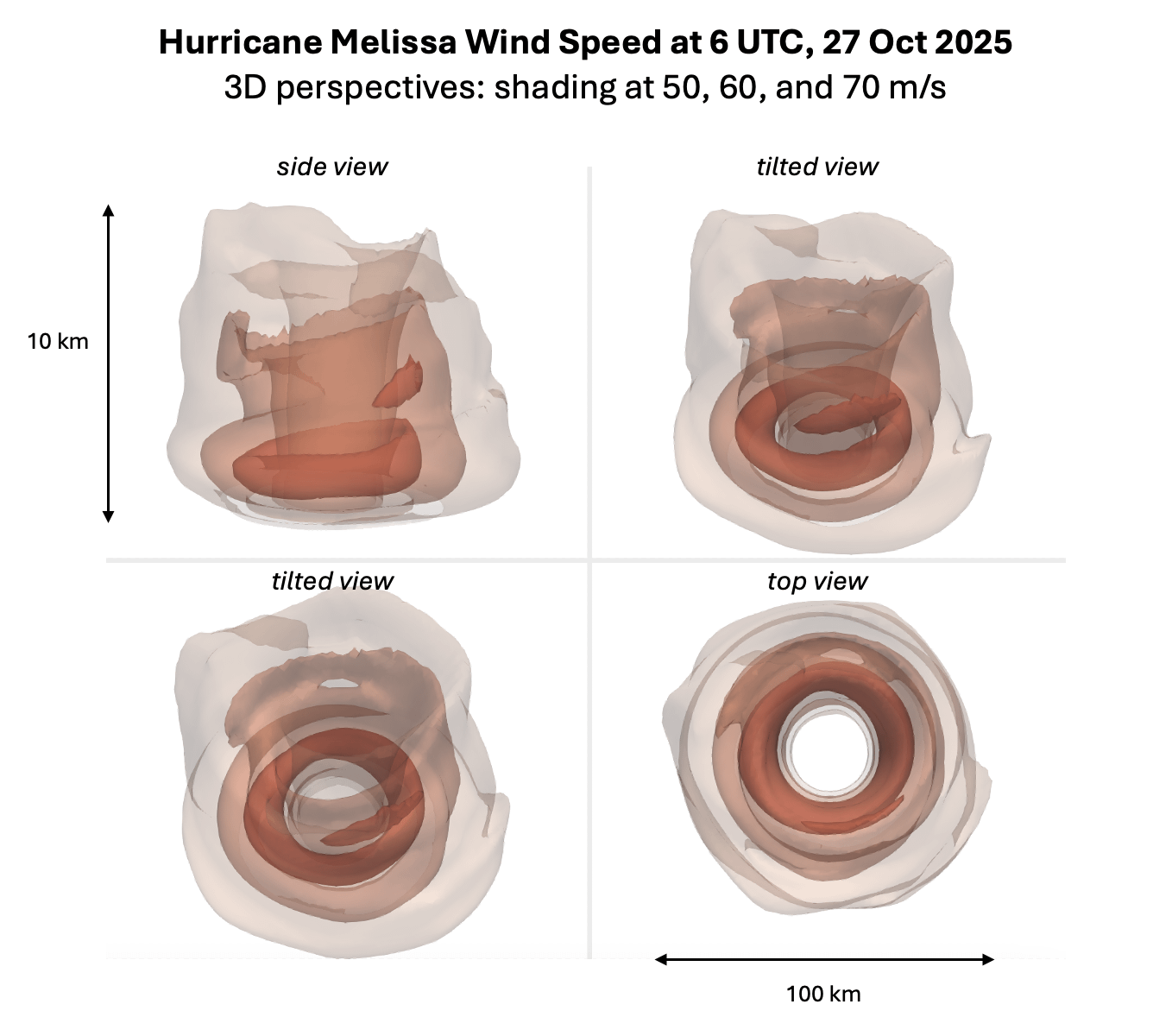
This image shows 3 isosurfaces of wind speed (50, 60, and 70 m/s) from a side view at the upper left, rotating to an overhead view in the bottom right. The data is from the initial conditions (zero hour forecast) of the HWRF model.
This will be a devastating event for Jamaica, Haiti and the Dominican Republic, Eastern Cuba, and the Southeast Bahama & Turks and Caicos. Please see hurricanes.gov for forecast and impact information.
Mathew Barlow
Professor of Climate Science
University of Massachusetts Lowell
Posted by Mathew_Barlow
23 Comments
Your data looks like dog poop.
Not the most intuitive or informative visual to be quite honest. What exactly are we looking at and what does it mean? You provided a brief description with the post but it should be integrated into the visual as much as possible.
This is incredible, both the data itself and the visualization!
Cool visual representation. No legend tho, so bad job.
I wonder how far above ground level that reddest donut starts
https://preview.redd.it/odyvr2u4hpxf1.png?width=1600&format=png&auto=webp&s=7b5b185d773944b0cb9340e640fbbad2eb744adf
Hurri Cane
Is it squished from a 10:1 wide thing to a 1:1 to fit in the square-ish display boxes, or am I misreading the scale?
I’m sad the crew that flew through Melissa to get this data will be replaced with a Sharpie next week.
This looks like one of those devices medical students use to practice measuring a dilated cervix during childbirth.
Where can I buy the top down view? asking for a friend.
Either way we are 💯 cooked
These look like how my guts feel after too many hurricanes.
I thought this was 3d view of shit in large intestine
Why choose these colours? It looks like an CT-scan of Melisa
Girl, That’s a booty hole.
The two tilted views are not very clear, if you put an xyz arrow set tilted and scaled accordingly, in the bottom left corner of each one, I think it’d end up being easier to interpret.
This looks like a colonoscopy visualization.
left a hurricane melissa in my toilet this morning.
r/dataisterrifying (for Jamaica and Haiti at least)
50, 60 and 70 meters/sec = 112, 134 and 156 miles per hour
Finally some beautiful data
This is an incredible visualization, how do you use this type of modeling in your research? (aside from science communication)
In today’s edition of hurricane or large intestine….
And this is supposed to sit on Jamaica and move slowly…