The data may be beautiful, but the context is missing.
Is anyone able to explain what is being portrayed by this wonderful graphic?
MahaloMerky on
Bro reposted and still provided no context.
62JaCrispy on
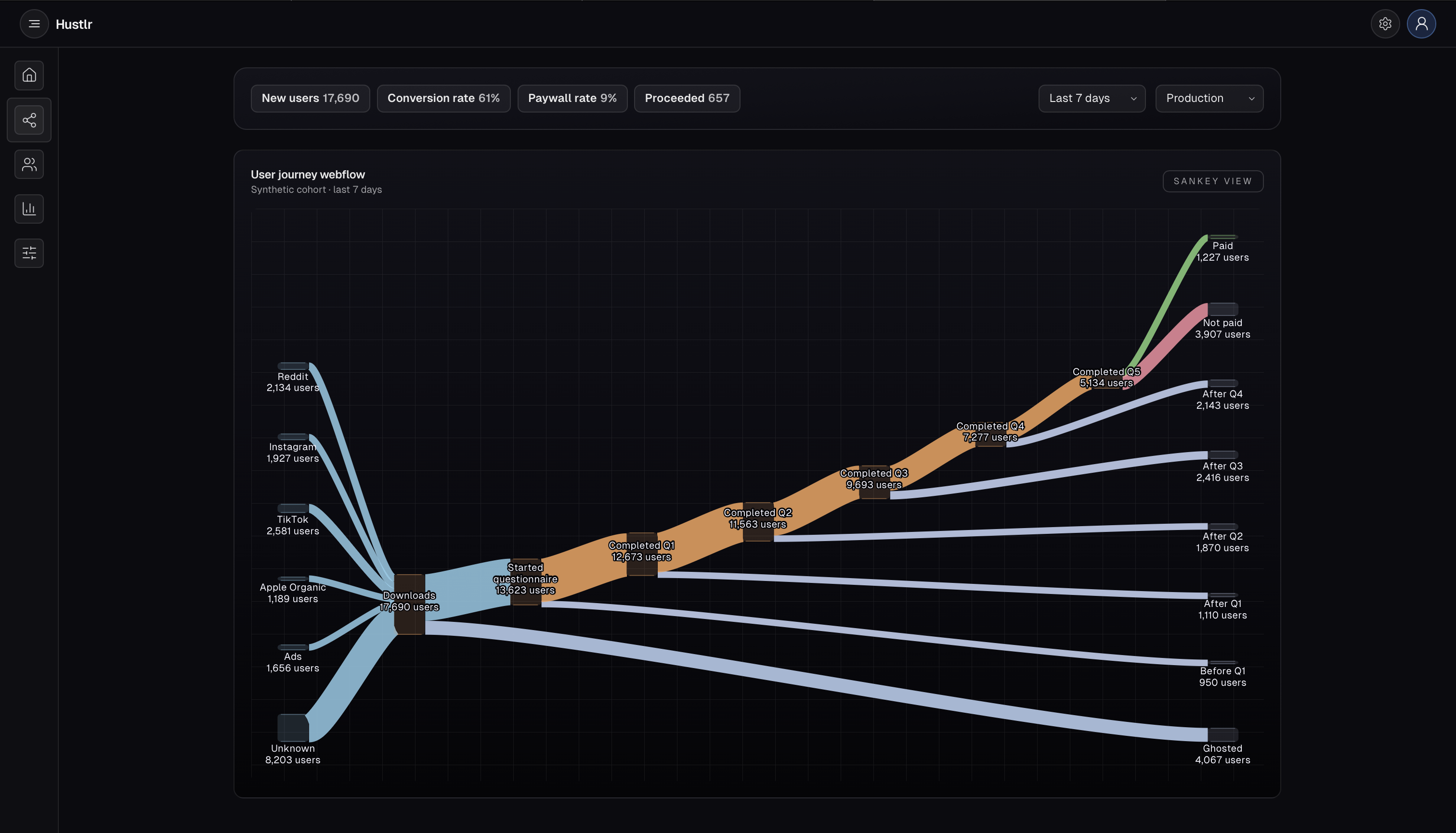
I think part of the problem is OP not explaining what is meant by the term onboarding. Often the same terms are used in different contexts.
For example: When I got hired for a job, the HR department had me through a process they called onboarding… getting email, security tag photos etc. So this is where my brain went. Clearly the context is different here but it is not explained.
After some time and reading comments- I think he means ..
I built an app and put it out for people to download from different platforms. Here is how it converted to people purchasing the app.
Second unrelated suggestion…wouldn’t it also be meaningful to provide percentages as a metric of success. Just stating you got 1200 purchases doesn’t mean much. I mean if you get 1200 purchases off 2000 downloads – thats awesome. If you get 1200 purchases off 1 million downloads, you might need to make a new app.
I know the reader could get the percentage from doing the calculations presented in the graphic, but when presenting data as a graphic the point is for people to be able to look at it and reach a meaningful conclusion, not to make people look through the graphic to do their own calculations to make conclusions.
My two cents.
clownyfish on
Again OP does not give the tool used to create the vis. Rule 3
Cero_Kurn on
different number of questionnaires its always a problem
a trick is combining them so there are less and putting the less critical ones after the paying process.
also, make sure all of them are absolutely necessary. dont ask info that’s not critically important for the app.
just cuz u CAN ask for that data doesnt mean you should

![[OC] User journey through my onboarding](https://www.byteseu.com/wp-content/uploads/2025/10/7x9qmmjhyjxf1-1536x880.png "[OC] User journey through my onboarding")
5 Comments
The data may be beautiful, but the context is missing.
Is anyone able to explain what is being portrayed by this wonderful graphic?
Bro reposted and still provided no context.
I think part of the problem is OP not explaining what is meant by the term onboarding. Often the same terms are used in different contexts.
For example: When I got hired for a job, the HR department had me through a process they called onboarding… getting email, security tag photos etc. So this is where my brain went. Clearly the context is different here but it is not explained.
After some time and reading comments- I think he means ..
I built an app and put it out for people to download from different platforms. Here is how it converted to people purchasing the app.
Second unrelated suggestion…wouldn’t it also be meaningful to provide percentages as a metric of success. Just stating you got 1200 purchases doesn’t mean much. I mean if you get 1200 purchases off 2000 downloads – thats awesome. If you get 1200 purchases off 1 million downloads, you might need to make a new app.
I know the reader could get the percentage from doing the calculations presented in the graphic, but when presenting data as a graphic the point is for people to be able to look at it and reach a meaningful conclusion, not to make people look through the graphic to do their own calculations to make conclusions.
My two cents.
Again OP does not give the tool used to create the vis. Rule 3
different number of questionnaires its always a problem
a trick is combining them so there are less and putting the less critical ones after the paying process.
also, make sure all of them are absolutely necessary. dont ask info that’s not critically important for the app.
just cuz u CAN ask for that data doesnt mean you should