blog post with code and analysis: https://aaronjbecker.com/posts/comparing-child-share-population-1990-vs-2024-by-state/ (repost due to technical issue earlier)
Posted by aar0nbecker

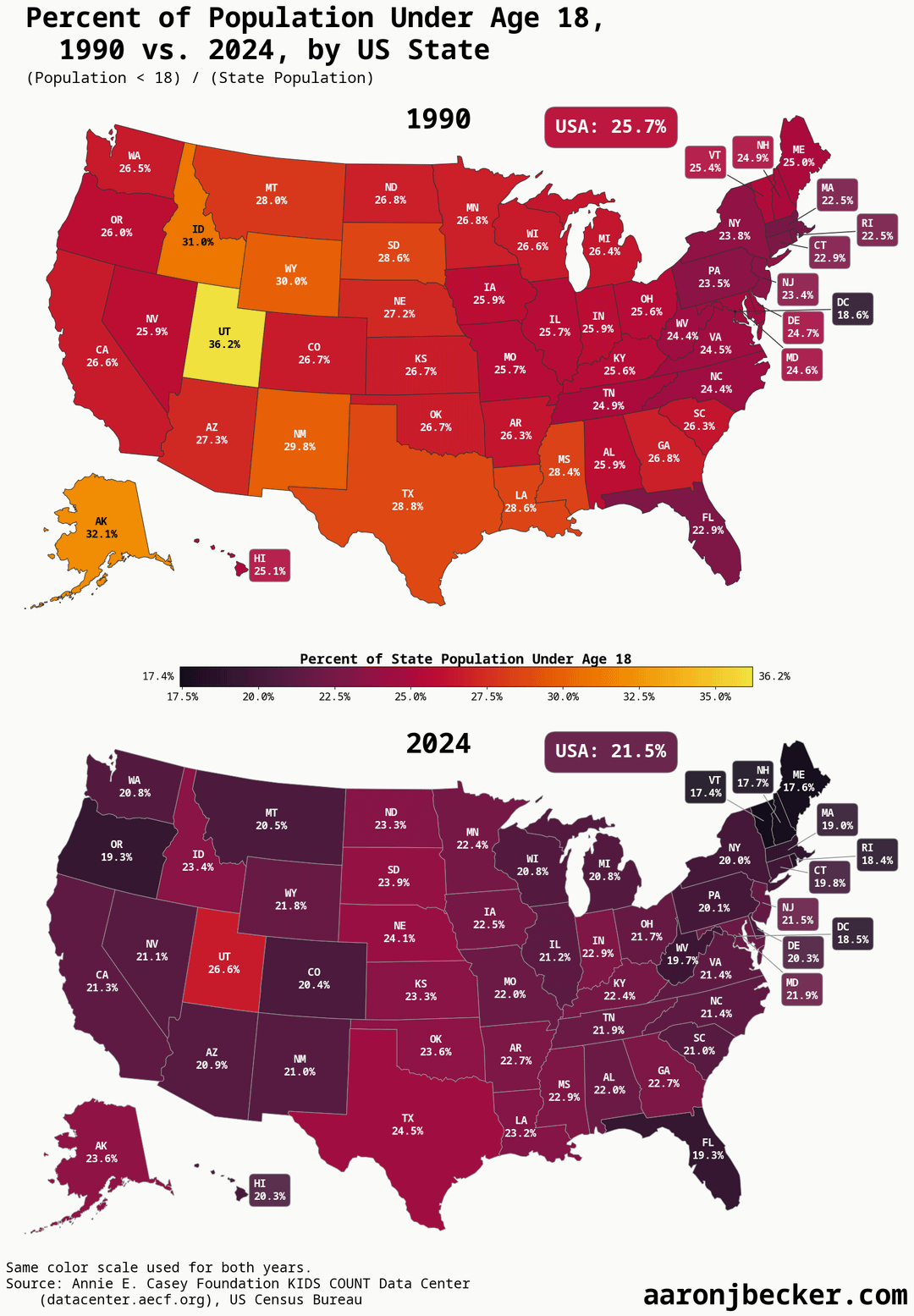
![percent of population under 18 by US state, 1990-2024 (swipe for time series) [OC]](https://www.byteseu.com/wp-content/uploads/2025/10/8cujm8z15yxf1-1067x1536.png "percent of population under 18 by US state, 1990-2024 (swipe for time series) [OC]")
blog post with code and analysis: https://aaronjbecker.com/posts/comparing-child-share-population-1990-vs-2024-by-state/ (repost due to technical issue earlier)
Posted by aar0nbecker
25 Comments
Data source: [US Census Bureau intercensal estimates analyzed by Annie E Casey Foundation KIDS COUNT Data Center](https://datacenter.aecf.org/data/tables/99-total-population-by-child-and-adult-populations?loc=1&loct=1#detailed/2/2-53/false/1096,1/39,40,41/416,417)
Tools: python, jupyter, matplotlib, geopandas, pandas, polars
[Blog post with full replication code, walkthrough, and analysis](https://aaronjbecker.com/posts/comparing-child-share-population-1990-vs-2024-by-state/)
Is Utah just like that because of the Mormons?
having kids is rewarding, but damn its expensive
Sounds like a combination of people living longer and everything being more expensive for larger families to be less desirable.
The color coding is pretty misleading here, ngl
I feel like these colors should be swapped, with the darker colors being higher population of under 18. Not surprised by the results on this one, higher cost of living/less religion = less kids.
I think it’s almost always more intuitive to have lighter, less saturated colors depict smaller numbers. Or warmer colors for higher and cooler colors for lower.
An aging population into a monetary system that requires a growing population. What could possibly go wrong?
3% is the difference between bright red and deep purple. ok
Utah now has below replacement fertility rates. Still above average for USA, but the notion of a bunch of 8 person families running around is at least 25 years out of date.
Daycare and camp is prohibitively expensive. College will be even more. I would love more children but having them has almost become a luxury and I can’t afford more
In my opinion this is the real reason roe v wade was overturned. Forced births.
Lord of wealthy countries are under the threshold of repopulation. South Korea for instance… https://youtu.be/Ufmu1WD2TSk?si=wg9huaRjc9f4I4Sl
Here’s a version with somewhat improved color scheme, although Utah still throws the scale off:
https://preview.redd.it/uumx6rehdyxf1.png?width=1652&format=png&auto=webp&s=f3c22cb05473284fab4a050448fb15b1943eea45
Gee it’s almost like they made it too expensive to have lots of kids or something.
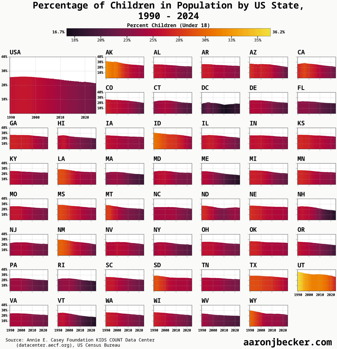
Here’s a version of the time series chart that better shows the slope by starting all Y axes at 15%, and also uses a color scheme which might be better:
https://preview.redd.it/v9d8thuaeyxf1.png?width=2734&format=png&auto=webp&s=b2e42b38b5ba132cf16768b65a026e29cacd3546
Font also changed because I’m on a different machine.
This is why housing prices are completely insane here in Utah
It’s why immigrants are so important. Without them the economy would collapse, but xenophobia rules the country now.
Them Mormans…they like to make some babies.
Mormons single-handedly keeping the American population from plummeting
Those mormons do be procreating
Mormons are freaks in the sheets.
[People are having fewer kids. Their choice is transforming the world’s economy](https://www.npr.org/2025/10/27/nx-s1-5551125/people-are-having-fewer-kids-their-choice-is-transforming-the-worlds-economy) — NPR
Liable to get much worst for those who grew up in the middle of Covid.
On par with the rest of the developed world. Birth rates are declining
It would be interesting to see the biggest delta between years on a similar heat map. Utah looks like it’s the biggest decliner though still the highest share of the younger population.