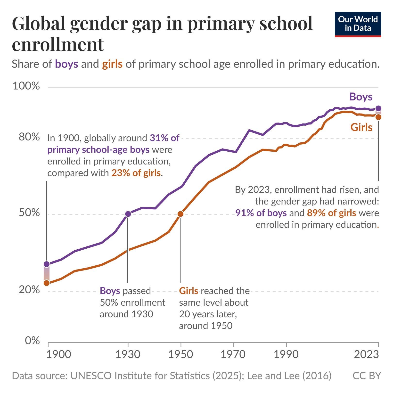
I work at Our World in Data and made this chart for one of our Data Insights, where I explain better what's behind the data: https://ourworldindata.org/data-insights/a-century-of-progress-in-access-to-primary-education
Posted by eortizospina

![[OC] A century of progress in access to primary education](https://www.byteseu.com/wp-content/uploads/2025/10/mwq33j3jqgyf1-1536x1536.jpeg "[OC] A century of progress in access to primary education")
I work at Our World in Data and made this chart for one of our Data Insights, where I explain better what's behind the data: https://ourworldindata.org/data-insights/a-century-of-progress-in-access-to-primary-education
Posted by eortizospina
6 Comments
I work at Our World in Data and made this chart for one of our Data Insights: [ourworldindata.org/data-insights/a-century-of-progress-in-access-to-primary-education](https://ourworldindata.org/data-insights/a-century-of-progress-in-access-to-primary-education)
You can find an interactive version of this chart with data for every country here: [ourworldindata.org/grapher/gender-gap-education-levels](http://ourworldindata.org/grapher/gender-gap-education-levels)
I made this chart using data from UNESCO for recent years, and an academic paper (Lee and Lee 2016) for the historical estimates.
In terms of tools, I used the OWID Grapher for a first version (https://ourworldindata.org/faqs#what-software-do-you-use-for-your-visualizations-and-can-i-use-it) and then I made annotations and improvements in Figma.
A very uplifting graph, thank you.
I’ve seen the US graph for gender and tertiary education but I’d love to see a global one
Is this normalized by the amount of boys and girls? Since there are more boys than girls being born?
does this factor in birth rates or just enrollments? Because arguably speaking if more females are born than ever before then wouldn’t that affect the enrollment numbers as well?
Looks like a ton of progress happened in the late 90s – early 2000s.