
![[OC] Latitude, Longitude, and Humanity: Mapping Global Population Distribution](https://www.byteseu.com/wp-content/uploads/2025/11/cz0kh5sr8azf1-1536x1277.png "[OC] Latitude, Longitude, and Humanity: Mapping Global Population Distribution")
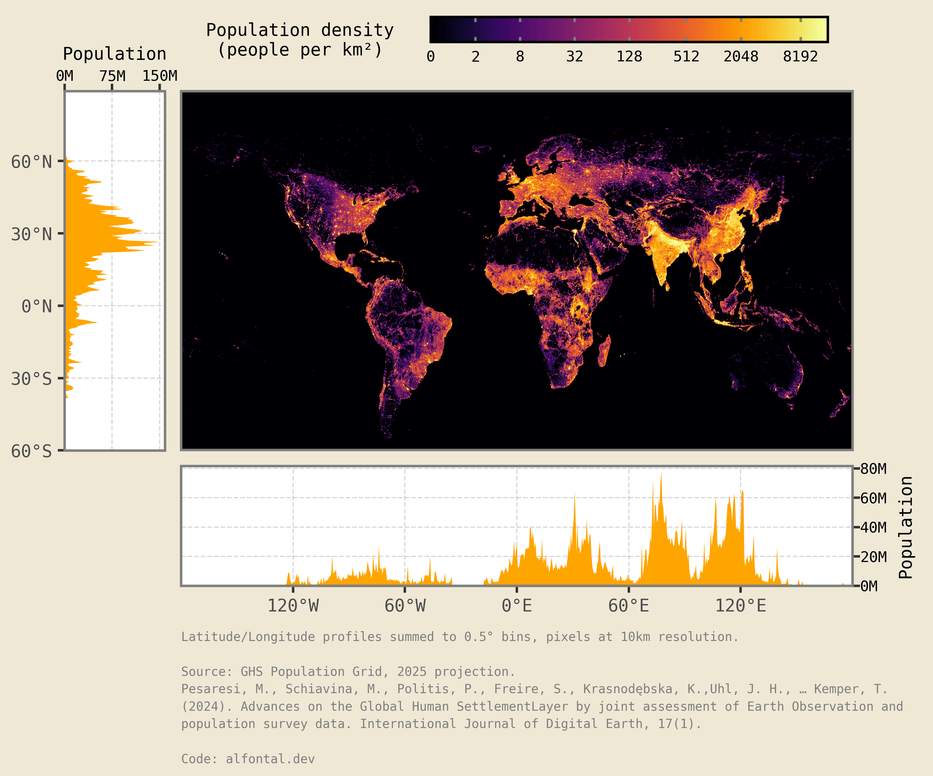
I saw an old picture at very low resolution on a Facebook post and thought I might be able to reproduce it with new data and some Python data viz. It's quite fascinating to see how most of humanity is concentrated in a rather close-by quadrant.
Data source: Global Human Settlement population projection grid for 2025 1km resolution.
Tools: Python. xarray library for the data wrangling and plotnine for the visualization.
Code source: Python code to reproduce the data source download, wrangling and plotting in:
Posted by fontalovic
3 Comments
This one is what this sub was made for
Wow, this is fascinating! Humanity really clusters in certain spots, huh?
Wow… I knew the latitude Sydney sits on would be sparsely populated because of the Pacific and Indian oceans but in this perspective, it’s so stark 😂
That little bump in the 33.5S mark is barely 1/10th of 75M, which means it’s mostly just Sydney (5.5M) 😆