This data is barely readable, it totally can not be considered beautiful
Logitech4873 on
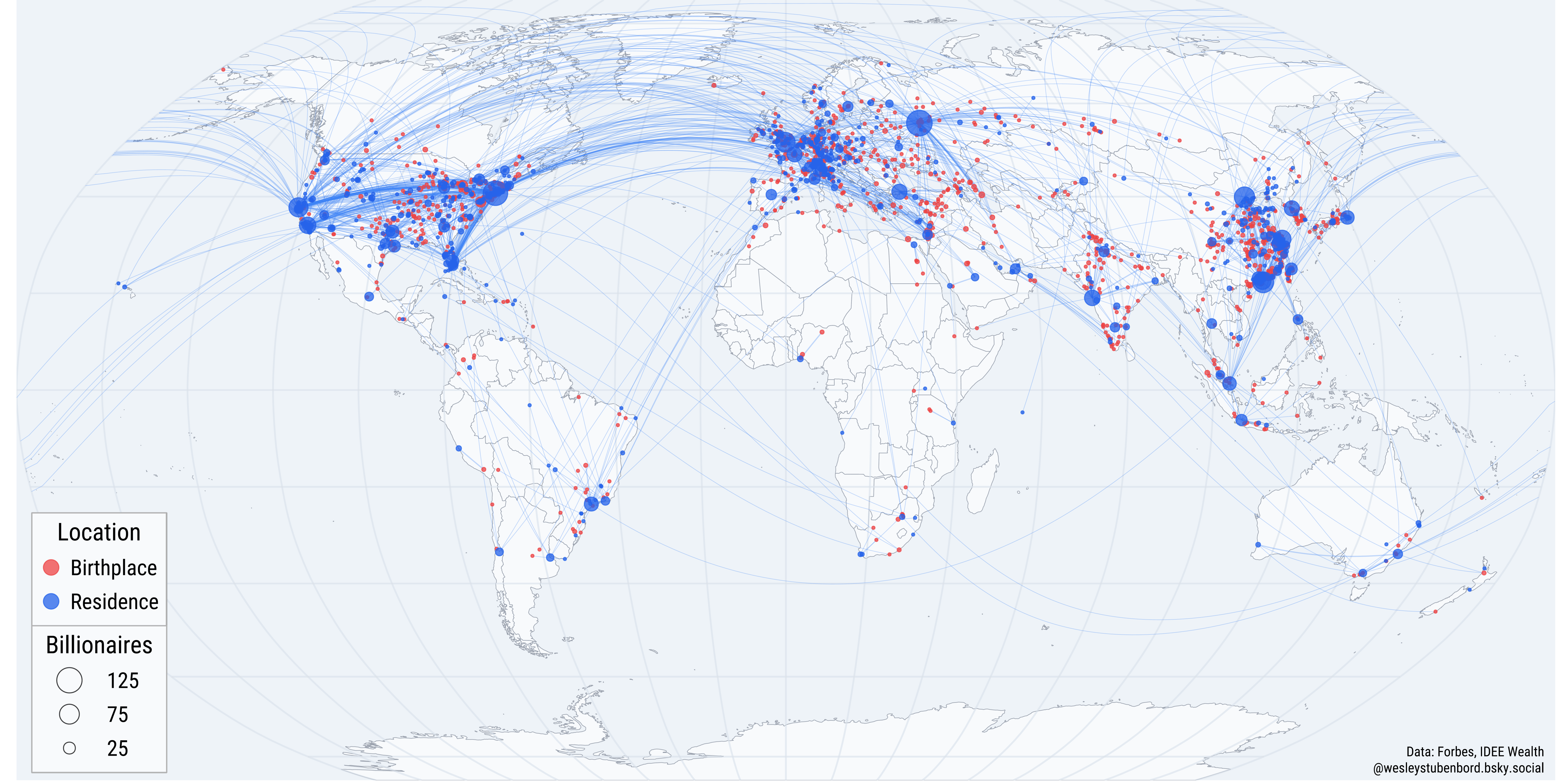
Billionaire by which metric?
Blackdutchie on
Are the points on a city scale? I think we’re losing a lot of readability on the American east coast, in China, and in Europe because of this.
And the lines, as they are now, can mostly be used to tell one thing: That most billionaires that move between countries, appear to move between Europe and the US (but not in which direction).
Specialist-Earth-652 on
Why is it that most of the hotspots are near coastlines of some country (more like continents as well)?
ZaaraKo on
Most useless graph of 2025??????
Choopse on
Why is Moscow attracting so many billionaires from all around the world?
BrightWubs22 on
I’m guessing if a location should be both red and blue, ONLY the blue color is represented?
alexothemagnificent on
It actually really surprises me to see so many from Europe I don’t know why
immoonmoon on
One of those times where Raw data in excel would be more usable than the chart or graph or whatever this monstrosity is, built on top of it
EviEti on
What billionaire is living in the Chagos Islands???
food4me247 on
The beautiful if you shared the data
LestradeOfTheYard on
Bejing, New York, London, San Francisco?
alldasmoke__ on
A ratio with a color gradient would have been better
_Payback on
Maybe it would be easier to read if the relocation lines were a gradient between red (birthplace) and blue (residence)
Festivus_Rules43254 on
As someone who teaches data science on the high school level, this is an example of a weak data visualization.
There are too many lines on it and it also doesn’t really show any kind of pattern (with the exception of that almost all of the billionaires live in the Northern Hemisphere.)
D0ML0L1Y401TR4PFURRY on
Wow Russia is really unequal
hyvel0rd on
Why are there 3.100 billionaires?
HotAppointment1999 on
1 billionaire lives in the Dominican Republic that was born in Venezuela. Wonder who that is.
KrackSmellin on
Data is a hot mess of dots and lines that make absolutely no sense to anyone but OP…
Luddevig on
Billionaires don’t really live in one place anymore.
Before, when the richest felt they had a real home, they would donate money for good causes in their home town / country. But today, they don’t feel as attached and spend the money on a yacht or something instead.
ConsistentAide3165 on
Basically a lot are moving to fiscal paradises to avoid taxes. And we allow to have one fiscal paradise in the hearth of Europe.
OllivanderAU on
This infographic is awful no offense. I just wanted to be able to know how many billionaires currently reside in X, Y, or Z country and I have no idea how to determine that. I just see bubbles.
Separate-Character81 on
Why are there apparently 3,100 billionaires and there are people starving on the same rock and we’re all like oh cool? What the hell is wrong with people
Ilosc on
Billionth population density map
_mayuk on
Who the duck is the billonarie that decide to move to Venezuela ????
freckledtabby on
I can see there are many billionaires in France and nearby places, but they have a great socialized medical offering to the commoners. How kind of them.

![[OC] Where 3,100 billionaires were born and where they live now](https://www.byteseu.com/wp-content/uploads/2025/11/tfv6w772df0g1-1536x768.png "[OC] Where 3,100 billionaires were born and where they live now")
26 Comments
This data is barely readable, it totally can not be considered beautiful
Billionaire by which metric?
Are the points on a city scale? I think we’re losing a lot of readability on the American east coast, in China, and in Europe because of this.
And the lines, as they are now, can mostly be used to tell one thing: That most billionaires that move between countries, appear to move between Europe and the US (but not in which direction).
Why is it that most of the hotspots are near coastlines of some country (more like continents as well)?
Most useless graph of 2025??????
Why is Moscow attracting so many billionaires from all around the world?
I’m guessing if a location should be both red and blue, ONLY the blue color is represented?
It actually really surprises me to see so many from Europe I don’t know why
One of those times where Raw data in excel would be more usable than the chart or graph or whatever this monstrosity is, built on top of it
What billionaire is living in the Chagos Islands???
The beautiful if you shared the data
Bejing, New York, London, San Francisco?
A ratio with a color gradient would have been better
Maybe it would be easier to read if the relocation lines were a gradient between red (birthplace) and blue (residence)
As someone who teaches data science on the high school level, this is an example of a weak data visualization.
There are too many lines on it and it also doesn’t really show any kind of pattern (with the exception of that almost all of the billionaires live in the Northern Hemisphere.)
Wow Russia is really unequal
Why are there 3.100 billionaires?
1 billionaire lives in the Dominican Republic that was born in Venezuela. Wonder who that is.
Data is a hot mess of dots and lines that make absolutely no sense to anyone but OP…
Billionaires don’t really live in one place anymore.
Before, when the richest felt they had a real home, they would donate money for good causes in their home town / country. But today, they don’t feel as attached and spend the money on a yacht or something instead.
Basically a lot are moving to fiscal paradises to avoid taxes. And we allow to have one fiscal paradise in the hearth of Europe.
This infographic is awful no offense. I just wanted to be able to know how many billionaires currently reside in X, Y, or Z country and I have no idea how to determine that. I just see bubbles.
Why are there apparently 3,100 billionaires and there are people starving on the same rock and we’re all like oh cool? What the hell is wrong with people
Billionth population density map
Who the duck is the billonarie that decide to move to Venezuela ????
I can see there are many billionaires in France and nearby places, but they have a great socialized medical offering to the commoners. How kind of them.