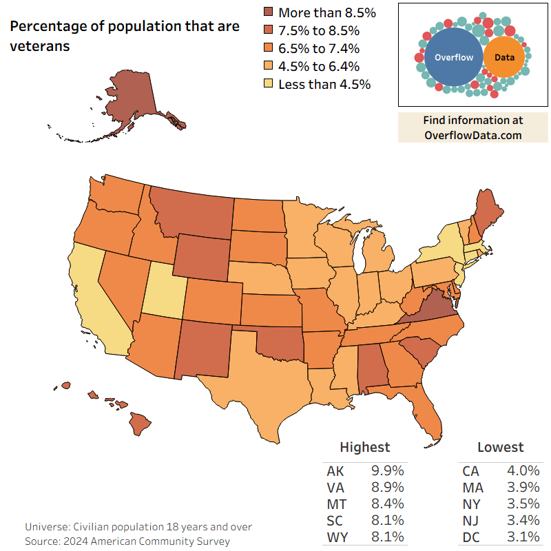
The data in this visualization comes from the 2024 American Community Survey 1 year estimates which are compiled by the U.S. Census Bureau. The visualization was made in Tableau.
DelBrowserHistory on
Not a huge fan of the color scale personally. Cool info tho.
LegallyBrody on
Interesting that Alabama has a high percentage yet its governor was notoriously hostile towards the military and its members getting their promotions.
DerHeiligste on
I feel like this doesn’t give you a good answer to the question in the title. Probably many more veterans live in the states with higher populations, but they’re a relatively smaller part of the population.
The title seems like the graph should tell you “given that someone is a veteran, where are they likely to live?” From this map, I think you can learn more about “where do non-veterans not live”.
Fluid-Assistant-5 on
I’d guess it anti-correlates with access to higher education.
xeno_dorph on
TX has insanely good benefits for vets and their families, surprised their population isn’t higher there.
Oh yeah, cuz it’s TX.
GalegoBaiano on
The lower-end states are the ones that don’t really give a tax break to veterans. Many will have a home for residency and then ACTUALLY live and work elsewhere. Like “living” in FL, but really living and working in NY
GILDID on
The data is a little irrelevant due to veterans also getting jobs after their service and living and or working in or near military installations for access to those services.
ExtinctLikeNdiaye on
Virginia is basically DoD central – Pentagon, Norfolk Naval Shipyard/Station, Ft Lee, Ft Belvoir, and a myriad of other bases and logistics installations. Also, a significant part of the contractor base that serves the federal government is based in NoVA.
The only thing surprising is that MORE veterans aren’t based there and that MD isn’t higher on the list considering Annapolis and other naval/intel facilities are located there.
ExtinctLikeNdiaye on
A much more interesting visual would be what percentage of a state’s population decide to join the military rather than where they end up.
I realize the data for it is harder to find but it would definitely give you a lot more insight about the people in the military.
Extra_Intro_Version on
Interestingly, 3 of the top 5 are the most sparsely populated states.
endreeemtsuyah on
This data is flawed because it’s based on percentage of population but populations vary wildly between states. California has the lowest percent but the highest population so the breakdown of data is misleading.
Danglez83 on
I don’t think there are any veterans in the United States but good try its fake news
Phosphorus444 on
Alaska because: “Fuck the government, I want to be as far away from it and still get VA benefits.”
Virginia because: “The DoD prioritizes hiring veterans.”
qodeninja on
percentage of the population is an entirely misleading metric. especially for the larger states.
Ffftphhfft on
Curious why Utah specifically is low? Does it have something to do with going on mission trips at a young age vs going into the military?
Bibbity_Boppity_BOOO on
They may not live in dc but they sure drive into it all the damn time
Error_404_403 on
This chart is misleading: it does not show American’s Veterans, it shows Americans on active duty service!
360walkaway on
Why so many in Alaska? Do they just say fuck it to civilian life and just live out in the middle of nowhere?

19 Comments
The data in this visualization comes from the 2024 American Community Survey 1 year estimates which are compiled by the U.S. Census Bureau. The visualization was made in Tableau.
Not a huge fan of the color scale personally. Cool info tho.
Interesting that Alabama has a high percentage yet its governor was notoriously hostile towards the military and its members getting their promotions.
I feel like this doesn’t give you a good answer to the question in the title. Probably many more veterans live in the states with higher populations, but they’re a relatively smaller part of the population.
The title seems like the graph should tell you “given that someone is a veteran, where are they likely to live?” From this map, I think you can learn more about “where do non-veterans not live”.
I’d guess it anti-correlates with access to higher education.
TX has insanely good benefits for vets and their families, surprised their population isn’t higher there.
Oh yeah, cuz it’s TX.
The lower-end states are the ones that don’t really give a tax break to veterans. Many will have a home for residency and then ACTUALLY live and work elsewhere. Like “living” in FL, but really living and working in NY
The data is a little irrelevant due to veterans also getting jobs after their service and living and or working in or near military installations for access to those services.
Virginia is basically DoD central – Pentagon, Norfolk Naval Shipyard/Station, Ft Lee, Ft Belvoir, and a myriad of other bases and logistics installations. Also, a significant part of the contractor base that serves the federal government is based in NoVA.
The only thing surprising is that MORE veterans aren’t based there and that MD isn’t higher on the list considering Annapolis and other naval/intel facilities are located there.
A much more interesting visual would be what percentage of a state’s population decide to join the military rather than where they end up.
I realize the data for it is harder to find but it would definitely give you a lot more insight about the people in the military.
Interestingly, 3 of the top 5 are the most sparsely populated states.
This data is flawed because it’s based on percentage of population but populations vary wildly between states. California has the lowest percent but the highest population so the breakdown of data is misleading.
I don’t think there are any veterans in the United States but good try its fake news
Alaska because: “Fuck the government, I want to be as far away from it and still get VA benefits.”
Virginia because: “The DoD prioritizes hiring veterans.”
percentage of the population is an entirely misleading metric. especially for the larger states.
Curious why Utah specifically is low? Does it have something to do with going on mission trips at a young age vs going into the military?
They may not live in dc but they sure drive into it all the damn time
This chart is misleading: it does not show American’s Veterans, it shows Americans on active duty service!
Why so many in Alaska? Do they just say fuck it to civilian life and just live out in the middle of nowhere?