
![[OC] Number of Children Born to Parent Age Pairs in US in 2024 IMPROVED](https://www.byteseu.com/wp-content/uploads/2025/11/9zffn1nh6c1g1-1024x866.png "[OC] Number of Children Born to Parent Age Pairs in US in 2024 IMPROVED")
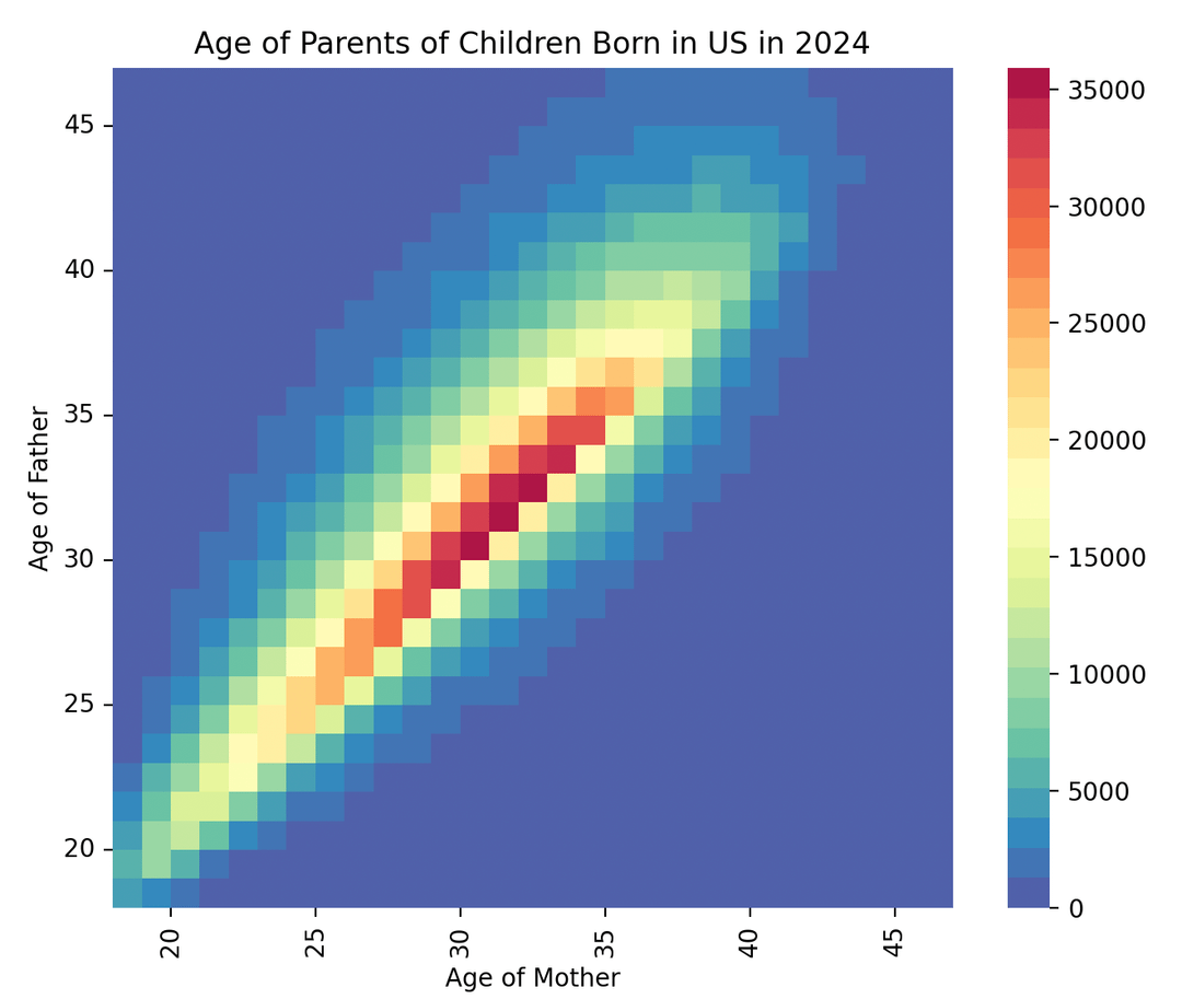
I made this plot using Matplotlib and the data from the US CDC vital statistics data which is publicly available here: https://www.cdc.gov/nchs/data_access/Vitalstatsonline.htm . The data is on the over 3.5 million births of children in the US in 2024.
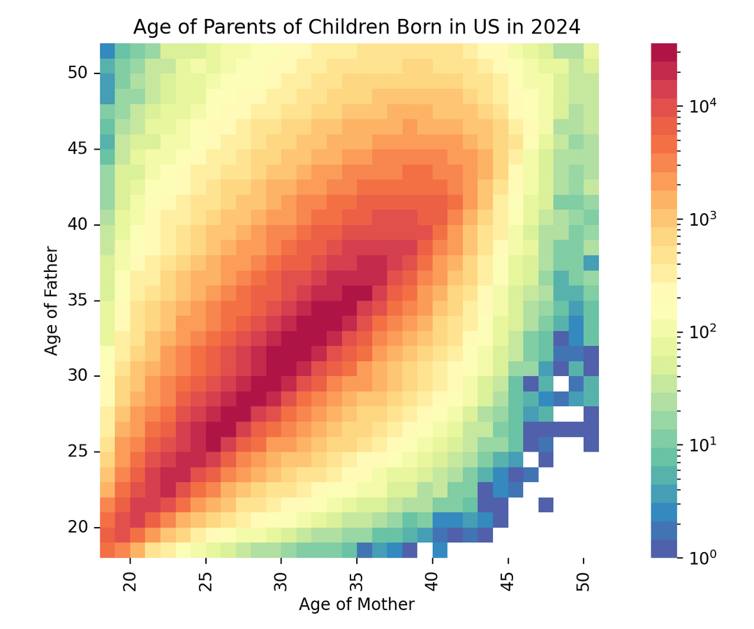
After feedback last time I posted this data, I made the plot more readable and in addition added a second plot with logarithmic scale.
Posted by lorisaurus
7 Comments
My wife’s ex-husband, at 52, just knocked up a 28 year old. The box isn’t even on this fucking graph. Hilarious.
That little green block in the upper right corner is Robert DeNiro’s child
Would be interesting to see a time series of these stacked.
Is there any particular reason why younger teen pregnancies weren’t included? Just not enough data?
Where’s Janet Jackson? Didn’t she have a kid at 50?
This really is some beautiful data!
The “improved” heat map is actually informative. It shows that people tend to settle down and start families with people their own age. BUT, men skew just a bit older than women.
The stories we hear about crazy age gaps are the minority, at least with couples that have kids. It’s more like “guys tend to be *a few* years older than their partners.”
At least there’s empty cells in the bottom right. The fact that there’s any color at all in the top left is very disturbing.