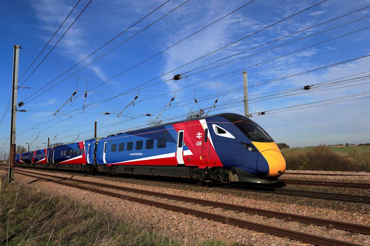
Train livery revealed for Great British Railways
https://www.railadvent.co.uk/2025/12/train-livery-revealed-for-great-british-railways.html
Posted by eldomtom2


Train livery revealed for Great British Railways
https://www.railadvent.co.uk/2025/12/train-livery-revealed-for-great-british-railways.html
Posted by eldomtom2
17 Comments
Brighter than I expected and I’m not sure the angle design works on the coaches… But I like it.
One of my lecturers at college worked on the branding for BR. He brought in the design manuals (and a bunch of extra interesting bits and pieces). The manuals were multi volume hefty tomes. As a first years design student it was intimidating to see the amount of work and attention to detail that went into it.
This was all pre computer aided design IIRC, which made it even more impressive. He showed us some of the design artefacts which were layers of acetate with hand drawn logos/diagrams and a lot of Letraset typesetting. Proper old school graphic design.
Anyway, all that to say I’ve been fond of the BR branding since then, and I’m glad to see it making a comeback.
Yesss love some patriotic trains! Proper British ones. Get rid of GWR, they fined me for using a child ticket as a 16 year old.
Honestly? I’m really excited to see these soon. Well done Labour?
Obviously it was always going to be flags but there is a right way of doing it.
Clean, understated, horizontals are how train liveries should look and Acela, Trenitalia especially SBB show how you can incorporate ‘patriotic’ colours in an effective way.
This is *beyond hideous*, especially on the inner coaches. Loud, in your face, distracting, this isn’t a British design language but American – doesn’t belong anywhere near our timeless classic double arrow logo.
I support renationalising the railways, but I am a little sad because I think the LNER red and white looks REALLY cool.
Don’t hate it!
The name is a bit ‘corporate twee’, though I guess going back to ‘British Rail’ was deemed to involve too much baggage
Looks quite clean, actually.
Though, if I could change anything, it’d be that it should flip on each carriage, so the red ends are touching
I mean its fine, but its hard to escape the thought that they’ve designed it to look good in a TV advert first.
And if I’m reading this right there’s a single livery for the entire country, no matter what type of service? Not sure I’m a fan of that. Sectorisation had the right idea with splitting services by purpose.
I might be in the minority, but I really don’t like it. Too busy, and there’s just no flow down the train (the pattern just restarts on each carriage). If I were to tweak it I’d remove the extra triangle of blue mid carriage, and keep the busy flag design to only first and last coach (anything in-between could be monotone, or some simplified version of main livery)
Rubbish. Why can’t they just used solid colours and straight parallel lines.
Glad to see the Arrow of Indecision front and centre.
As someone who works on the railway I’m disappointed. The liveries of old promoted flow and speed. I LOVED the old FGW lines that “squiggled” at the end of each carriage then in to straight lines to the opposite end. The continuity was there. There is no continuity on this livery. They should have gone with something more like the RAF Voyager KC2 A330s (UK Government Livery). I really do like the colours chosen, just not in that style.
Love this. Now please bring rolling stock into public ownership.
Honestly who cares about the paintwork and branding? How many millions did that cost them, when they could have added more trains or done things to lower the cost of them (which are already ridiculous).
I don’t use the train much, but when I do it’s usually stupid prices. A return trip to London for me is £55 minimum. A return trip to Morocco I can get for £35-42. Make it make sense…
Train prices in the UK are so ridiculous that I actually flew from Manchester to London via Dublin for less than the train would have cost… Trains should be cheaper if they want people to actually use them and to be ‘greener’.
Painting things to make them look nice and fancy is effectively the ‘polishing a turd’ method. Which may give an illusion of looking better but work on the actual problems like more trains, more carriages, less bus replacements, and actually being on time (not having to refund haof the journeys because they’re delayed).
I don’t hate it, but I think having the flag design on every single carriage is a bit too much. If they just left the intermediary carriages in navy then it would probably look a lot cleaner. Alternatively, just do the GNER livery but have it say GBR instead.
Also, could the DfT not have paid someone to do a half-decent looking mockup in Blender or something? Why does the official imagery look like it was coloured in using the pen tool in PowerPoint, ran through ‘needs more jpeg’ a few times, and followed up with a quick blast of the ‘remove background’ tool on the doors?
My personal preference would be subtler branding that respects regional heritage, if you really want you can still stick some flags / BR logos on the carriages but smaller