
![[OC] How Apple Generated $416B in Revenue and $112B in Profit in FY25](https://www.byteseu.com/wp-content/uploads/2025/12/9mmj7ilvmr6g1-1536x960.png "[OC] How Apple Generated $416B in Revenue and $112B in Profit in FY25")
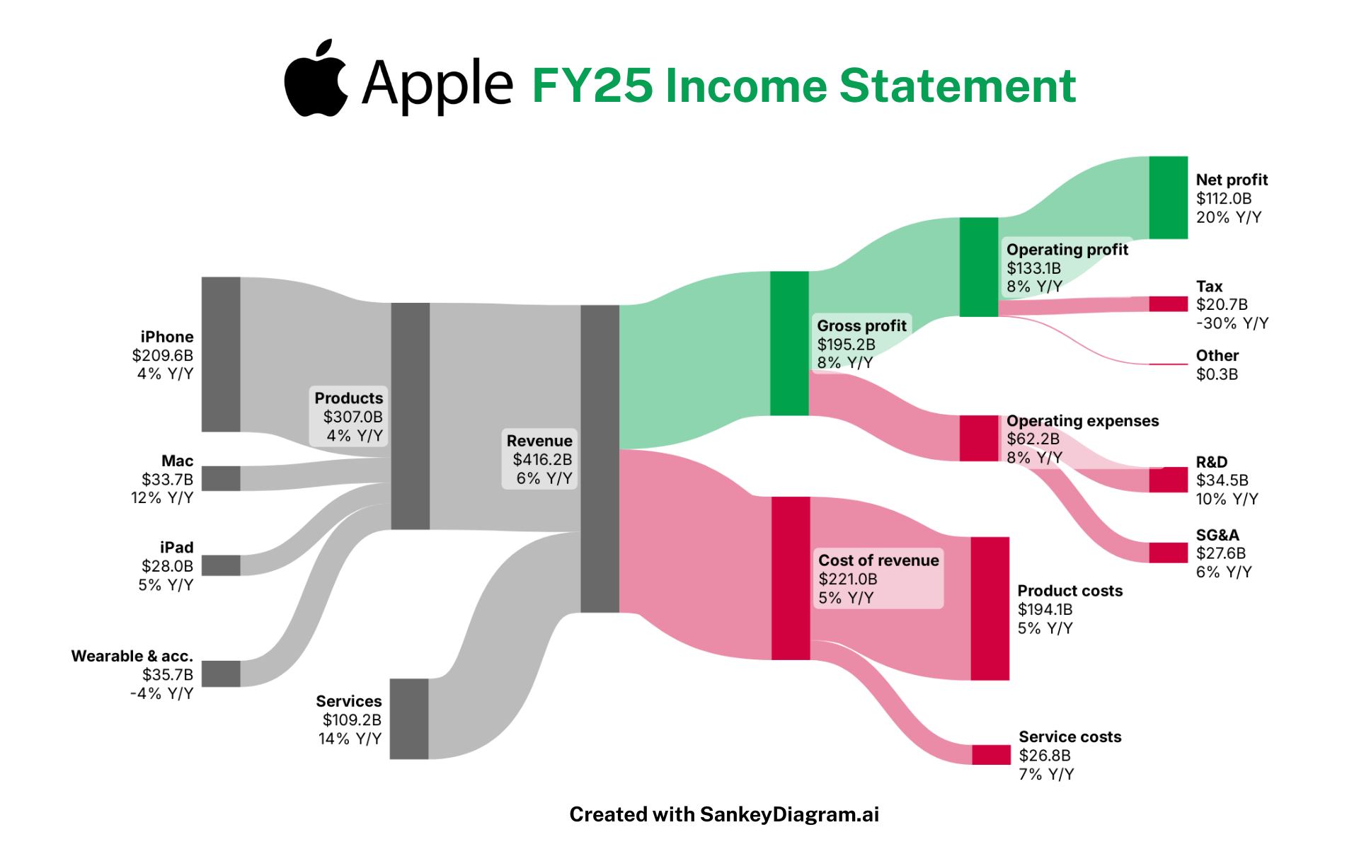
This Sankey diagram visualizes Apple’s FY25 income statement, showing how the company generated $416.2B in total revenue and ultimately produced $112.0B in net profit.
Key highlights from FY25:
- iPhone continues to dominate with $209.6B in revenue (+4% YoY)
- Mac saw strong growth at 12% YoY
- Wearables & Accessories declined 4% YoY
- Services grew to $109.2B, up 14% YoY
- Gross profit reached $195.2B (+8% YoY)
- Operating expenses climbed to $62.2B (+8% YoY), driven by R&D investments
- Net profit jumped 20% YoY, aided by a sharp tax reduction (–30% YoY)
Made with: Using SankeyDiagram + Canva
Source: Apple FY25 Annual Report (Investor Relations)
Posted by FrostingTall9171
12 Comments
I don’t know anything about company profit, but that green part looks very thick.
133,1 out of 416,2 = 31,97% net profit before taxes
20,7 in taxes off of 133,1 = 15,55% taxes
Numbers in fucking billion USD of course. Is it just me or should they have to pay more taxes?
Made 8% more gross profit, paid 30% less taxes than year prior. How’s that make sense
So many business Sankeys … sooooooo many.
These are the most useless charts. Why? Because they don’t actually show where profits or expenses come from.
I’d be much, MUCH more interested in seeing the margins on each of these revenue streams.
For a while I feel like we were free of the Sankey spam, but now they’re back. (Also maybe because I blocked that one account that does nothing but Sankeys)
We just gotta do more interesting things with data.
A 4 trillion corporation having a lower tax rate than me. Nice!
400B Revenue with 20B in taxes. Nice.
damn, people love their iPhones.
Are they not sitting on a huge cash pile?
Does it not make any interest?
It is wild to me that over half of their revenue is *just* iPhones and the other half is literally everything else they sell combined.
+8% Y/Y Operating Profit … +20% Y/Y Net Profit … because of a -30% Y/Y Taxes Expenses … suggesting that last year they paid nearly $70B in Taxes … why not the $50B ? … where is that being replaced from ?