

I have been living in Switzerland for 7 months now, and it’s impossible not to love the fashion for iconography in a country like this, with all the cantons’, families or guilds’ coats of arms. However, during this period I’ve been constantly puzzled by the symbols of TurbinenBrau and BlueCinema.
With the former, I get it must be a turbine, but I just cannot see it, as it looks kind of irregular. With BlueCinema, I am completely clueless.
Anyone that is into design and cares to help me see what they should represent?
https://www.reddit.com/gallery/1plvzz4
Posted by Micangeloo
6 Comments
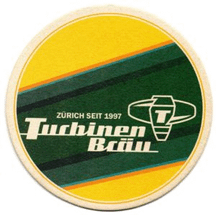
Turbinebräu shows a turbine.
Blue cinema is the cinema of Swisscom. The logo is the Swisscom logo im blue for blue cinema.
blue Cinema is the monochromatic Swisscom logo in 2D: https://www.swisscom.ch/en/about/company/brand.html. blue Cinema, or rather blue Entertainment, is a Swisscom subsidiary.
As for the Swisscom logo itself: The newest iteration is only a couple of months old but it’s still based on the “life form”, I think it was called. The things that stuck with me for that one are the red being a stylised apple (callback to the Tell mythos), containing a white cross to resemble a Swiss flag. The blue part in front was styled to resemble the sail of a boat.
I might still have some of the old material I received from when I was working for a company dealing with Swisscom products. Multiple slides dedicated to this logo. Need to look for it.
You will certainly enjoy visiting Museum für Gestaltung in Zürich
One is a turbine, the other one a vagina.
Turbinen Bräu is a Turbine of a River Hydroplant like this: [https://www.wasserkraftverband.de/wp-content/uploads/2022/06/Kaplan-Turbine.svg](https://www.wasserkraftverband.de/wp-content/uploads/2022/06/Kaplan-Turbine.svg)
The Swisscom logo are signal waves that overlap each other and are rotated so they are vertical.